Category : Design

AR/VR Design Design Thinking iOS Technology

Designing for Vision Pro: the coming spatial experience

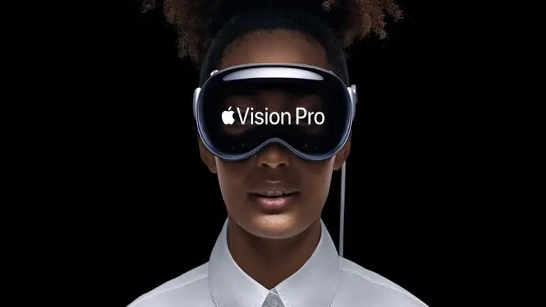
As the real and virtual worlds continue to converge, Apple has introduced Vision Pro, a device designed to deliver immersive mixed-reality experiences. Vision Pro enables endless possibilities for exploring human-to-system interactions and spatial dynamics. Users can interact with the digital world more naturally using the mixed-reality headset. It overlaps digital content in the real world, allowing users to simultaneously see and interact with both worlds. Vision Pro is slated for limited release to the public next year, but Apple has already given a demo to select developers.

Vision Pro features two high-resolution micro-OLED displays that project images directly onto the user’s retinas, creating a “screenless” (screen without a screen) experience. The headset has 12 built-in cameras for tracking the user’s head, eyes, and hands, a LiDAR scanner for depth perception, and an Apple M2 chip with 10 CPU and 32 GPU cores.

Vision Pro is designed with accessibility at the center, using gestures, voice, and combinations of these input modes as critical enablers. This was showcased in the launch event video, where users could interact with the headset using gestures to browse the web, watch movies, and play games. Designing for Vision Pro requires understanding these input modes and providing solutions for users to have a seamless journey.

Apple Vision Pro Gestures Feature

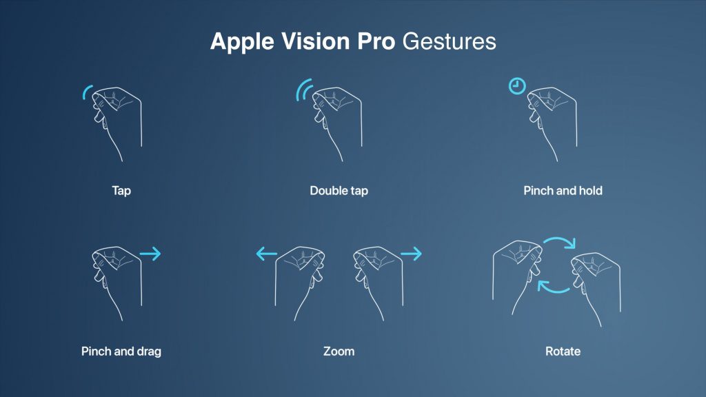
Source: MacRumors Apple Vision Pro Gestures

Designing for a spatial experience

Design principles for traditional screens may not work for the future of spatial experiences, which are more immersive and interactive. Designers need to adapt these principles to consider the unique features of spatial experiences. Spatial experiences allow users to interact with the environment more naturally, so designers must create interfaces that are easy to use and understand.

Vision Pro’s spatial capabilities allow designers to create visually captivating and user-friendly interfaces that feel intuitive and natural to navigate. This focus on user-centric design enhances the user experience across various applications. Below are some key aspects to consider while designing for glass-style UI:

Iconography

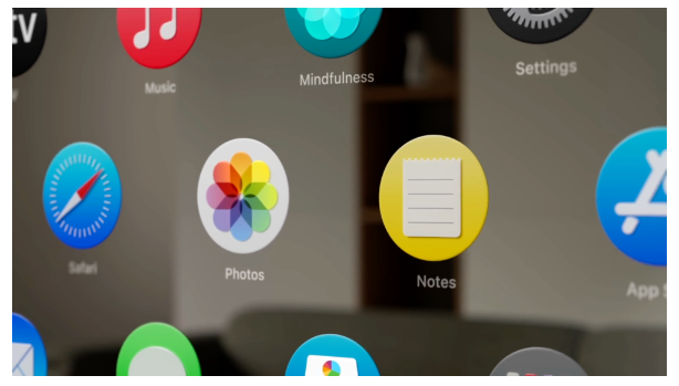
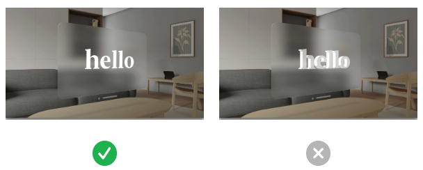
To create a seamless user experience, Apple has reimagined the feedback mechanism for icons on the home screen. When a user looks at an icon, it expands as if it is being hovered over. Designers design icons with subtle depth by adding specular shadows and highlights.

To design a great icon, start by creating multiple layers. The system uses these flat layers to create a three-dimensional effect. The icon should be converted to 1024×1024 pixels, with transparent foreground layers. Do not use large regions of semi-transparent pixels, as they will blend with the shadow behind them.

Consider these additional recommendations when designing icons:

  • Maintain a uniform color scheme and style throughout your icons.
  • Make sure your icons are clear and easy to understand.
  • Use high-quality images and graphics.
  • Test your icons on different devices and screen sizes to ensure they look good everywhere.

apple vision pro icons for spatial immersive experiences

Source: App icons | Apple Developer Documentation
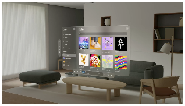
Glass panels design

Apple has introduced glass material to create a more spatial and lightweight user experience. This material allows users to see what is behind a window, such as other apps or people, without feeling suffocated.

Therefore, when designing an app window, it is essential to avoid using solid colors. Too many opaque windows can make the interface feel heavy. Instead, use a lighter material to bring attention to interactive elements, such as buttons, or a darker material to separate sections of the app.

For example, if you want to design a lock-up with a lighter button, you can place it on top of the glass material. Or, if you’re going to create more contrast, you can use a darker cell behind the button. However, it is crucial to avoid stacking lighter materials on top of each other, as this can impact legibility and reduce contrast.

Consider these bonus tips for designing with glass material:

  • Use glass material sparingly. Too much of it can make the interface feel cluttered.
  • Use glass material to create a sense of depth. For example, you can use a darker glass material for the background and a lighter glass material for the foreground.
  • Use glass material to highlight essential elements. For example, you can use a lighter glass material for buttons or other interactive elements.

apple vision pro glass material design for spatial immersive experiences

Source: Materials | Apple Developer Documentation

Legibility

Typography

The font-weight can be slightly increased to improve text contrast against vibrant materials. For example, on iOS, regular weight for the body text style must be used; on this platform, a medium can be used. And for titles, instead of semi-bold, bold can be used. This makes the text more legible, even when displayed on a vibrant background. System fonts, which are designed for optimized legibility, can also be used.

Vibrancy

Vibrancy is another crucial detail for maintaining legibility. It enhances the foreground content by bringing light and color from the background forward. On this platform, vibrancy updates in real-time to ensure your text is always legible, even when the background constantly changes. Vibrancy can indicate hierarchy for text, symbols, and fills. Primary vibrancy can be used for standard text, and secondary vibrancy can be used for less critical text.

Pointers for using typography and vibrancy:

  • Use a heavier font weight for text that needs to be legible, such as body text and titles.
  • Use system fonts or other fonts that are designed for optimized legibility.
  • Use vibrancy to brighten foreground content and make it stand out from the background.
  • Use primary vibrancy for standard text and secondary vibrancy for less critical text.
  • When using custom fonts, make sure they are designed for readability.
  • Avoid using small or lightweight fonts, which can be challenging to read, especially on large screens.
  • Consider using a darker shade for the pop-over background to make the text more legible.

apple vision pro legibility typography vibrancy for spatial immersive experiences

Source: Typography | Apple Developer Documentation

Colors

When designing a glass-style UI, use white text and icons on a colored background. This will make the text and icons stand out and be more legible.

  • Use system colors whenever possible. System colors are designed for legibility and look best on a glass background.
  • If you need a custom color, use it sparingly and make sure it contrasts nicely with the background.
  • Avoid using dark colors for text or icons. Dark colors will blend in with the background, making the text and icons challenging to read.

Here are some additional tips for designing glass-style UIs:

  • Use a light overall color palette. This will help to create a sense of spaciousness and airiness.
  • Use transparency and blur effects to create a sense of depth.
  • Use shadows to add dimension to the UI.
  • Use gradients to add interest and visual interest.

apple vision pro colors design for spatial immersive experiences

Source: VisionOS – Apple Developer

How Vision Pro can transform businesses

Businesses of all sizes and across some industries are excited about the potential of Apple Vision Pro, which is still in its early stages of development. The technology has the potential to transform operations, improve customer experiences, and boost overall performance. Still, which industries will most successfully adopt it remains to be seen.
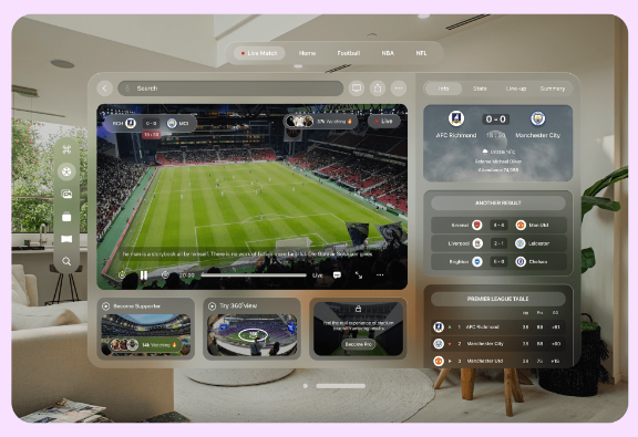
Entertainment

  • Create immersive gaming experiences that blur the line between the virtual and real worlds. To illustrate, game developers can use Apple Vision Pro to create realistic first-person shooter games where players can interact with the environment lifelike.
  • Create interactive storytelling experiences. Filmmakers can use Apple Vision Pro to create 3D movies, transporting viewers into breathtaking cinematic worlds.
  • Provide real-time translation of foreign language text. For example, language learners can use Apple Vision Pro to get a real-time translation of foreign language text while traveling or interacting with people from other cultures.

apple vision pro application for spatial immersive experiences for entertainment and sports

Source: How will Apple Vision Pro VR influence industries | Merge Development

Education and training

  • Provide students with interactive learning experiences. For instance, teachers can use Apple Vision Pro to take students on virtual field trips to historical sites or to conduct experiments in a safe and controlled environment.
  • Offer virtual field trips. For example, students can use Apple Vision Pro to visit museums or other educational institutions without leaving their homes.
  • Provide real-time translation of foreign language text. Concretely, language learners can use Apple Vision Pro to get the real-time translation of foreign language text while taking a class or reading a book.

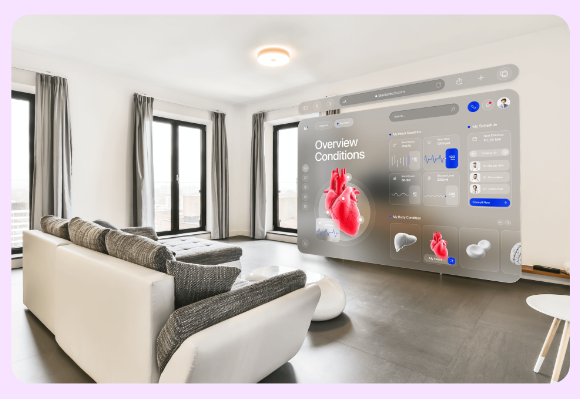
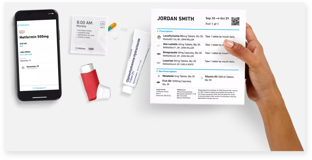
Healthcare and medical

  • Provide realistic surgical simulations and training scenarios. In other words, doctors and medical students can use Apple Vision Pro to practice procedures without risking harming a patient.
  • Offer remote consultations with patients. For example, doctors can use Apple Vision Pro to consult with patients in remote areas.
  • Visualize and analyze medical data. For instance, researchers can use Apple Vision Pro to visualize and analyze medical images and data to understand diseases better and develop new treatments.

apple vision pro application for spatial immersive experiences in healthcare medical industry

Source: How will Apple Vision Pro VR influence industries | Merge Development

Real estate and architecture

  • Give potential buyers virtual tours of properties. Real estate agents can use Apple Vision Pro to give potential buyers a 360-degree view of a property without meeting them in person.
  • Collaborate with clients and stakeholders on 3D design projects. Architects can use Apple Vision Pro to collaborate with clients and stakeholders on 3D design projects in real time.
  • Visualize furniture and decor in a physical space. For example, interior designers can use Apple Vision Pro to visualize how furniture and decor will look in a room before making a purchase.
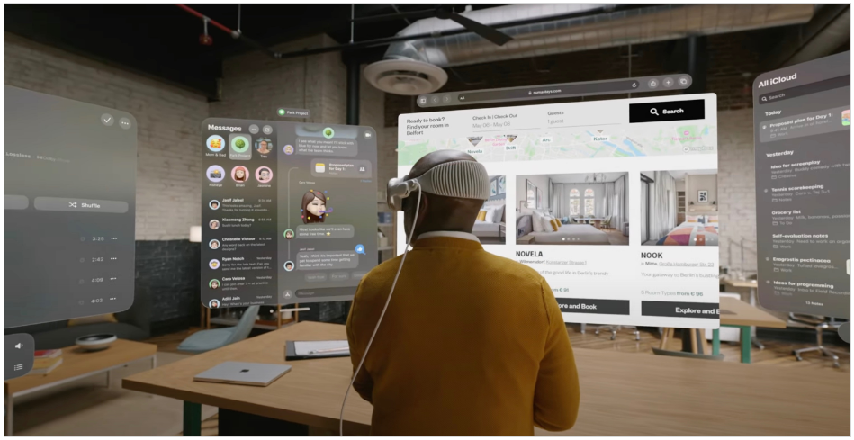
Meetings

  • Join virtual meetings from anywhere. For instance, remote workers can use Apple Vision Pro to join virtual discussions from anywhere.
  • Collaborate in real-time and share information. For example, participants in virtual meetings can use Apple Vision Pro to collaborate in real time and share information.
  • Track customer behavior and improve the shopping experience. Concretely, businesses can use Apple Vision Pro to track customer behavior in a retail store and use that data to enhance the shopping experience.

apple vision pro application for spatial immersive experiences in workspace education and meetings

Source: Apple’s Vision Pro: Revolutionizing Industries Through Spatial Computing| ELEKS

Finance and banking

  • Visualize financial data. For example, financial analysts can use Apple Vision Pro to visualize financial data to understand the market better and make informed investment decisions.
  • Help clients track their spending. For example, personal finance managers can use Apple Vision Pro to help clients track their spending and reach their financial goals.
  • Visit virtual bank branches. Concretely, customers can use Apple Vision Pro to visit virtual bank branches to conduct transactions or speak to a banker.

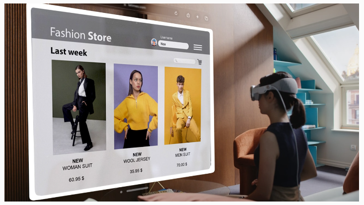
Retail and e-commerce

  • Try on clothes and accessories before making a purchase. To illustrate, shoppers can use Apple Vision Pro to try on clothes and accessories before purchasing.
  • Provide personalized shopping recommendations. Retailers can use Apple Vision Pro to provide personalized shopping recommendations based on a shopper’s past purchases and browsing history.
  • Offer in-store navigation. For instance, businesses can use Apple Vision Pro to offer in-store navigation to help customers find the products they are looking for.

apple vision pro application for spatial immersive experiences in retail ecommerce fashion

Source: Apple Vision Pro and The Future of ECommerce (codilar.com)

Vision Pro: the flip side

Innovation can be exciting, promising a brighter future with endless possibilities. However, carefully considering the potential consequences of new technologies is essential. While innovation often brings benefits, it can also come with risks, such as privacy concerns, surveillance risks, and impacts on mental health and social isolation. Balancing progress with responsibility when developing and using new technologies is essential.

Comfort and ergonomics

Early reports suggest that the Vision Pro is well-built but slightly uncomfortable to wear for extended periods. The headset is front-heavy due to its metal construction, which could make it difficult to wear for long periods. Additionally, the headset’s weight distribution and heat management could further impact user comfort. If the Vision Pro is not designed to be comfortable, it may limit its appeal to consumers and businesses.

Privacy at stake

The Vision Pro raises fundamental concerns about personal privacy. The headset’s ability to project floating screens onto our vision while observing our environment could collect vast data about us. This data could include our eye movements, facial expressions, and surroundings. The potential for this data to be used to track our movements, monitor our behavior, and even identify us is a serious privacy concern. Establishing robust safeguards and ethical boundaries is essential to protect individuals’ privacy in the digital age.

Mental health and social isolation

While technological advancements can enhance our lives, we must also consider their potential impact on mental well-being and social dynamics. The Vision Pro’s immersive AR experience could be a double-edged sword. On the one hand, it offers captivating virtual overlays of reality that could tempt users to immerse themselves in a captivating digital realm. On the other hand, this allure could come at the risk of isolating individuals from their physical surroundings and authentic human connections. As we increasingly detach from the present moment and substitute genuine interactions with virtual experiences, the potential for social isolation and its associated mental health consequences is serious.

apple vision pro designing for spatial immersive experiences

Source: Apple Developer Forums

Apple’s Vision Pro hasn’t even been released yet, but the company is already planning a smaller and lighter version of the headset and is deep into work on follow-up products.

Conclusion

Apple Vision Pro can redefine how we interact with technology in a human-centric way. Its spatial capabilities allow designers to create visually appealing, user-friendly interfaces that feel natural. This focus on human-centric design will enhance and transform businesses of all sizes and industries by enabling immersive, interactive, and personalized experiences in various applications, from gaming and entertainment to education and training. While Vision Pro can be a powerful tool for good, it is essential to remember that it is also a new technology with potential risks. Our collective responsibility is to ensure that Vision Pro is used responsibly in a human-centric way.

Read More
Design UX/UI

Designing for humanity – going beyond accessibility to create inclusive designs

In early 2005, Wayne Westerman, founder of Fingerworks, wanted to find a convenient solution to use a computer without stressing the hands. The objective was to help people like him who suffered from carpal tunnel syndrome or other such issues to comfortably work on a computer. He and his team invented a way to replace the keyboard with a touchpad. The invention was initially marketed to people with hand disabilities, but over time popularity of the solution grew among a larger group of customers. Fingerworks later sold its invention to Apple inc., which built its first gesture-controlled multitouch interface – the iPhone. The use of button-free gesture control in the iPhone kickstarted the ‘focus on user’ revolution and fundamentally changed the principles of UX design. This is what Designing for Inclusivity is all about. It requires starting from identifying and finding solutions for specific pain points which can lead to exclusion of a certain group of users, then designing experiences that can benefit a diverse group.

In the book Mismatch, Kat Holmes, (former Principal Director of Inclusive Design at Microsoft and an author) illustrates how exclusion is innate to any design if we do not identify it, and how solving for exclusion can lead to benefit of a larger group:

Imagine a playground full of only one kind of swing. A swing that requires you to be of a certain height, with two arms and two legs. The only people who will come to play here are people who match this design, because this design welcomes them and no one else. And yet there are many unexplored, different ways you can design an experience of swinging. You can adjust the shape and size of the seat. You can keep a person stationary and swing the environment around them. You can support the body without holding onto the ropes. Participation doesn’t require a particular design. But a particular design can prohibit participation.

While designing a product or a digital experience it is easy to fall into the trap of generalizing when and how it will be used. But, when those stereotypes are broken it paves the way for inclusive designs and innovations that can benefit a large and diverse group of users.

In this article, let’s deep dive into why every experience must be approached through a lens of inclusivity and the best practices that we can embrace for creating inclusive designs.

Understanding The Difference Between Universal Design, Accessibility and Inclusivity

Universal Design and Inclusivity and Accessibility – these terms are often used interchangeably. While all of them converge together to solve the common objective of creating designs that have minimal exclusion, they differ from each other. Before we talk about inclusivity, it is important to understand the difference between Universal Design, Accessibility, and Inclusive Design.

Universal Design – stems from the objective of making a product, environment, or interface usable by as many people as possible without the need for any adaptation. Motion-operated automatic doors are an example of Universal Design. Universal Design has a one-size-fits-all approach. 

Accessible Design – Accessibility in design focuses on users with disabilities and is a subset of Inclusive designs. Web Content Accessibility Guidelines 2.1, was initiated to improve accessibility guidance for three major groups: users with cognitive or learning disabilities, users with low vision, and users with disabilities on mobile devices. Accessibility is an outcome of inclusive design practices.

In our earlier article, we talked about Accessibility in design and the best practices around it.

Why Design for Inclusivity

Inclusive design involves designing for a specific individual or use cases that are not generic and then extending it to a diverse group. For example – the invention of the email was driven by the need of Vinton Gray Cerf, who is hard of hearing to communicate with his wife who is deaf. The email was a way for them to stay connected when they weren’t in one room. 

Another such example is the invention of captions. On August 5, 1972, “French chef” Julia Child, in a program televised from Boston’s WGBH studios, became a historic broadcast because it was the first time that deaf and hard-of-hearing Americans could enjoy the audio portion of a national television program through the use of captions. Since then, including captions and subtitles in videos has become a best practice for creating videos, which also benefits people beyond the ones who have difficulty in hearing or are in an environment that does not allow a clear hearing.

Designing for Inclusivity can lead to such remarkable inventions. 

However, in most cases, inclusivity is an afterthought in the design process. But, having it ingrained into the product design and development process can drive innovation and business. Here are a few examples:

PillPack founder T. J. Parker wanted to ease out the challenge of opening child-proof caps by people with limited dexterity in their hands. They also wanted to minimize the risk of patients mistaking their prescriptions, especially the ones on multiple medications. They partnered with IDEO to design a more accessible pill bottle and reimagined the prescription delivery service. When patients order their prescriptions through PillPack the medication arrives in presorted packages, where patients could simply remove one small pouch that contains the right medication for the right time of day. This innovative solution, born out of the need of a specific group of users proved to be a boon for 30 million people who needed to take more than five prescription medications in one day.

Source

The Americal Live a weekly public show broadcast created full transcripts for their online archive of hundreds of episodes. The objective was to make content accessible to people with hearing disabilities. This move helped them in reaching out to more audiences than ever. Not only did their website traffic rise drastically, but a substantial percentage of the unique visitors came due to the transcripts. 

Role of Empathy in Creating Inclusive Designs

At Robosoft, we believe in the principles of Design Thinking to create human-centric digital experiences. Empathy is the first step of the Design Thinking process that helps to understand the pain points of the end-user. At the core, the primary goal of creating inclusive designs is lowering the barriers that can exclude users from using digital products and interfaces effectively. A lot of times these barriers occur when product teams think about a design only from their experiences and world view, which results in retro-fitting inclusion and accessibility to the design. 

A lot of product teams and designers work with a Bell-Curve approach. A bell curve approach means designing experiences for the majority of the people, or the ones who lie in the middle of the bell curve, automatically leading to the exclusion of people who fall on the edges of the curve (the edge cases).

This exclusion of the ‘edge cases’ could mean the exclusion of a user need that can lead to an important feature benefiting a diverse group ( including the ‘average people’ who lie in the middle spectrum of the bell curve). 

Designing for inclusivity requires including and learning from people with a range of perspectives. This is where Empathy plays a key role.

Learn how people adapt to the world around them. Bring that into your design practiceTim Allen, VP, Design at Airbnb

Empathy plays a critical role while creating a user persona. It is a tool that helps product teams look beyond their experiences and understand where the user is coming from. It is critical to understand the pain point of the users who are at the left of the persona spectrum – which means they face the maximum mismatch with a product or interface. And then extending the design for a diverse set of users – who may face the same challenges depending on their situations.

User Persona Spectrum – from the Book Mismatch

Best Practices of Designing for Inclusivity

It is critical to think about products or experiences from the mindset of inclusivity, right through the entire product development process –  from strategy and design to development and testing. Let’s take a look at the best practices for designing for inclusivity from these aspects.

1. Identify the Points of Exclusion

Before starting the process of inclusive design, the product teams must seek out the points of exclusion. This means what are the aspects that lead to exclusion of a user and then solving for them. 

Designing for inclusion starts with recognizing exclusion. – Kat Holmes

This can include the following:

  • Recognizing personal biases.
  • Involving a wide and diverse set of users throughout the designing process. Especially the ones who are most likely to be excluded.
  • Identifying exclusion that can occur on a situational basis – this can lead to experiences that can be extended to users who can face challenges in experiencing a product due to their situational environment. This means solutions designed for users who are deaf or HOH (Hard of Hearing) can also benefit those who are navigating through a loud airport.

The Americans with Disabilities Act has legal provisions that address the difficulty of hearing in airports, they cite videotext displays as the most important auxiliary hearing aids that airports must provide. Airport televisions are also required to display captioning at all times.  A service that can help all passengers while navigating a noisy and crowded airport.

Source

2. Understanding User Diversity

The beauty of inclusive designs is that it puts people at the center of every experience. It requires learning from people with a range of perspectives. User research is an important step towards understanding diverse perspectives and creating experiences that are usable for a wider group of people. These activity cards from Microsoft can help in testing concepts through an inclusive lens. These include understanding a user from various aspects like:

  • Learning from users who face exclusion permanently – for instance, people with vision impairments face difficulties in accessing all kinds of digital devices. A feature like high contrast screen settings designed for such users benefits a wider range of users depending on the context like – interacting with the device in bright sunlight.
  • Mismatches in the human-to-technology interaction – most digital interfaces are designed to be used either via a mouse, keyboard, or touch screens. How do people who have constraints of using a hand due to a disability or contextual challenges (like luggage in one or both hands) use a device? This is where a design integrated with voice and speech recognition technology comes into the picture.

At Robosoft, we partnered with AAA to design Google Assistant and Alexa Skills that can help drivers get roadside assistance while driving.

  • Mapping human abilities on a spectrum to design solutions that benefit everyone

Persona Spectrum – Microsoft Inclusive Design Toolkit

  • Draw parallels between the role of human behavior and technology’s behavior – this means finding the human equivalent of the tech solution that is being designed. For instance, a voice assistant’s role in giving information to users can be in some ways equated to a teacher’s role of imparting knowledge to students. Designers should interview people who perform such roles that can be compared to technology’s role in the user’s life. Take note of what makes them good at their work and brainstorm ways to incorporate those insights into the design of your solution’s behavior.

At Robosoft, we partnered with Penske Media Corporation to create an ADA compliant app for WWD (Women’s Wear Daily) one of their leading industry trade journals for fashion. We did a detailed analysis of the audience segments and created detailed user stories. The solution included features like – text alternative for all rich media content, page titles that describe topic or purpose, an optimized order of content rather than a predetermined sequential order, etc.

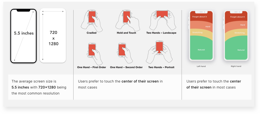
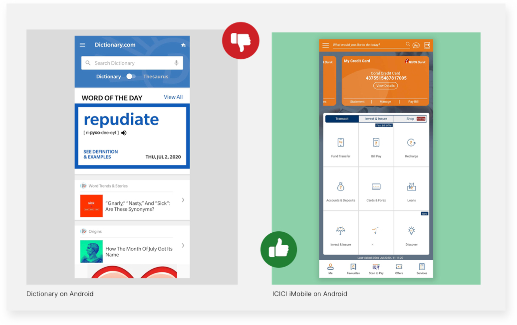
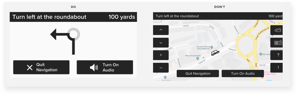
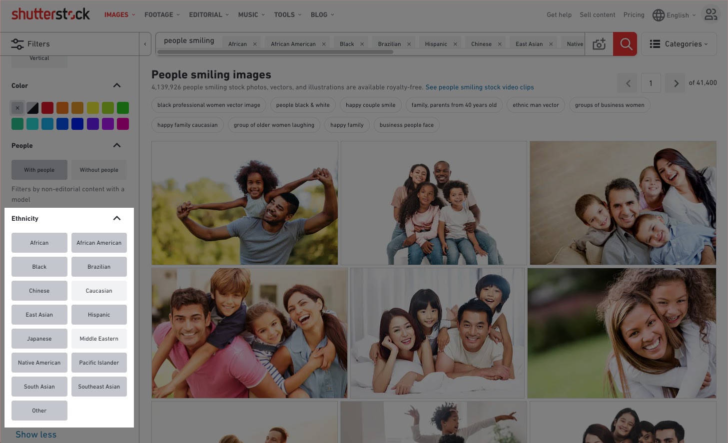
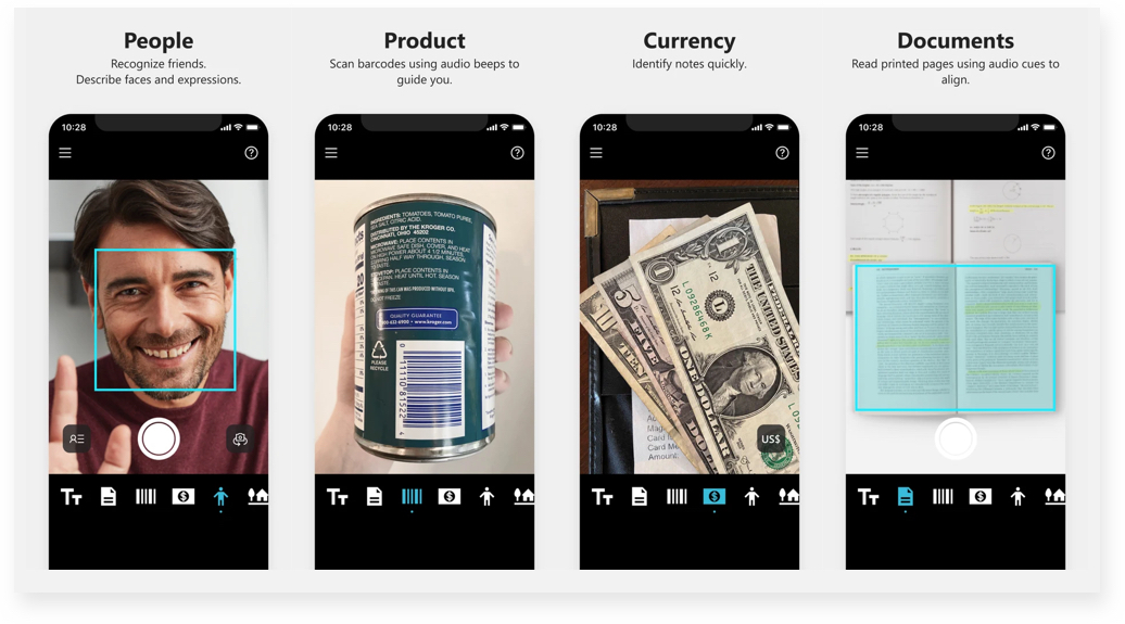
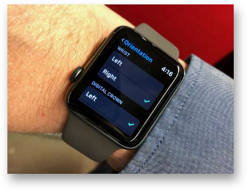
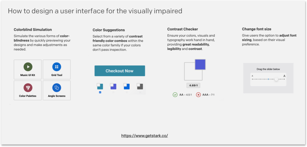
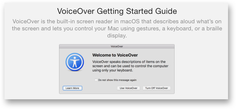
3. Design Essentials for Inclusivity

When it comes to design principles to follow while designing for inclusivity, a lot of factors are similar to guidelines one would follow for accessibility. We have discussed the key points including – Fonts, Text and Typography, Color, Forms, Content, and more in detail in our article covering best practices of designing for accessibility. In the subsequent section, we will talk about design best practices beyond the above-mentioned factors.

Start with micro-interactions

With Agile development product development teams can pick small interactions, identify barriers around them and then design and develop features in an incremental pattern. This can help in creating inclusive designs step-by-step, testing them, iterating them without getting overwhelmed by the entire process. Micro-interactions though small can have a huge impact on the usability of an interface. Micro-interactions can provide instant and relevant feedback about a completed action to a user and in most cases, micro-interactions only need a little more effort to be inclusive to all users.

Source

Microinteractions also play an important role in UX writing known as microcopy. It is a small, informative, or instructional text on forms, pop-ups, buttons, search prompts tips, etc.


Microcopy helps in assisting users in small ways as they are navigating through an app or website. It is also an opportunity to engage with users with a quirky and interesting copy.

Source

Navigation and interaction – following Gestalt Principles

When designing for inclusivity it is important to plan a clear and easy-to-use navigation structure. Gestalt principles (principles of grouping) help to organize related items and support a clear visual hierarchy and navigation structure. Here are few points to consider while creating a navigation structure:

  • Designing not just for every type of user and screen size, but also for the various ways people hold their device

  • Easy access to the bottom navigation, which holds key menu items and features that are frequently used to be placed in the mid to two-thirds area of the screen

Design for the context the user is actually in

Digital interfaces are used in multiple situations. How the interface appears and functions should reflect and fit into that context. An example of this principle is touch screen interfaces in cars. It can be difficult and time-consuming if the touch target is small and hard to read. So in any in-motion scenario, it is important to maximize the size of the text and touch elements and simplify the presentation of crucial information, like the next route instruction. 


Source

Scalability

In today’s world users can interact with a digital solution on multiple devices – whichever is most convenient for them at that point in time. Therefore It is important to create multiexperiences – by mapping every touchpoint across the user journey.

Some considerations while building multiexperiences that are inclusive are:

  • Create fully responsive designs – Rather than “adapting” a desktop design for a mobile device, or vice-versa, designers should consider all device form factors and ensure that extreme cases are taken into account as well.
  •  Ensure the interface responds well when Zoomed. This means – the layout should remain usable and not have any broken or overlapping elements when zoomed whether the user is seeing it on a desktop browser or on a mobile device.
  • While designing an app, make sure it responds to the user’s device settings for text size and includes native zoom and sizing options if appropriate.
  • Two concepts that can help rich web applications support more browsers and have a wider reach are:
    • Graceful degradation is the practice of building an application for modern browsers while ensuring it remains functional in older browsers.
    • Progressive enhancement is the practice of building an application for a base level of user experience but adding functional enhancements when a browser supports it.

Images and videos

Images and videos can make an interface visually interactive and engaging. However, if not done right they can be the biggest barriers to creating an inclusive interaction. Here are some points to consider while using images and videos: 

  • Minimize image file sizes -All photographic images should be below 1MB, for faster loading.
  • Use JPGs first – it allows for the highest level of compression.
  • Include transcripts and captions in audio and video content
  • Consider cultural context while adding images and videos – which means using diverse stock images taking into account the existence of different identities, skin tones, body shapes, and abilities.

Ethnicity filters return that can help to select diverse and inclusive images and videos on Shutterstock.com.

  • While including video, make sure to use modern HTML5 video standards
  • Don’t Autoplay media – Autoplaying video and audio are generally annoying, and where users are working across multiple apps or tabs, it can be hard to identify the source of the media to hit pause. 

Development and markup

A design is only as good as the engineering behind it. Here are some key points to consider while implementing a design.

  • Don’t use tables for layout – there are two kinds of tables – Data Tables (to represent data) and Layout Tables (commonly used for page layout). Screen Readers treat even the layout tables as data tables and read out their content row-by-row, which can be quite confusing to understand.
  • Minimize bandwidth requirements wherever possible, and optimize load time
  • Accommodate focus states and tab and arrow key functionality
  • Validate the markup for accessibility – Markup provides instructions to the software used for viewing a webpage (web browser) on how the page should look and work. W3 has a free markup validation tool that will help to identify any technical barriers to inclusion, like missing “alt” text. 

Applying Inclusive Design Principles to Emerging Technologies

Emerging technologies like Augmented Reality, Virtual Reality, and AI can play an important role in creating inclusive digital experiences. Here’s how:

AR/VR can lead the way towards inclusive designs. As rightly mentioned in this Fast Company article:

VR at its best can do more than immerse: it lets people appreciate new perspectives.

Researchers at Stanford are running “virtual shoes” experiments in which people “viscerally embody avatars” that encounter various forms of prejudice, based on age, race, economic status, and disabilities. The Stanford team is now partnering with neuroscientists to demonstrate how these experiences — can physically change the brain to reduce bias. UNICEF more than doubled the funding it received after screening its documentary ‘Clouds over Sidra’ on a 12-year-old refugee, in a 360-degree video.

Immersive technologies will also play a critical role in creating inclusive workspaces. The US Department of Labor (DOL) is currently funding Partnership on Employment & Accessible Technology, which is focused on laying the groundwork for an accessible future of work led by emerging technologies.

Artificial Intelligence can help create intelligent apps that see, hear, speak, understand, and better interpret people’s needs. Seeing AI is a Microsoft research project that brings together the power of the cloud and AI to deliver an intelligent app. It is an app that narrates the world around you. Designed for the blind and low vision community.

Source

Wrapping Up

We are all temporarily abled – Cindy Li.

Digital interfaces have permeated most aspects of a users’ life. Depending on the user environment, context or situation a digital experience can be inaccessible or accessible. Designing for inclusion cannot be an afterthought, the design process will have to start with inclusivity. Kat Holmes summarises three critical steps to build inclusive design practices:

  • Use the cycle of exclusion to assess where you are today and where to start. Answering the 5 key questions about the experience can be a starting point of identifying exclusion.

The cycle of exclusion – from the book Mismatch

  • Apply the principles of inclusive design to any element of the cycle of exclusion.

Principles of inclusive design – from the book Mismatch

  • Integrate inclusive design methods within your team to build a purposeful culture where people can do their best work.

It has become critical for digital experiences to be extended to as many people as possible. More so when digital solutions have become critical to complete day-to-day tasks. Enterprises will have to ingrain a mindset shift that leads to inclusion as a starting point for any design experience. The first step towards this is aligning the organizational goals towards inclusivity. Further, building a team of designers and developers who understand and appreciate the value of learning from a diverse group of users. Once these building blocks are in place, defining the tools and methodologies that can help in creating Inclusive Designs is critical to standardize the practice across organizations and projects.  One small change toward inclusion can inspire innovation, benefit a wide range of users in a positive way and drive business impact.

Read More
Design Design Thinking

Accessibility in design: best practices for creating human-centric and inclusive digital experiences

The concept of Accessibility in design was introduced to enable people with special abilities to perceive, understand, navigate and interact with digital products and platforms with ease. Over time, this concept has expanded to help enterprises create digital experiences for a large group of users, regardless of their current circumstances. After all, a design is only useful if it is inclusive – i.e., accessible to a wide group of users.

COVID-19 has accelerated the adoption of digital mediums even for day-to-day tasks and communication. With people avoiding physical contact, some designs that were earlier created for lowering the usage barriers are now proving to be extremely useful. The automatic sliding door in shopping complexes and supermarkets, which was created to make entry and exit easier for people, has now become critical when people do not want to touch physical surfaces.

Enterprises are also improving their digital experiences to meet the demands of consumers in the new normal.  A few airports have offered self-check-in kiosks and automated boarding by facial recognition for some time now. Technology is increasingly playing a greater role.  United Airlines has recently upgraded its app with a slew of features such as check-in, printing of bag tags, and downloading boarding passes. Additionally, they have also ensured that the latest updates make the app more accessible to people with visual disabilities. To do so, they have increased color contrast, added more space between graphics, and reordered how information is displayed and announced. This way, screen readers will be able to convert text to audio in a more seamless, logical sequence.

Designing for Accessibility – the need and how it can lead to better designed digital experiences

Accessibility and simplicity in design go hand-in-hand and solve usability issues. Taking Accessibility into consideration introduces a set of constraints for designers and inspires innovations that can result in better designed and easy-to-use products for all users.

“It’s really common to end up just designing for yourself. So if you can push yourself to think, How would a different group use this?’ or even How would your kid or grandmother use this? it can lead to a better, more accessible design.” –  McKinsey Design Senior Design Researcher Madison Berger.

In this article, we will explore the concept of Accessibility and the best practices to design digital experiences that are accessible to a diverse set of users. We will also briefly introduce the concept of Inclusion and how it differs from Accessibility. Additionally, we will see some interesting use cases and examples keeping in mind the design thinking approach.

Accessible and Inclusive designs – two pillars for creating human-centered digital experiences

Creating Inclusive designs involves an understanding of user-diversity. It is a methodology that is human-centered and means including a varied set of users, with a wide range of perspectives. As per Web Accessibility Initiative, “Inclusion is about diversity, and ensuring involvement of everyone to the greatest extent possible.’’

Accessibility is an outcome of Inclusive Design

Accessibility is an attribute of Inclusive design. Accessibility advocates often describe the concept as providing access to products and services for people with recognized disabilities. However, Inclusive design is much more than creating digital products that can be used by people with different abilities.

  • Accessibility: the qualities that make an experience open to all.
  • Inclusive design: a design methodology that derives design inspiration from a full range of human diversity.

While Accessibility focuses on sections of the population with a defined disability, it is possible that some sections of users may be left out in the process, like users with language barriers. Inclusive designs take into account such constraints that users might have. For example, the Zangi messaging app allows for left-hand orientation to ensure their app is easy to use for people who read and write from right to left.

Another such example is the Apple Watch which gives left-handed users an option to choose the wrist they will wear the watch to check if the crown should be facing to the left or right. The screen then orients accordingly and all users have to do is swap the two halves to the band so they can buckle it correctly.

While creating Inclusive designs, designers actively seek out diverse situations and aim to address them. Therefore, we can say that Accessibility and Inclusion work hand in hand to create products and solutions that are usable and accessible by everyone. 

“Accessibility is an outcome. Inclusive design is a process to create a masterpiece.” – Derek Featherstone, CXO of Level Access.

How to design digital products for Accessibility

The  Web Accessibility Initiative’s definition of Accessibility talks about addressing the issues of user experience for people with special abilities. When creating a new product, companies often identify and design for their target markets. However, human-centered design can help businesses consider a much diverse and larger group of users, and thus a larger target market.

“The longer an organization waits to incorporate accessibility, the greater the chance that the product will be inaccessible (or expensive and time-consuming to retrofit). When the product team considers accessibility from the start, they can iterate, test, learn, and end up with a stronger product.”, stated a recent 2020 Digital Accessibility Report by Level Access.

Role of Design Thinking and User Empathy while designing for accessibility

Empathy is one of the core attributes for creating human-centric digital experiences. In her book, Accessibility For Everyone, Laura Kalbag, writes that in order to improve the user experience, designers must focus on the concept of usability from four broad parameters:

  1. Visual: make it easy to see
  2. Auditory: make it easy to hear
  3. Motor: make it easy to interact with
  4. Cognitive: make it easy to understand

While designing for Accessibility, it is important to know user behavior from all the above perspectives. Creating Empathy Maps, which is a critical step of the Design Thinking process, can be a useful tool to achieve this. For teams involved in the design and engineering of products, services or experiences, an empathy mapping session is a great exercise for groups to “get inside the heads” of users.

Learning about the target group at an empathetic level opens up the opportunity to understand their intent while using a digital product and how they are feeling while trying to accomplish it. This allows product and design teams to get empathetic insights which can help them build a product, service, or experience that enables accessibility as well as inclusiveness.

“The aim of empathic design studies is not to seek solutions for recognized problems, but rather to look for design opportunities as well as develop a holistic understanding of the users. Design empathy is not only information and facts, but also inspiration and food for ideas.” — Tuuli Mattelmäki, Finnish industrial designer, researcher & lecturer.

Designing for Accessibility: best practices

Below are some of the key factors that can be considered while designing for Accessibility. These factors bucketed as per the following attributes:

  • Usability and heuristics 
  • Design and interaction
  • Content and Communication

Usability and heuristics

Navigation bar on your website: A simple and straight-forward navigation bar can make it easier for a visitor to navigate through a website. For visually impaired users, it is important to include a voice feature to simplify the navigation process. 

The latest Apple devices have VoiceOver – an assistive screen reader that allows impaired or disabled users to easily navigate their devices.

A look at Facebook’s Accessibility menu that slides in from the top of the page

Usability and readability of links: Most browsers render links in blue text with an underline by default. The contrast between link text and regular text is the key factor for spotting the hyperlinked words or sentences. Most people with color blindness cannot distinguish between colors but can see the underlined text. For improving Accessibility, adding an underline for the hyperlinked text is critical, like done on the GDS website within the body of the articles.

Image source

Similarly, adding a dark mode feature can also help in improving readability.

Design and interaction

The WCAG documents explain how to make web content more accessible to people with disabilities. Some of these guidelines include considerations like:

  • Provide sufficient contrast between foreground and background
  • Avoid using colors alone to convey information
  • Ensure that interactive elements are easy to identify, and more

Color contrast between foreground and background: This dashboard of the Invision app, which shows the status of invoices, indicates which ones have been successfully issued, and also displays any cancellations or errors, using color contrasts. The dashboard also features readable typography with large font sizes and high-contrast colors. The icons help to distinguish content for users with cognitive issues.

Image source

Control over contrast ratio on Skype

Ensure that all images are marked with alternative text: Adding ALT text to your HTML code allows visually impaired people using screen readers to understand what the images represent.

Here is the ALT text displayed in the code editor:

Image source

Carousels and animation elements: When using carousels and animation across your web platform, it is imperative to let users take control over the next slide advances. For instance, the below slider template highlights highly visual content, features dot navigation, and is touch-friendly on mobile devices.

Image source

Choice of colors in design: Colors play an important role in impacting the design accessibility of a digital product. The popular game Among Us relies on color encoding as a primary identifier for players. The game revolves around identifying an ‘imposter’ in the group. Colors remain the primary identifier for players for this purpose, as players commonly use names such as ‘I’, ‘No one’, ‘Someone’ or simply colors to name themselves, like a player with a green avatar sets their name as ‘Red’. However, the process as shown in this video becomes extremely chaotic when players just use their pronouns as their avatar names. In such a scenario, any form of color blindness can impact players’ performance during the game. This case study showcases how the game could be recreated using various color schemes to include people with color blindness. The solution could be as simple as using additional identifiers for players, like ColorADD color identification system which uses symbols to represent different colors or displaying the name of the color right next to the avatar name.

Displaying the name of the avatar’s color in brackets similar to how the name of the player is displayed

Image source

For designers, there are multiple resources that one can make use of for creating a color scheme that is more accessible. Some such tools include Adobe Illustrator’s Color-Blind Proof Setup and sites like ColorBrewer that can help them select a colorblind-friendly color scheme.

Content & Communication

Font size: With mobile devices, readers often use the pinch gesture to zoom into text, making it bigger and easier to read on smaller screens. However, developers often disable zoom to gain greater control over the page layout resulting in an irritatingly common accessibility problem. As a best practice, the recommended font size should be equivalent to 16 pixels or larger, depending on the font type. Certain apps also allow users to change the font size basis their preference. One such example is the Kindle app across devices that allows to customize font size basis reader’s preference.

Font customization on the Kindle App

Telegram allows to change text size for better readability

Font customization on Axis EasyConnect App

Using forms and other data capturing methods: Forms are enabled on a website for a user to communicate with a site. But even filling out the shortest form can be taxing for people at times. A common error that people tend to make while filling forms can be in the date formats.

Formatting the content of an input field should not be a burden for the user. To make such tasks easy for the user, designers and developers should ensure that the user’s input is converted into the necessary format by default.

In conclusion:

Designing user experiences often involves making assumptions about users’ preferences. While we should question those assumptions and use research to better inform ourselves about user preferences, sometimes just providing, an alternative way, can make a huge difference. 

In this ongoing process, the importance of usability, accessibility, and inclusion cannot be understated – especially now, when there is so much reliance on the digital medium to complete daily activities. The process of designing for accessibility should be included in the initial stages itself and shouldn’t be an afterthought. Shifting accessibility testing in the development stage to gather real-time feedback from people and carrying out design research will help to achieve this goal.

Accessibility and Inclusivity are two pillars of creating human-centered design for a wide range of users. Microsoft’s Inclusive Design Principles define Inclusive Design as – a methodology, born out of digital environments, that enables and draws on the full range of human diversity. Most importantly, this means including and learning from people with a range of perspectives.

Diversity is Being invited to the party; Inclusion is being asked to dance — Vernã Myers

In an upcoming post, we will cover Inclusive design in-depth and with some interesting examples.

While creating digital experiences from an Inclusive design perspective the saying ‘the more the merrier’ fits just right. The larger and diverse the group of users considered while designing, the better it is for both – users and enterprises.

Read More