
The concept of Accessibility in design was introduced to enable people with special abilities to perceive, understand, navigate and interact with digital products and platforms with ease. Over time, this concept has expanded to help enterprises create digital experiences for a large group of users, regardless of their current circumstances. After all, a design is only useful if it is inclusive – i.e., accessible to a wide group of users.
COVID-19 has accelerated the adoption of digital mediums even for day-to-day tasks and communication. With people avoiding physical contact, some designs that were earlier created for lowering the usage barriers are now proving to be extremely useful. The automatic sliding door in shopping complexes and supermarkets, which was created to make entry and exit easier for people, has now become critical when people do not want to touch physical surfaces.
Enterprises are also improving their digital experiences to meet the demands of consumers in the new normal. A few airports have offered self-check-in kiosks and automated boarding by facial recognition for some time now. Technology is increasingly playing a greater role. United Airlines has recently upgraded its app with a slew of features such as check-in, printing of bag tags, and downloading boarding passes. Additionally, they have also ensured that the latest updates make the app more accessible to people with visual disabilities. To do so, they have increased color contrast, added more space between graphics, and reordered how information is displayed and announced. This way, screen readers will be able to convert text to audio in a more seamless, logical sequence.
Designing for Accessibility – the need and how it can lead to better designed digital experiences
Accessibility and simplicity in design go hand-in-hand and solve usability issues. Taking Accessibility into consideration introduces a set of constraints for designers and inspires innovations that can result in better designed and easy-to-use products for all users.
“It’s really common to end up just designing for yourself. So if you can push yourself to think, How would a different group use this?’ or even How would your kid or grandmother use this? it can lead to a better, more accessible design.” – McKinsey Design Senior Design Researcher Madison Berger.
In this article, we will explore the concept of Accessibility and the best practices to design digital experiences that are accessible to a diverse set of users. We will also briefly introduce the concept of Inclusion and how it differs from Accessibility. Additionally, we will see some interesting use cases and examples keeping in mind the design thinking approach.
Accessible and Inclusive designs – two pillars for creating human-centered digital experiences
Creating Inclusive designs involves an understanding of user-diversity. It is a methodology that is human-centered and means including a varied set of users, with a wide range of perspectives. As per Web Accessibility Initiative, “Inclusion is about diversity, and ensuring involvement of everyone to the greatest extent possible.’’
Accessibility is an outcome of Inclusive Design
Accessibility is an attribute of Inclusive design. Accessibility advocates often describe the concept as providing access to products and services for people with recognized disabilities. However, Inclusive design is much more than creating digital products that can be used by people with different abilities.
- Accessibility: the qualities that make an experience open to all.
- Inclusive design: a design methodology that derives design inspiration from a full range of human diversity.
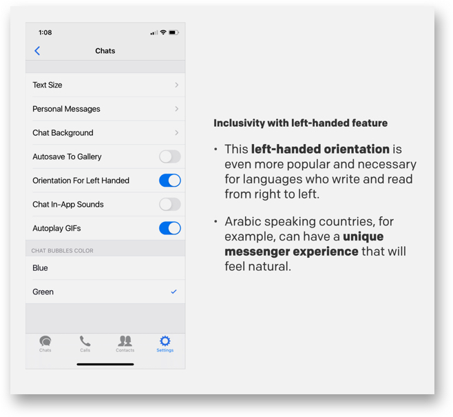
While Accessibility focuses on sections of the population with a defined disability, it is possible that some sections of users may be left out in the process, like users with language barriers. Inclusive designs take into account such constraints that users might have. For example, the Zangi messaging app allows for left-hand orientation to ensure their app is easy to use for people who read and write from right to left.
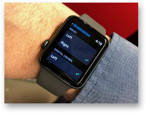
Another such example is the Apple Watch which gives left-handed users an option to choose the wrist they will wear the watch to check if the crown should be facing to the left or right. The screen then orients accordingly and all users have to do is swap the two halves to the band so they can buckle it correctly.
While creating Inclusive designs, designers actively seek out diverse situations and aim to address them. Therefore, we can say that Accessibility and Inclusion work hand in hand to create products and solutions that are usable and accessible by everyone.
“Accessibility is an outcome. Inclusive design is a process to create a masterpiece.” – Derek Featherstone, CXO of Level Access.
How to design digital products for Accessibility
The Web Accessibility Initiative’s definition of Accessibility talks about addressing the issues of user experience for people with special abilities. When creating a new product, companies often identify and design for their target markets. However, human-centered design can help businesses consider a much diverse and larger group of users, and thus a larger target market.
“The longer an organization waits to incorporate accessibility, the greater the chance that the product will be inaccessible (or expensive and time-consuming to retrofit). When the product team considers accessibility from the start, they can iterate, test, learn, and end up with a stronger product.”, stated a recent 2020 Digital Accessibility Report by Level Access.
Role of Design Thinking and User Empathy while designing for accessibility
Empathy is one of the core attributes for creating human-centric digital experiences. In her book, Accessibility For Everyone, Laura Kalbag, writes that in order to improve the user experience, designers must focus on the concept of usability from four broad parameters:
- Visual: make it easy to see
- Auditory: make it easy to hear
- Motor: make it easy to interact with
- Cognitive: make it easy to understand
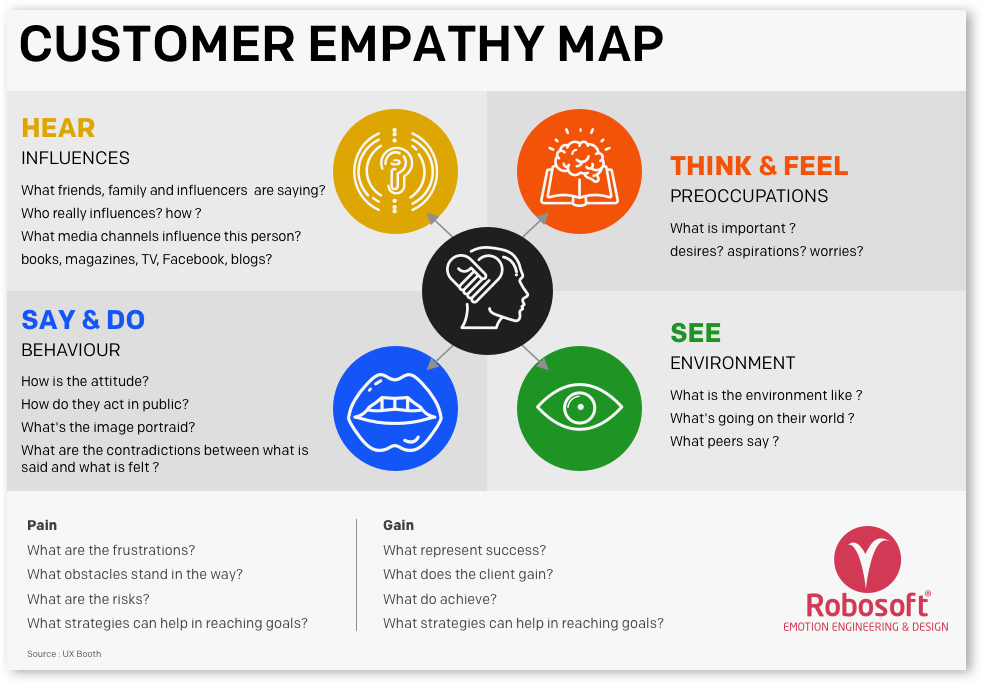
While designing for Accessibility, it is important to know user behavior from all the above perspectives. Creating Empathy Maps, which is a critical step of the Design Thinking process, can be a useful tool to achieve this. For teams involved in the design and engineering of products, services or experiences, an empathy mapping session is a great exercise for groups to “get inside the heads” of users.
Learning about the target group at an empathetic level opens up the opportunity to understand their intent while using a digital product and how they are feeling while trying to accomplish it. This allows product and design teams to get empathetic insights which can help them build a product, service, or experience that enables accessibility as well as inclusiveness.
“The aim of empathic design studies is not to seek solutions for recognized problems, but rather to look for design opportunities as well as develop a holistic understanding of the users. Design empathy is not only information and facts, but also inspiration and food for ideas.” — Tuuli Mattelmäki, Finnish industrial designer, researcher & lecturer.
Designing for Accessibility: best practices
Below are some of the key factors that can be considered while designing for Accessibility. These factors bucketed as per the following attributes:
- Usability and heuristics
- Design and interaction
- Content and Communication
Usability and heuristics
Navigation bar on your website: A simple and straight-forward navigation bar can make it easier for a visitor to navigate through a website. For visually impaired users, it is important to include a voice feature to simplify the navigation process.
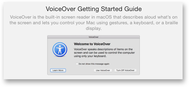
The latest Apple devices have VoiceOver – an assistive screen reader that allows impaired or disabled users to easily navigate their devices.
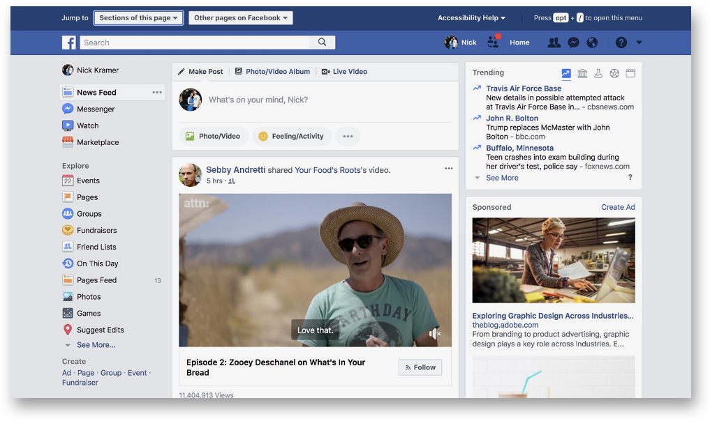
A look at Facebook’s Accessibility menu that slides in from the top of the page
Usability and readability of links: Most browsers render links in blue text with an underline by default. The contrast between link text and regular text is the key factor for spotting the hyperlinked words or sentences. Most people with color blindness cannot distinguish between colors but can see the underlined text. For improving Accessibility, adding an underline for the hyperlinked text is critical, like done on the GDS website within the body of the articles.
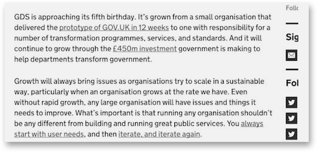
Image source
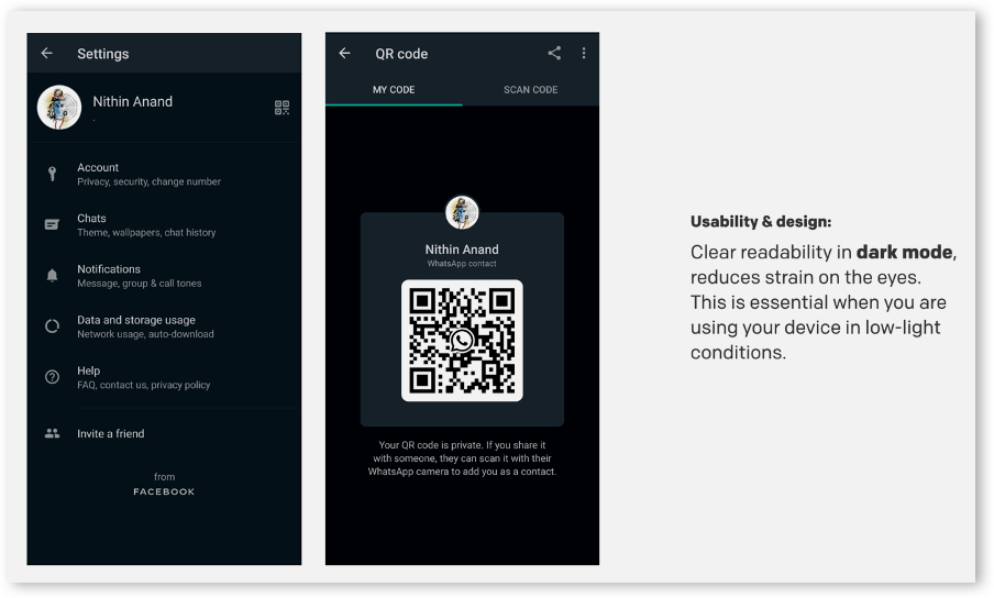
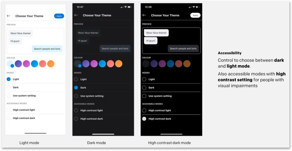
Similarly, adding a dark mode feature can also help in improving readability.
Design and interaction
The WCAG documents explain how to make web content more accessible to people with disabilities. Some of these guidelines include considerations like:
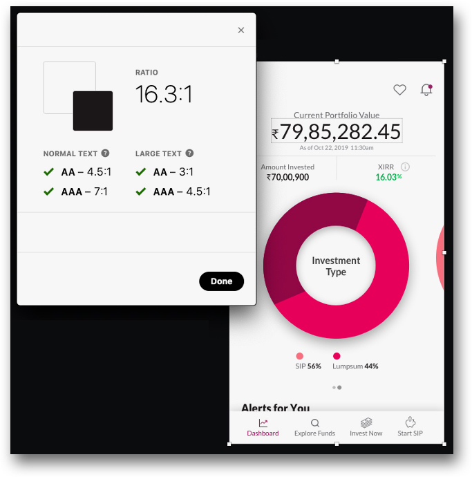
- Provide sufficient contrast between foreground and background
- Avoid using colors alone to convey information
- Ensure that interactive elements are easy to identify, and more
Color contrast between foreground and background: This dashboard of the Invision app, which shows the status of invoices, indicates which ones have been successfully issued, and also displays any cancellations or errors, using color contrasts. The dashboard also features readable typography with large font sizes and high-contrast colors. The icons help to distinguish content for users with cognitive issues.
Image source
Control over contrast ratio on Skype
Ensure that all images are marked with alternative text: Adding ALT text to your HTML code allows visually impaired people using screen readers to understand what the images represent.
Here is the ALT text displayed in the code editor:

Image source
Carousels and animation elements: When using carousels and animation across your web platform, it is imperative to let users take control over the next slide advances. For instance, the below slider template highlights highly visual content, features dot navigation, and is touch-friendly on mobile devices.
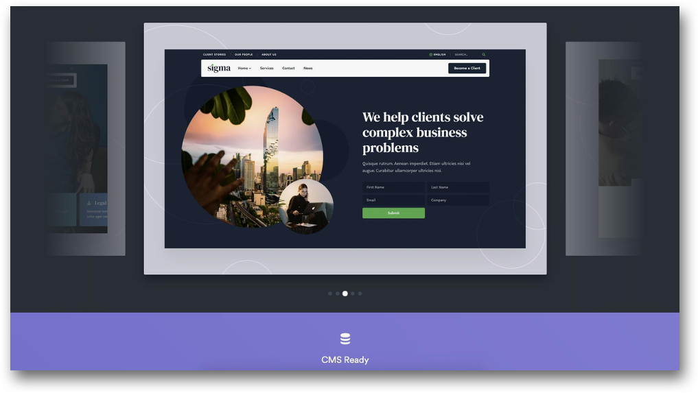
Image source
Choice of colors in design: Colors play an important role in impacting the design accessibility of a digital product. The popular game Among Us relies on color encoding as a primary identifier for players. The game revolves around identifying an ‘imposter’ in the group. Colors remain the primary identifier for players for this purpose, as players commonly use names such as ‘I’, ‘No one’, ‘Someone’ or simply colors to name themselves, like a player with a green avatar sets their name as ‘Red’. However, the process as shown in this video becomes extremely chaotic when players just use their pronouns as their avatar names. In such a scenario, any form of color blindness can impact players’ performance during the game. This case study showcases how the game could be recreated using various color schemes to include people with color blindness. The solution could be as simple as using additional identifiers for players, like ColorADD color identification system which uses symbols to represent different colors or displaying the name of the color right next to the avatar name.
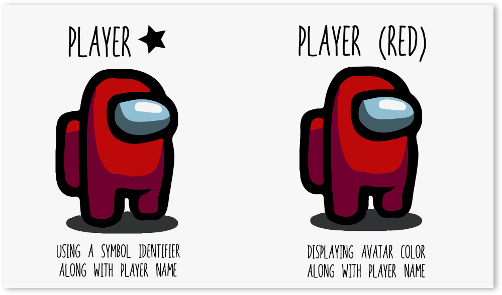
Displaying the name of the avatar’s color in brackets similar to how the name of the player is displayed
Image source
For designers, there are multiple resources that one can make use of for creating a color scheme that is more accessible. Some such tools include Adobe Illustrator’s Color-Blind Proof Setup and sites like ColorBrewer that can help them select a colorblind-friendly color scheme.
Content & Communication
Font size: With mobile devices, readers often use the pinch gesture to zoom into text, making it bigger and easier to read on smaller screens. However, developers often disable zoom to gain greater control over the page layout resulting in an irritatingly common accessibility problem. As a best practice, the recommended font size should be equivalent to 16 pixels or larger, depending on the font type. Certain apps also allow users to change the font size basis their preference. One such example is the Kindle app across devices that allows to customize font size basis reader’s preference.
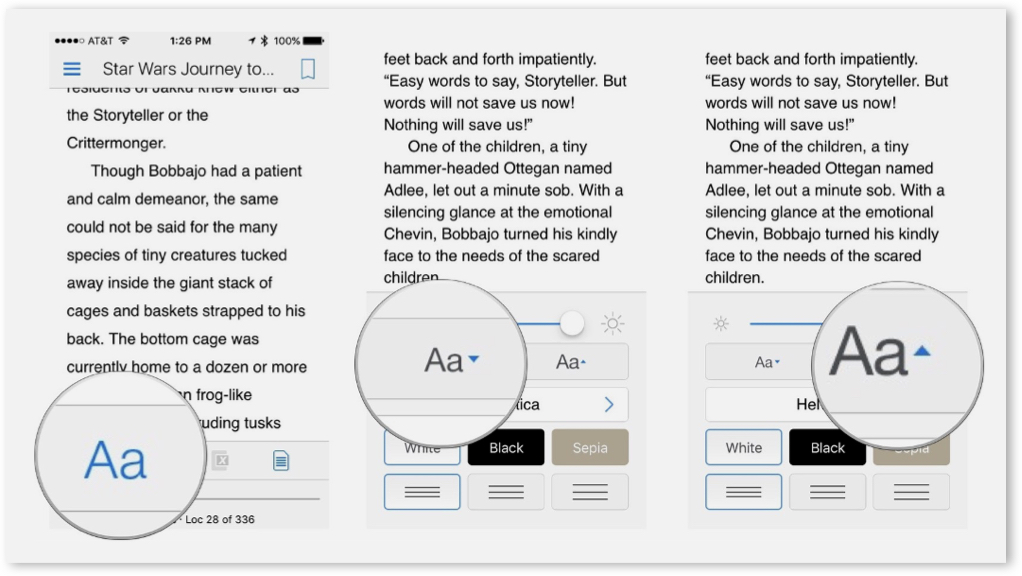
Font customization on the Kindle App
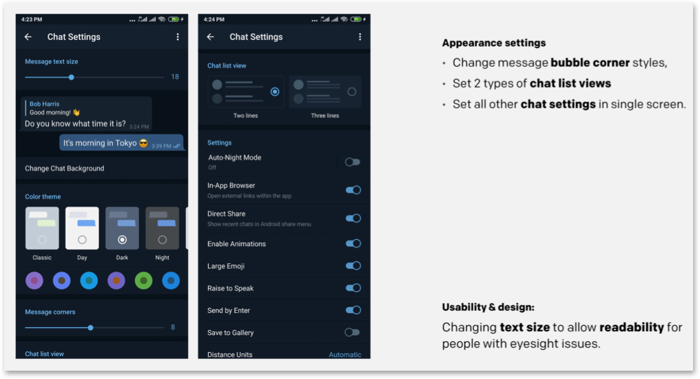
Telegram allows to change text size for better readability
Font customization on Axis EasyConnect App
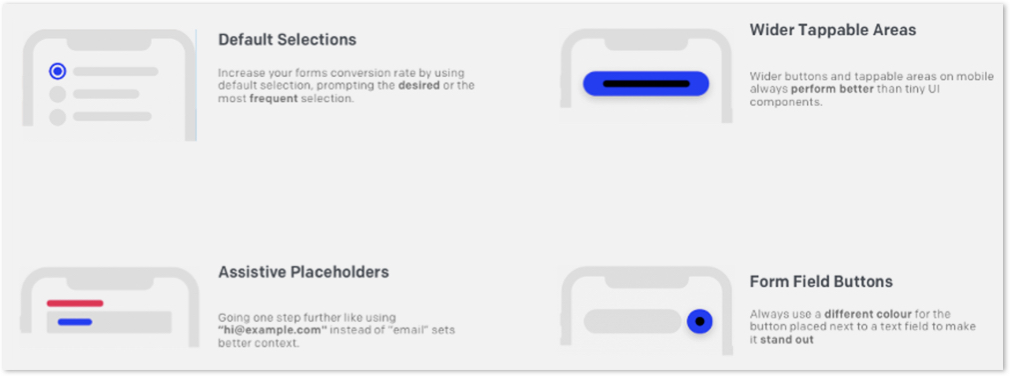
Using forms and other data capturing methods: Forms are enabled on a website for a user to communicate with a site. But even filling out the shortest form can be taxing for people at times. A common error that people tend to make while filling forms can be in the date formats.
Formatting the content of an input field should not be a burden for the user. To make such tasks easy for the user, designers and developers should ensure that the user’s input is converted into the necessary format by default.
In conclusion:
Designing user experiences often involves making assumptions about users’ preferences. While we should question those assumptions and use research to better inform ourselves about user preferences, sometimes just providing, an alternative way, can make a huge difference.
In this ongoing process, the importance of usability, accessibility, and inclusion cannot be understated – especially now, when there is so much reliance on the digital medium to complete daily activities. The process of designing for accessibility should be included in the initial stages itself and shouldn’t be an afterthought. Shifting accessibility testing in the development stage to gather real-time feedback from people and carrying out design research will help to achieve this goal.
Accessibility and Inclusivity are two pillars of creating human-centered design for a wide range of users. Microsoft’s Inclusive Design Principles define Inclusive Design as – a methodology, born out of digital environments, that enables and draws on the full range of human diversity. Most importantly, this means including and learning from people with a range of perspectives.
Diversity is Being invited to the party; Inclusion is being asked to dance — Vernã Myers
In an upcoming post, we will cover Inclusive design in-depth and with some interesting examples.
While creating digital experiences from an Inclusive design perspective the saying ‘the more the merrier’ fits just right. The larger and diverse the group of users considered while designing, the better it is for both – users and enterprises.


