Author Archives: Parth Khandekar

Parth Khandekar
Parth is our Senior Analyst in Design Strategy at Robosoft Technologies. A problem solver at the core, he believes in the “Hold the vision, trust the process” mantra when it comes to innovating new ideas. With a propensity to connect with the users, he crafts blissful experiences by conceptualizing effective and efficient products. At Robosoft, he has worked on designing products & strategies for global brands in industries such as automotive, finance, mobility, OTT, gaming, and more.
AR/VR Design Design Thinking iOS Technology

Designing for Vision Pro: the coming spatial experience

As the real and virtual worlds continue to converge, Apple has introduced Vision Pro, a device designed to deliver immersive mixed-reality experiences. Vision Pro enables endless possibilities for exploring human-to-system interactions and spatial dynamics. Users can interact with the digital world more naturally using the mixed-reality headset. It overlaps digital content in the real world, allowing users to simultaneously see and interact with both worlds. Vision Pro is slated for limited release to the public next year, but Apple has already given a demo to select developers.

Vision Pro features two high-resolution micro-OLED displays that project images directly onto the user’s retinas, creating a “screenless” (screen without a screen) experience. The headset has 12 built-in cameras for tracking the user’s head, eyes, and hands, a LiDAR scanner for depth perception, and an Apple M2 chip with 10 CPU and 32 GPU cores.

Vision Pro is designed with accessibility at the center, using gestures, voice, and combinations of these input modes as critical enablers. This was showcased in the launch event video, where users could interact with the headset using gestures to browse the web, watch movies, and play games. Designing for Vision Pro requires understanding these input modes and providing solutions for users to have a seamless journey.
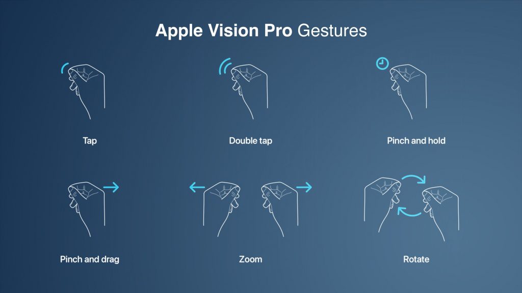
Apple Vision Pro Gestures Feature

Source: MacRumors Apple Vision Pro Gestures

Designing for a spatial experience

Design principles for traditional screens may not work for the future of spatial experiences, which are more immersive and interactive. Designers need to adapt these principles to consider the unique features of spatial experiences. Spatial experiences allow users to interact with the environment more naturally, so designers must create interfaces that are easy to use and understand.

Vision Pro’s spatial capabilities allow designers to create visually captivating and user-friendly interfaces that feel intuitive and natural to navigate. This focus on user-centric design enhances the user experience across various applications. Below are some key aspects to consider while designing for glass-style UI:

Iconography

To create a seamless user experience, Apple has reimagined the feedback mechanism for icons on the home screen. When a user looks at an icon, it expands as if it is being hovered over. Designers design icons with subtle depth by adding specular shadows and highlights.

To design a great icon, start by creating multiple layers. The system uses these flat layers to create a three-dimensional effect. The icon should be converted to 1024×1024 pixels, with transparent foreground layers. Do not use large regions of semi-transparent pixels, as they will blend with the shadow behind them.

Consider these additional recommendations when designing icons:

  • Maintain a uniform color scheme and style throughout your icons.
  • Make sure your icons are clear and easy to understand.
  • Use high-quality images and graphics.
  • Test your icons on different devices and screen sizes to ensure they look good everywhere.

apple vision pro icons for spatial immersive experiences

Source: App icons | Apple Developer Documentation

Glass panels design

Apple has introduced glass material to create a more spatial and lightweight user experience. This material allows users to see what is behind a window, such as other apps or people, without feeling suffocated.

Therefore, when designing an app window, it is essential to avoid using solid colors. Too many opaque windows can make the interface feel heavy. Instead, use a lighter material to bring attention to interactive elements, such as buttons, or a darker material to separate sections of the app.

For example, if you want to design a lock-up with a lighter button, you can place it on top of the glass material. Or, if you’re going to create more contrast, you can use a darker cell behind the button. However, it is crucial to avoid stacking lighter materials on top of each other, as this can impact legibility and reduce contrast.

Consider these bonus tips for designing with glass material:

  • Use glass material sparingly. Too much of it can make the interface feel cluttered.
  • Use glass material to create a sense of depth. For example, you can use a darker glass material for the background and a lighter glass material for the foreground.
  • Use glass material to highlight essential elements. For example, you can use a lighter glass material for buttons or other interactive elements.

apple vision pro glass material design for spatial immersive experiences

Source: Materials | Apple Developer Documentation

Legibility

Typography

The font-weight can be slightly increased to improve text contrast against vibrant materials. For example, on iOS, regular weight for the body text style must be used; on this platform, a medium can be used. And for titles, instead of semi-bold, bold can be used. This makes the text more legible, even when displayed on a vibrant background. System fonts, which are designed for optimized legibility, can also be used.

Vibrancy

Vibrancy is another crucial detail for maintaining legibility. It enhances the foreground content by bringing light and color from the background forward. On this platform, vibrancy updates in real-time to ensure your text is always legible, even when the background constantly changes. Vibrancy can indicate hierarchy for text, symbols, and fills. Primary vibrancy can be used for standard text, and secondary vibrancy can be used for less critical text.

Pointers for using typography and vibrancy:

  • Use a heavier font weight for text that needs to be legible, such as body text and titles.
  • Use system fonts or other fonts that are designed for optimized legibility.
  • Use vibrancy to brighten foreground content and make it stand out from the background.
  • Use primary vibrancy for standard text and secondary vibrancy for less critical text.
  • When using custom fonts, make sure they are designed for readability.
  • Avoid using small or lightweight fonts, which can be challenging to read, especially on large screens.
  • Consider using a darker shade for the pop-over background to make the text more legible.
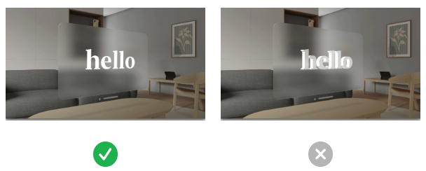
apple vision pro legibility typography vibrancy for spatial immersive experiences

Source: Typography | Apple Developer Documentation

Colors

When designing a glass-style UI, use white text and icons on a colored background. This will make the text and icons stand out and be more legible.

  • Use system colors whenever possible. System colors are designed for legibility and look best on a glass background.
  • If you need a custom color, use it sparingly and make sure it contrasts nicely with the background.
  • Avoid using dark colors for text or icons. Dark colors will blend in with the background, making the text and icons challenging to read.

Here are some additional tips for designing glass-style UIs:

  • Use a light overall color palette. This will help to create a sense of spaciousness and airiness.
  • Use transparency and blur effects to create a sense of depth.
  • Use shadows to add dimension to the UI.
  • Use gradients to add interest and visual interest.
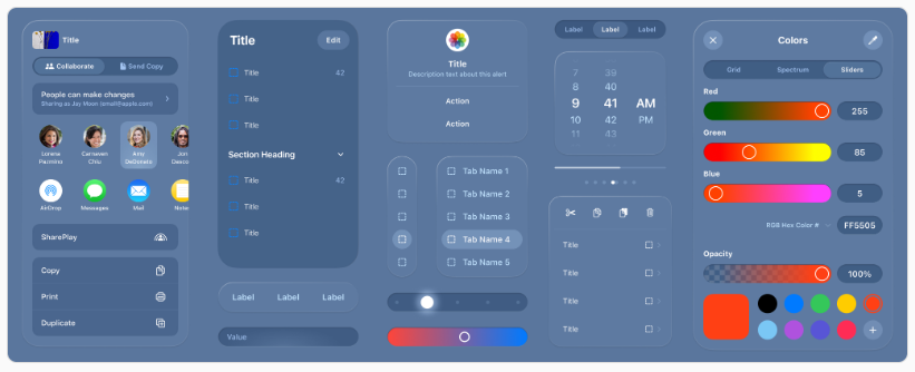
apple vision pro colors design for spatial immersive experiences

Source: VisionOS – Apple Developer

How Vision Pro can transform businesses

Businesses of all sizes and across some industries are excited about the potential of Apple Vision Pro, which is still in its early stages of development. The technology has the potential to transform operations, improve customer experiences, and boost overall performance. Still, which industries will most successfully adopt it remains to be seen.

Entertainment

  • Create immersive gaming experiences that blur the line between the virtual and real worlds. To illustrate, game developers can use Apple Vision Pro to create realistic first-person shooter games where players can interact with the environment lifelike.
  • Create interactive storytelling experiences. Filmmakers can use Apple Vision Pro to create 3D movies, transporting viewers into breathtaking cinematic worlds.
  • Provide real-time translation of foreign language text. For example, language learners can use Apple Vision Pro to get a real-time translation of foreign language text while traveling or interacting with people from other cultures.
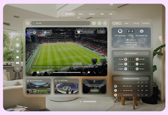
apple vision pro application for spatial immersive experiences for entertainment and sports

Source: How will Apple Vision Pro VR influence industries | Merge Development

Education and training

  • Provide students with interactive learning experiences. For instance, teachers can use Apple Vision Pro to take students on virtual field trips to historical sites or to conduct experiments in a safe and controlled environment.
  • Offer virtual field trips. For example, students can use Apple Vision Pro to visit museums or other educational institutions without leaving their homes.
  • Provide real-time translation of foreign language text. Concretely, language learners can use Apple Vision Pro to get the real-time translation of foreign language text while taking a class or reading a book.

Healthcare and medical

  • Provide realistic surgical simulations and training scenarios. In other words, doctors and medical students can use Apple Vision Pro to practice procedures without risking harming a patient.
  • Offer remote consultations with patients. For example, doctors can use Apple Vision Pro to consult with patients in remote areas.
  • Visualize and analyze medical data. For instance, researchers can use Apple Vision Pro to visualize and analyze medical images and data to understand diseases better and develop new treatments.
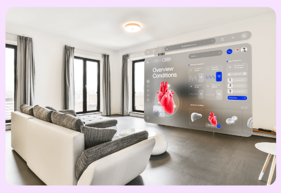
apple vision pro application for spatial immersive experiences in healthcare medical industry

Source: How will Apple Vision Pro VR influence industries | Merge Development

Real estate and architecture

  • Give potential buyers virtual tours of properties. Real estate agents can use Apple Vision Pro to give potential buyers a 360-degree view of a property without meeting them in person.
  • Collaborate with clients and stakeholders on 3D design projects. Architects can use Apple Vision Pro to collaborate with clients and stakeholders on 3D design projects in real time.
  • Visualize furniture and decor in a physical space. For example, interior designers can use Apple Vision Pro to visualize how furniture and decor will look in a room before making a purchase.

Meetings

  • Join virtual meetings from anywhere. For instance, remote workers can use Apple Vision Pro to join virtual discussions from anywhere.
  • Collaborate in real-time and share information. For example, participants in virtual meetings can use Apple Vision Pro to collaborate in real time and share information.
  • Track customer behavior and improve the shopping experience. Concretely, businesses can use Apple Vision Pro to track customer behavior in a retail store and use that data to enhance the shopping experience.

apple vision pro application for spatial immersive experiences in workspace education and meetings

Source: Apple’s Vision Pro: Revolutionizing Industries Through Spatial Computing| ELEKS

Finance and banking

  • Visualize financial data. For example, financial analysts can use Apple Vision Pro to visualize financial data to understand the market better and make informed investment decisions.
  • Help clients track their spending. For example, personal finance managers can use Apple Vision Pro to help clients track their spending and reach their financial goals.
  • Visit virtual bank branches. Concretely, customers can use Apple Vision Pro to visit virtual bank branches to conduct transactions or speak to a banker.

Retail and e-commerce

  • Try on clothes and accessories before making a purchase. To illustrate, shoppers can use Apple Vision Pro to try on clothes and accessories before purchasing.
  • Provide personalized shopping recommendations. Retailers can use Apple Vision Pro to provide personalized shopping recommendations based on a shopper’s past purchases and browsing history.
  • Offer in-store navigation. For instance, businesses can use Apple Vision Pro to offer in-store navigation to help customers find the products they are looking for.
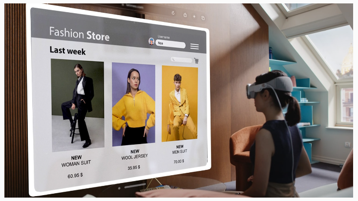
apple vision pro application for spatial immersive experiences in retail ecommerce fashion

Source: Apple Vision Pro and The Future of ECommerce (codilar.com)

Vision Pro: the flip side

Innovation can be exciting, promising a brighter future with endless possibilities. However, carefully considering the potential consequences of new technologies is essential. While innovation often brings benefits, it can also come with risks, such as privacy concerns, surveillance risks, and impacts on mental health and social isolation. Balancing progress with responsibility when developing and using new technologies is essential.

Comfort and ergonomics

Early reports suggest that the Vision Pro is well-built but slightly uncomfortable to wear for extended periods. The headset is front-heavy due to its metal construction, which could make it difficult to wear for long periods. Additionally, the headset’s weight distribution and heat management could further impact user comfort. If the Vision Pro is not designed to be comfortable, it may limit its appeal to consumers and businesses.

Privacy at stake

The Vision Pro raises fundamental concerns about personal privacy. The headset’s ability to project floating screens onto our vision while observing our environment could collect vast data about us. This data could include our eye movements, facial expressions, and surroundings. The potential for this data to be used to track our movements, monitor our behavior, and even identify us is a serious privacy concern. Establishing robust safeguards and ethical boundaries is essential to protect individuals’ privacy in the digital age.

Mental health and social isolation

While technological advancements can enhance our lives, we must also consider their potential impact on mental well-being and social dynamics. The Vision Pro’s immersive AR experience could be a double-edged sword. On the one hand, it offers captivating virtual overlays of reality that could tempt users to immerse themselves in a captivating digital realm. On the other hand, this allure could come at the risk of isolating individuals from their physical surroundings and authentic human connections. As we increasingly detach from the present moment and substitute genuine interactions with virtual experiences, the potential for social isolation and its associated mental health consequences is serious.
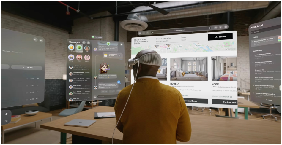
apple vision pro designing for spatial immersive experiences

Source: Apple Developer Forums

Apple’s Vision Pro hasn’t even been released yet, but the company is already planning a smaller and lighter version of the headset and is deep into work on follow-up products.

Conclusion

Apple Vision Pro can redefine how we interact with technology in a human-centric way. Its spatial capabilities allow designers to create visually appealing, user-friendly interfaces that feel natural. This focus on human-centric design will enhance and transform businesses of all sizes and industries by enabling immersive, interactive, and personalized experiences in various applications, from gaming and entertainment to education and training. While Vision Pro can be a powerful tool for good, it is essential to remember that it is also a new technology with potential risks. Our collective responsibility is to ensure that Vision Pro is used responsibly in a human-centric way.

Read More
Uncategorized

Test

HRTech Trends in Talent Management

Test

Read More
Retail

Streamlining the Checkout Process: Best Practices for eCommerce Success

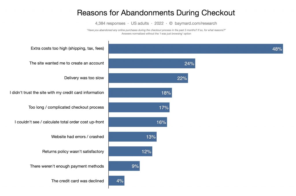
When shopping online, reaching the checkout page or app screen is not a guarantee of a sale. Consumers give up on the purchase intent for various reasons. According to a report, in 2022, only 3 out of 10 customers who add items to their cart complete the purchase. A well-designed checkout page and seamless payment method can lead to satisfied customers, while a poorly executed process can result in frustration and a loss of revenue. This highlights the importance of optimizing the checkout experience to ensure customer satisfaction and boost business outcomes.

What is checkout abandonment and what are the reasons for it?

Crafting an ideal eCommerce checkout experience is a critical element in enhancing customer satisfaction and driving sales conversion rates. Checkout abandonment occurs when customers exit the payment process before completing the transaction, and the reasons for this behavior can vary depending on the industry, target audience, and individual customer preferences.

Every abandoned checkout represents lost revenue for the business, as resources have been allocated toward marketing, operations, and development efforts to bring the customer to this stage of the purchasing process. To optimize outcomes, it is recommended to prioritize minimizing checkout abandonment rates, as it can have a significant impact on the overall financial performance of the business.

Abandonment reasons during eCommerce checkout

Source: Baymard Institue: Cart & Checkout Usability Research

Best practices for streamlining the checkout process in eCommerce platforms

#1 Keep the checkout process simple

Although it may seem obvious, it is crucial to avoid causing frustration for visitors during checkout as it could deter them from completing their purchase.

To minimize distractions during checkout, removing the header and footer may be a helpful consideration as they may draw the user’s attention away from important buttons and options. It is imperative to eliminate any possible obstacles such as lengthy forms with excess fields and mandatory account creation or sign-up during the checkout process to ensure a smooth and user-friendly experience. Some ways to ensure a simple and seamless user experience are:

a. Single-page checkout

With all the necessary steps displayed on a single page, users can complete the checkout process with minimal navigation. Furthermore, a single-page checkout can provide users with the ability to select custom delivery options and shipping methods. This helps to enhance the user experience by giving them more control over the delivery process. Incorporating a progress indicator in the checkout process will help users to track their progress and understand the mini-milestones they have accomplished, which can help to simplify the process and reduce confusion.

b. Smart form filling

This can be achieved through the use of various tools such as shipping address predictors, autofill options like Google Autofill, and form field validation with error notifications. To streamline the process further, consider adding a radio button or small checkbox that allows users to select the same billing address as the shipping address. These tools make form-filling quick, efficient, and error-free.

c. Guest Checkout

Many customers prefer to make a purchase quickly without the hassle of signing up or creating an account. Forcing them to do so can become a source of friction and lead to abandoned carts. By allowing users to checkout as a guest and enter only the minimum required information, they can proceed directly to payment and complete their purchase without delay.

Robosoft Tanishq case study

#2 Localized checkout experience

When running an eCommerce website that caters to customers across various nations, it is essential to consider implementing a localized checkout experience. This approach increases the likelihood of converting potential customers by eliminating any barriers that they might encounter while navigating the checkout process. Here’s how you can do so:

a. Support for multiple currencies and payment gateways

To provide a seamless and personalized checkout experience for users of an eCommerce website operating across multiple countries, it is essential to consider implementing features such as support for multiple currencies and payment gateways. Instead of relying on currency conversion options, users should be allowed to select their preferred currency to avoid additional costs and potential friction.

b. Adhere to global tax guidelines

It is important to adhere to global tax guidelines, as tax requirements vary depending on the user’s location. By dynamically calculating international taxes based on the user’s location, the checkout process can be made more streamlined and frictionless.

c. Multi-language support

Supporting multiple languages can also greatly enhance the localized experience of the checkout process. Multilingual checkout options can remove the language barrier for online shoppers who may not be comfortable with English, contributing to a more seamless and pleasant overall experience.

#3 Entice a leaving customer to proceed to checkout

To improve online conversion rates, it’s important to take all possible steps to guide customers toward the checkout process.

a. Upsell your bestsellers

Upsells are a good way to incentivize customers to buy more items, but it’s important to strike a balance and avoid overwhelming users with too many options. Limited-time offers and checkbox buttons can make it easy for customers to add additional items to their cart. Suggested items should include a mix of subscription-based and one-time purchase options.

b. Offer discounts and personalized recommendations

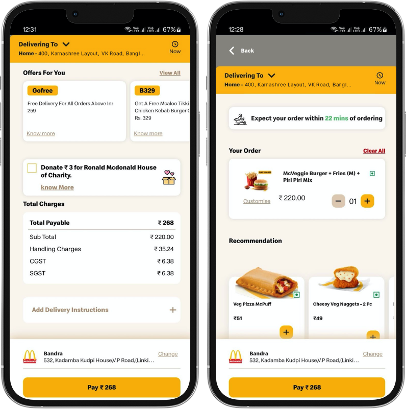
Exit intent pop-ups can be used to offer discounts, provide compelling copy, and present limited-time promo codes to entice customers back to the checkout process. If customers still choose to leave, offering an option to sign up for updates or newsletters can help maintain a connection and encourage future purchases.

Robosoft McDelivery discounts and offers screen

#4 Build trust and assurance

Building trust and assuring customers is essential for any business to succeed. During the checkout process, customers may have concerns about the product, support, or transaction security. To address these concerns, businesses can take several steps to assure customers.

a. Provide social proof

One effective approach is to incorporate customer testimonials or case studies with positive reviews on the website. This can help reassure customers about the quality of the product and reduce the risk of abandoned carts. By showcasing the real-life experiences of other satisfied customers, businesses can instill confidence in their potential buyers.

b. Easy access to customer support

Providing a live chat option or a support phone number during the checkout process can be a great way to offer assistance and address any concerns. Customers can get immediate help with their questions, and this can help to prevent them from abandoning their carts.

#5 Make checkout convenient and flexible

Streamlining the purchase process and providing customers with more options and flexibility are some effective ways to customer retention.

a. Multiple payment options

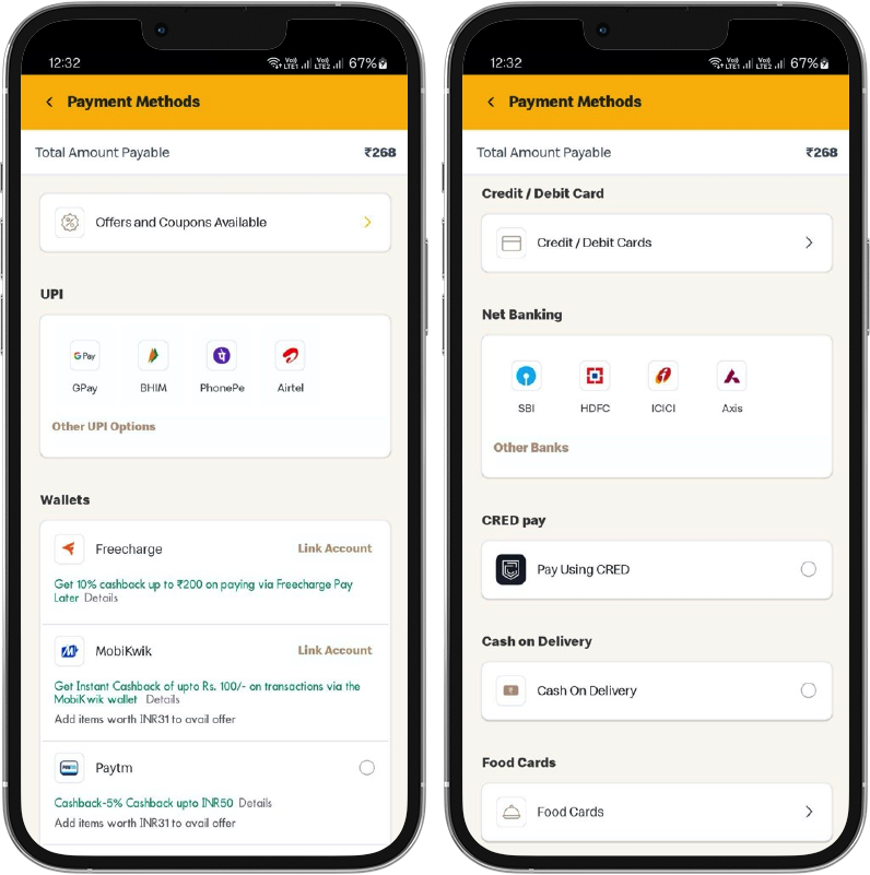
A common reason for cart abandonment is the unavailability of preferred payment methods, which vary across different countries. In some regions, credit cards are widely used, while in others, consumers may feel more secure using alternative methods such as Digital wallets like Paytm, Amazon Pay, or Apple Pay. By offering multiple payment options, you can enhance the customer experience and encourage them to complete their purchase.

Robosoft McDelivery multiple payment options screen

b. Ensure mobile-friendliness

With mobile eCommerce sales on the rise, it is imperative to optimize the checkout process for mobile devices. According to Insider Intelligence, in 2023, mobile eCommerce sales are expected to account for 43.4% of total retail eCommerce sales, up from 41.8% in 2022. Neglecting to optimize your eCommerce checkout for mobile devices could result in missed opportunities for sales. Therefore, it is important to ensure that the mobile checkout process is just as seamless as the desktop and to test the effectiveness of the call-to-action buttons.

c. Providing convenient purchase options

Providing customers with both one-time purchase and subscription checkout options can offer flexibility and cater to different customer preferences. Offering subscriptions can also help to increase customer loyalty and retention. Therefore, it is recommended that eCommerce businesses consider providing both one-time purchase and subscription checkout options to enhance the customer experience.

#6 Be attentive to security and privacy

Ensuring security and privacy in online shopping is a crucial factor that demands attention. Customers often prioritize the perceived security of their transactions while shopping online. Additionally, displaying security certifications and trust seals at checkout instills confidence in concerned customers.

a. Meet security guidelines

It is recommended to obtain a Secure Sockets Layer (SSL) certificate for the eCommerce website, which establishes a secure connection and encrypts credit card information. Adherence to the Payment Card Industry Data Security Standard (PCI DSS) is also vital to safeguard card information and ensure secure payments.

b. Compliance with data privacy regulations

California Consumer Privacy Act (CCPA) and the General Data Privacy Regulation (GDPR) adherence is necessary when storing sensitive information collected from customers, such as phone numbers, credit card information, shipping address, and email address. Additionally, following Multifactor Authentication (MFA) standards provides added security beyond the traditional username and password login.

#7 Keep experimenting to find your fit

As an eCommerce merchant, it’s important to remember that there’s no one-size-fits-all approach to designing the perfect checkout experience for your customers. Prioritizing the design of your checkout and engaging in continuous experimentation is key. Regular testing and analysis can help identify areas that need improvement, ranging from CTA placement to image reorganization within the checkout design.

a. Consider A/B testing to find the fit

This involves creating two versions of a checkout page and testing each version with a group of customers to see which one performs better. By testing different variations of the checkout page, you can identify the elements that work best for your customers and improve the overall checkout experience.

b. Using analytics tools to understand customer behavior at the checkout

This can help identify common pain points and areas that require improvement. For example, if you notice a high cart abandonment rate on a particular page, you can investigate the reasons behind it and make changes to improve the user experience.

Wrapping Up

The process of checking out is undeniably a critical component of the buying journey, and therefore, it is prudent to consistently strive for its optimization, as this effort will yield favorable outcomes in the long term. Enhancing the checkout experience is an extensive and continuous undertaking, and adopting the following best practices can serve as a starting point, allowing room for experimentation to determine what tactics are most effective for your specific circumstances.

Robosoft contact

Read More
Customer Experience Enterprise Applications UX/UI

The role of Information Architecture in creating richer user experiences

In a world where everything that a user needs is just ‘an app away,’ offering delightful User Experiences can be the differentiator for businesses amongst the myriad of options, that consumers might have. The fact that 88% of people are less inclined to return to a site after a bad UX makes it a key factor for businesses to retain customers. A good UX is not just critical for customer engagement and retention but it also drives business value, according to a study by Forrester, every $1 that’s being invested in UX returns $100.

The saying ‘well begun is half done’ is aptly well-suited in this context of creating unique, intuitive, and engaging user experiences that simplify the user’s journey across the platform, and building Information Architecture (IA) is the first step towards achieving this goal.

An IA is a blueprint that guides your team while designing the UX for any digital platform. It is in fact one of the most valuable and necessary aspects while embarking on the journey of creating digital solutions. It is a collaborative task often shared between the design, development and engineering teams.

In this article, we will learn about information architecture and how it functions as a backbone while crafting user experiences for your products.

What is an information architecture (IA)?

Information architecture can be defined as a method of organizing, structuring, and labeling the content of a website, web or mobile applications.

The ultimate goal of an IA is to establish an easy and logical decision-making process for the end users of designed product.

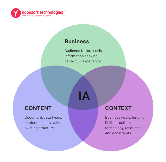
Elements of IA

Date source – 3 Elements of IA

The art and science of creating Information Architecture

Information architecture has roots in both library science and cognitive psychology.  Let us take a moment to understand these terms individually.

Library science

Libraries have always been associated with the practice of information science. Library science is the study of how to categorize and catalog information resources. The two defining traits of library science are:

  1. Categorizing – defining things by similarity
  1. Cataloging – creating metadata and assigning it to content in order to find it again in the future

Cognitive psychology

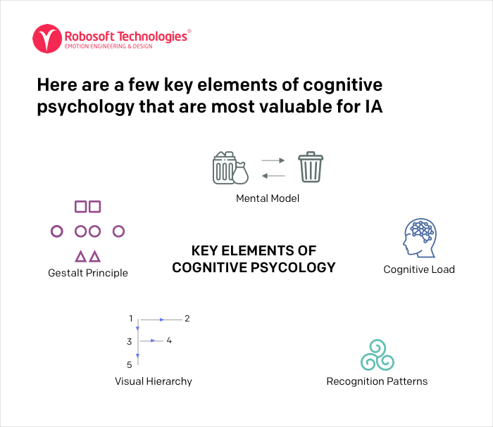
Cognitive psychology is the study of how our minds work —  what mental activities take place in our brain and what different factors influence our attention. Majority of the UI/UX design rules we have today have roots in cognitive psychology. Information Architecture uses some elements of cognitive psychology to define the way information should be structured.

Here are a few key elements of cognitive psychology that are most valuable for IA

key elements of cognitive psychology

Data source – Elements of cognitve psychology

Gestalt principles: Gestalt principles explore users’ visual perception of elements in relation to each other. They show how people tend to unify visual elements into groups according to their similarity, continuity, or closure. It focuses on good figure, proximity, similarity, continuation, closure & symmetry.

Mental models: It is the users’ perception about certain things based on their past experiences. For e.g. it could be expecting the user to close a particular website/app window on clicking the button represented by a cross in the box.

Cognitive load: Cognitive load is the amount of information that a person can process at any given moment.

Recognition patterns: People visiting a website or using a mobile app expect to see certain features associated with a specific product. Designers apply various recognition patterns to make the interaction familiar.

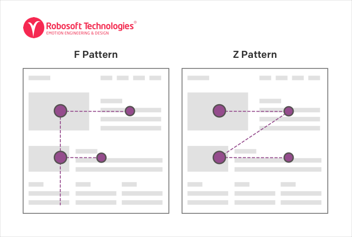
Visual Hierarchy: Visual hierarchy is directly related to content readability. One of the essential points to consider for architects is scanning patterns — before reading a page, people scan it to get a sense of interest. The most common scanning patterns are F and Z patterns.

The most common scanning patterns are F and Z patterns

We derive most important components of the information architecture from the understanding of the library science and the cognitive psychology. Let us understand what these components are and how do they help in shaping up the entire information architecture.

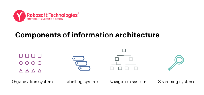
Components of information architecture

Components of information architecture

Components of IA

Information architecture is comprised of 4 components –organization system, labeling system, navigation system and search system

Organization systems Categorization of information, e.g., by subject or chronology.

Labeling systems Representation of information, e.g., scientific terminology (“Acer”) or lay terminology (“maple”).

Navigation systems How users browse or move through information, e.g., clicking through a hierarchy.

Search systems How userssearch for information, e.g., executing a search query against an index.

Types of Navigations in Information architecture

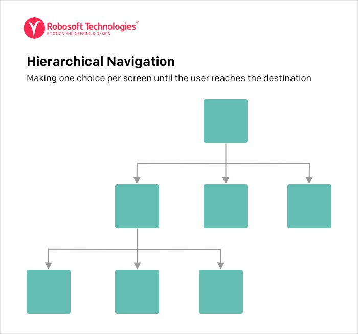
Hierarchical Navigation – Making one choice per screen until the user reaches the destination

Hierarchical Navigation

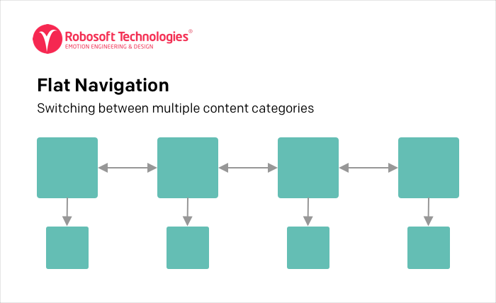
Flat Navigation – Switching between multiple content categories

Flat Navigation

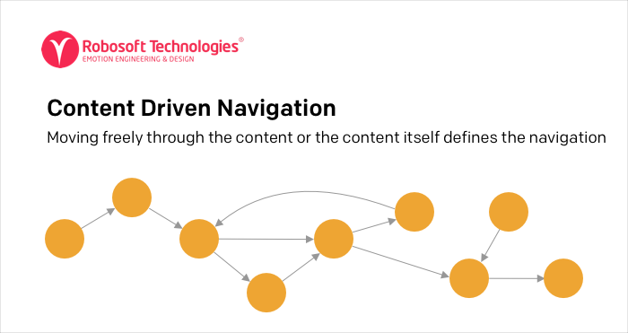
Content Driven Navigation – Moving freely through the content or the content itself defines the navigation

Content Driven Navigation

Now that we have the fair understanding of the Information Architecture, let us look at how to build one.

How to build an Information Architecture

The structure of an IA is based on the requirements of the project and the iterative nature of the design. It may vary from project to project. IA forms a firm base and supports the various design changes that may be done throughout the progress of the project.

Before defining the information architecture, the first step is to develop a supportive document. Based on the acquired business knowledge and the understanding of the users’ pain points. With these points in mind, adocument consisting of information like company goals, user goals, user personas and competitor analysis, etc. is created.

The process of designing an Information Architecture:

To define the information architecture we will follow a 5 step process.

1. Group the content

In this phase, we sort the content and group it under different umbrellas and define the content set.

In case of a redesign project, revisiting the entire structure and determining which information sets to keep and which ones to get rid of in addition to deciding where new content is required is the first step.

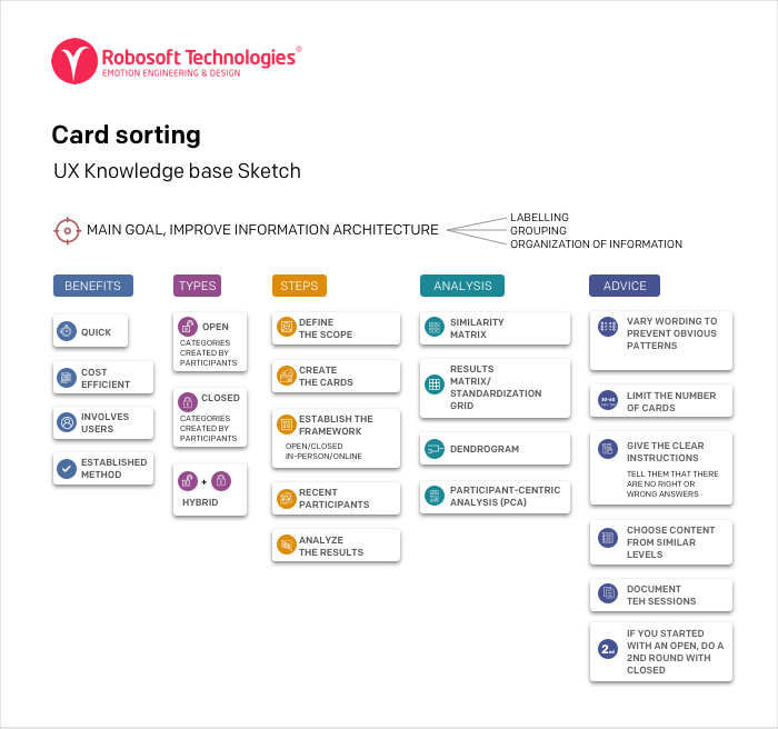
Card sorting is one of the most effective & widely used UX tool for content grouping

Group the content

Data source

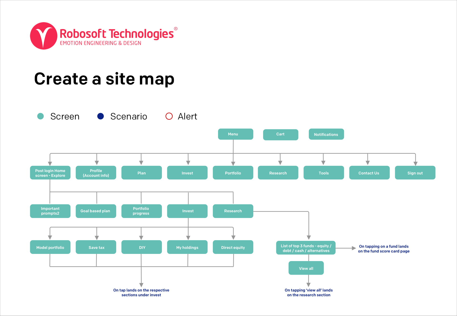
2. Create a site map

High Fidelity App Map for an Investment App

High Fidelity App Map for an Investment App

In this phase, the user goals and the purpose of the digital platform is defined. Post which the user journeys with different sets of tasks are created.

The user journeys helps in understanding the movement of the users on the digital platform and the interlinks between the pages.

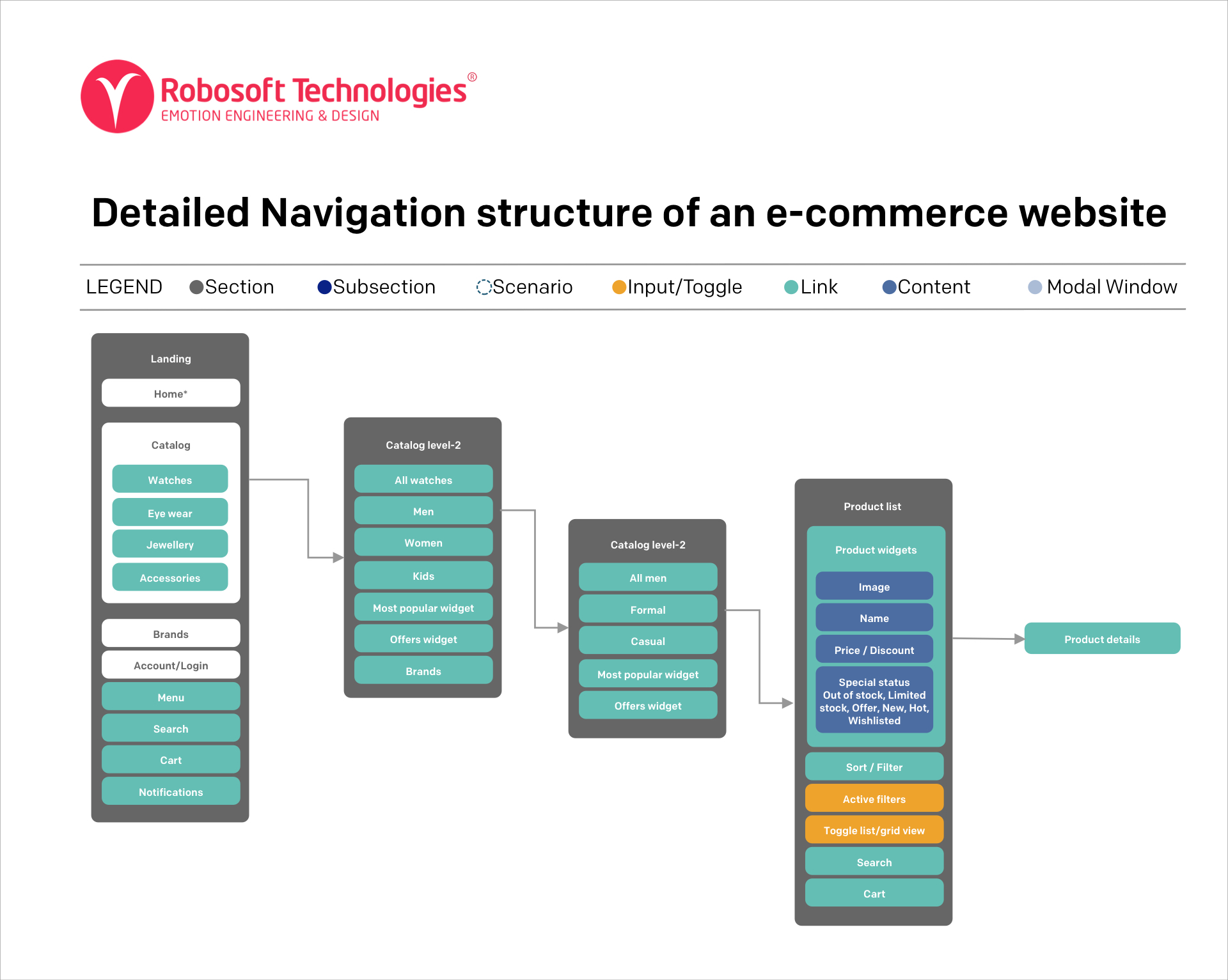
3. Outline the navigation structure

The navigation structure is created based on the business understanding. Any of the navigation types mentioned earlier in the article can be used as a foundation and the entire structure can be built on it.

Detailed Navigation structure of an e-commerce website

Detailed Navigation structure of an e-commerce website

4. Refine content labels

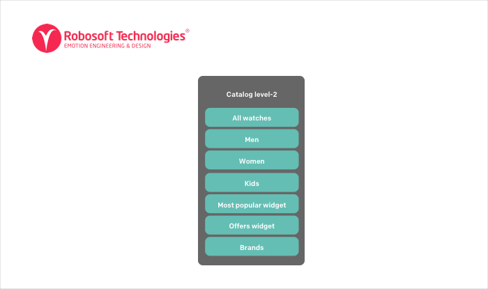
In this stage, the content is labeled according to its purpose. These labels are linked to create the structured categorisation, consisting of sections, sub-sections, links, toggles etc.

Precise and easy to understand content Labels for the catalog level -2 Section of e-commerce app

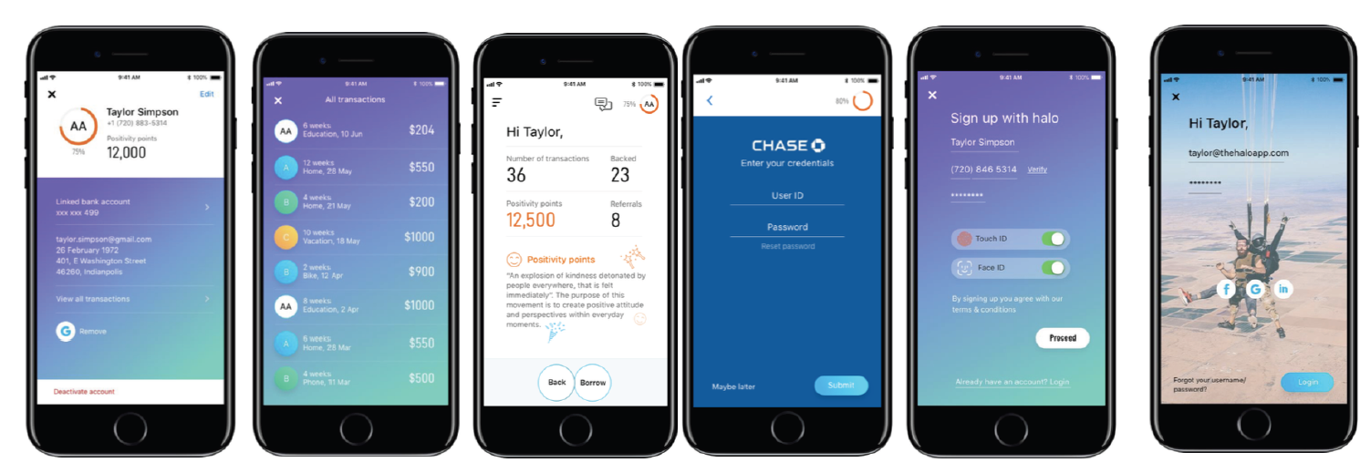
5. Create wireframes and conduct usability test (Writing Scenarios)

Wireframes created for an app to test the journey for the proposed IA

Wireframes created for an app to test the journey for the proposed IA

It is good practice to test out the information architecture early-on in the project and make changes as it progresses. Hence in this stage, user scenarios are written. Post which the wireframes are tested with these scenarios.

This process is critical to help understand user pain points and design failures. We can then iterate the design as required.

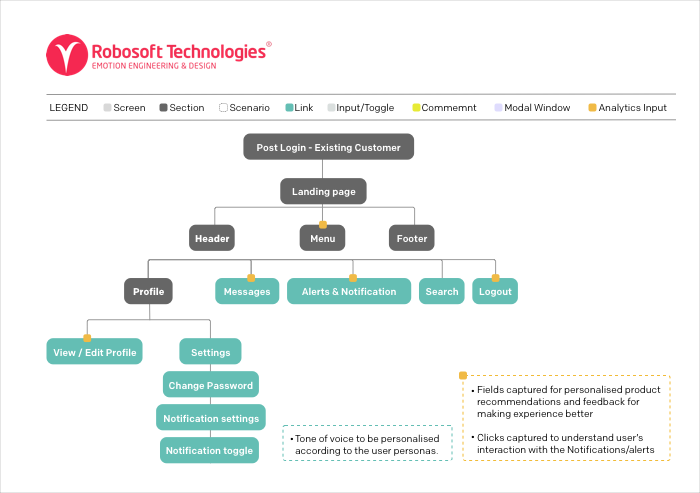
6. Defining areas for analytics integration. (Plugging in the analytics)

Plugging in the analytics

Example of an app map created for insurance company showing the analytics plugins

Analytics plays an important role in creating user journeys. This phase will help in identifying the focus areas of the users, the functionalities they will use most, and their pain points. This becomes a precursor for plugging in analytics to the digital platform.

Also this data comes in handy for future iterations as it can be used as a guide and changes can be made to the design in order to solve the problems and improve the user  experience. Hence, once the architecture is created, the decision can be made based on the goals of analysis and select tools as per requirements

In conclusion, Information Architecture is an integral part of an experience design process. A well structured IA is a powerful tool that ascertains methodical and easy navigation through a digital platform and ensures a seamless flow for content discovery. The nature, levels, and detailing of the architecture can vary according to the project. However, creating an  IA is a must for every experience designer and it is a critical step before embarking on the design journey.

Read More