UX design has been a critical aspect of aviation for a long time, from the creation of cockpit systems to the development of cabin design and passenger experience. With the introduction of more refined UI and new technologies like AI/AR, and Biometrics, airlines are continuously looking at ways to enhance UX in Aviation. These exciting new technological advancements in the aviation industry are being enabled by robust new user experiences.
From the past, airlines have already been making significant efforts in improving the passenger experience from varied seating choices to chef-designed meals. Aircrafts are now also able to access real-time data directly from the ground, improving situational awareness and increasing control capabilities. Mobile devices will also gain access to wider navigation information and improved passenger services, ensuring that users of their devices will better understand why they’re using it.
However, improving customer experience is a never ending process and even now passengers tend to report that they are left looking for more in terms of improved UX. In a world where customer is king, it falls on the aviation industry as a whole to tackle its UX challenges and find CX improvement areas. Only then it may be able to appeal to the next-generation of customers.
Some UX Challenges and CX Improvement Areas in the Aviation Industry
According to McKinsey, the overall traveler satisfaction level hasn’t seen any kind of decline post pandemic. In fact, many have found the travel experience to be better than it was before the pandemic.
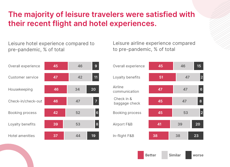
Source: McKinsey
But these surprising numbers in customer satisfaction are mostly derived from leisure travelers who maybe just feeling happy to be on the road again. There are still major UX challenges and improvement areas like flight cancellations, delays, rebooking hassle, compensation merry-go-round, loss of time and money among others.
These are just a few examples of the vast majority of UX challenges generally faced by customers while traveling via air. Some major challenges and improvement areas in customer experience journey are:
#1 Non-uniform travel experiences
Till now aviation companies were looking to continuously improve only the in-flight passenger experiences while somewhat disregarding the other touchpoints for passengers. But now there is a need to improve the customer journey in all aspects of their travel by working towards an omnichannel experience. This will provide a seamless end-to-end customer experience by airlines from booking tickets to arriving at their destination.
In our previous article, we have talked about designing a deeper, more intimate airport experience for travelers. It breaks down the whole flying experience to seven stages and provides valuable UX recommendations for each.
#2 Adequate pre and post flight information
The new generation of customers are driven by seamless smartphone experiences and seek for the same everywhere. A big step to achieve this is by providing important notifications via normal text or via app notification. Airlines are now expected to be able to provide pre- and post-flight information, timely updates and assistance to customers.
#3 Longer processing time
Earlier, the check-in experience was already a tedious task, now add new norms after the pandemic and you got a steep challenge to keep your wits end together. The new health check regulations have undeniably added more minutes to the long waiting time of passengers patiently waiting for their turn to check-in.
#4 Undeniable influence of Online Travel Agencies (OTAs)
While OTA websites drive most of the traffic, the actual purchase is generally made on the airlines’ own website/app. Still, when it comes to easy website navigation and other UI/UX features, airline websites lose the battle. Even in today’s time many travelers find booking a ticket very stressful and confusing from airlines’ own website.
#5 Increase in CX while maintaining operational costs
FSC or LCC carriers used to cater to very different class of passengers who were either driven by flight experience or price. As it is becoming a challenge for aircraft carriers to attract new set of passengers, they are looking for ways to attract both these set of customers without compromising much on customer experience.
In our article on digitalization effects on leisure and travel industries, we pitched a Right Price Model for airline business which tackles the important CX initiatives while maintaining operational costs.
How New Technologies are Boosting UX for Airlines [with examples]
One of the main enablers for improved UX is the emergence of newer technologies and their applications in aviation industry. These technologies are digitally transforming the aviation industry and paving the way for a customer centric airline industry.
Some of these technologies and their real life examples are listed below –
#1 Blockchain Technology
Using blockchain technology helps airlines to securely maintain user data and privacy across multiple touchpoints via a digital ledger. The technology can find its use in identity management & record keeping, cross integrations for seamless travel experience, building robust data security systems and airline maintenance.
Air France deployed blockchain technologies to create a COVID-19 test verification system via a mobile app during the pandemic. Singapore Airlines uses blockchain technology for their frequent flyer loyalty program using KrisPay. It also offers promotions to customers along with the program.
#2 Augmented Reality and Virtual Reality (AR & VR)
AR and VR technology when used correctly can not only enhance the UX but also help in improving the customer experience of navigating through the airport or aircraft. The obvious uses of AR and VR technologies can be seen in airports. For e.g. AR/VR can show the passengers cabin experience on VR headsets, provide a digital tour guide, show fastest route through airport, etc.
The Gatwick airport uses AR to help passengers navigate the complex layout of the airport, and London City Airport has installed AR tech to help air traffic controllers with the vital job of keeping planes safe.
#3 Artificial Intelligence (AI)
AI integrated with machine learning, and predictive analytics can help immensely in providing a connected and customized experience to the flyers. Further, AI also has the potential to ease out various operational processes of airlines like revenue management, managing ticket pricing, etc.
Shenzhen airport in China uses AI for AI airbridge allocation as well as for AI turnaround times. Air France implemented the specialized AI platform called Sky Breath that collects data from the flight, performs in-depth analytics, and helps identify fuel-saving opportunities and increase efficiency.
#4 Biometrics
Biometrics is not new to aviation. All the major and minor airports started implementing it since 9/11 to improve their security details. But over the years it has found use in improving passenger experience as well by improving the time and speed of check-in and other operations. In fact, use of facial recognition has been proposed for airports to cut down on flight delays by 80 percent.
Fraport in conjunction with Zwipe have agreed to trial their biometric solutions to boost security at Frankfurt airport. Miami International Airport and US Customs and Border Protection (CBP) started rolling out biometric technology with a few airlines back in 2019. MIA is now seeking a huge biometric push by 2023 that will serve multiple purposes.
#5 Internet of Things (IoT)
The airline industry is using IoT to build a integrated ecosystem combining the organizational functions to increase efficiencies and provide a seamless experience to their customers.
Virgin Airlines have implemented IoT in its Boeing 787. Every single element on the plane is attached to a wireless airplane network, providing real-time IoT data on elements like performance, maintenance, etc. EasyJet’s Mobile Host at London’s Gatwick Airport combines the traveler flight details with live data from the airport’s Google indoor maps. This allows the airline to deliver updated check-in reminders, gate updates, and even personalized directions.
#6 Mobile Solutions
Airlines are using the mobile platform to connect with their customers throughout the passenger journey starting from booking a flight to deplaning it. Airlines can send real time alerts and notification on and off the airport.
Almost all airline carriers nowadays send real-time flight notifications from post booking to deplaning. These include self check-in, flight delay notifications, feedback, etc.
#7 Hearable, wearable & Voice Technologies
These technologies have increasingly found various usage in aviation from internal communication between flight attendants, voice searches, voice bookings to voice check-ins. These are also used in conjunction with in-flight connectivity which provide a real opportunity to drive conversion, upsell items on flight.
#8 Advanced Data Analytics and Big Data
Aviation companies collect traces of customer data from each stage of their travel journey, be it planning, research, reservation, stay, or post-travel review of their experiences. They can use insights from this data and advance analytics to provide a high degree of personalization to the travel experience which in turn could help in building customer loyalty.
These technologies have the potential to revolutionize air travel as we know it. The airline industry is on the precipice of a breakthrough, and most of the credit goes to the wave of digital transformation across the industry with CX as center.
Technology in each step of airline customer journey
As you can see how much of a bigger role technology plays in designing the UX of travelers. Let us further break down the whole customer journey into 5 different stages and discuss how technology plays a vital role in each step.
1. Pre-booking – Airlines can offer a digital tour guide powered by a personalization engine to show destination highlights based on individual customer preferences. Airlines use data analytics telemetry based pattern identification to drive loyalty management programs and offer dynamic rewards while booking.
2. Booking and Check-in – Airline companies can use geolocation based service and marketing apps to offer transportation services, bot assisted agent or self service changes. Geolocation also allows display of local language and currency on website for familiarity and convenience while booking and payment.
3. Airport Experience – Use of IoT baggage tags providing real-time tracking, self-tagging and activation. Biometric enabled check-in and security check. A combination of AR/VR enabled mobile computing, AI, robotics, Big Friendly Data (BFD), Intuitive UX, and wearable technology to help users in self-service check-in to intimate boarding experiences.
4. In-flight experience – Taking help of big data and hearable, wearable & voice technologies to enhance in-flight experiences with traveler loyalty services, communications, and purchases.
5. Post-travel – Mobile solutions to assist in un-boarding and baggage claims. Also, sending customer satisfaction surveys post travel for better personalization in upcoming travel plans.
How Airlines are Ensuring a Highly Personalized Experience for Customers
Introduced in 2012 by IATA, the NDC airline standard is now helping airlines break away from over-reliance on GDS intermediaries. Airlines can now offer more differentiation, push new offers right away on their website, and provide high class personalization to their customers.
The NDC standard ensures each ticket seller stays up to date with each airlines’ newest offers and products. Other benefits of NDC includes:
i) Direct access to upgrades, exclusive packages, or limited-time offers even when customer is booking from a third-party.
ii) High personalization according to individual preferences across customer journey.
iii) Advance level of comparisons for all airline options, including their different services, products, promotions and of course, prices.
iv) Speed to market while distributing products widely across third-party agents or sites.
v) Same content across airline website and travel agent sites.
In short, NDC allows airlines to take control of their purchase and distribution when dealing with customers. This ensures a high level of customer experience from the airlines.
Possibilities for Airline Industry
As new technologies find ways to integrate themselves across various industries, customer expectations are growing higher and higher. Technology is now playing a major role in UX design for the whole airport and airline experience for customers. Today, what looks mind boggling due to technology may become standard norms in near future.
It is very important for the aviation industry to keep evolving with the growing trends in CX and UX. In times to come the airline travel experiences are set to become more personalized, valuable, and memorable for the flyers.


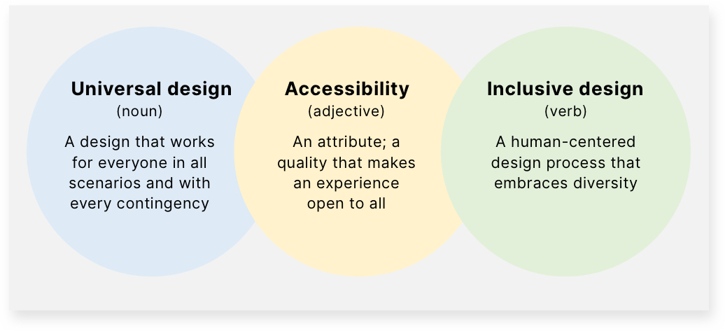

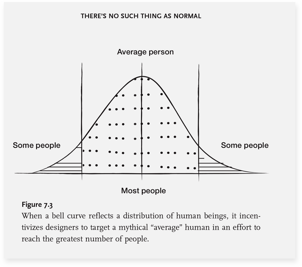
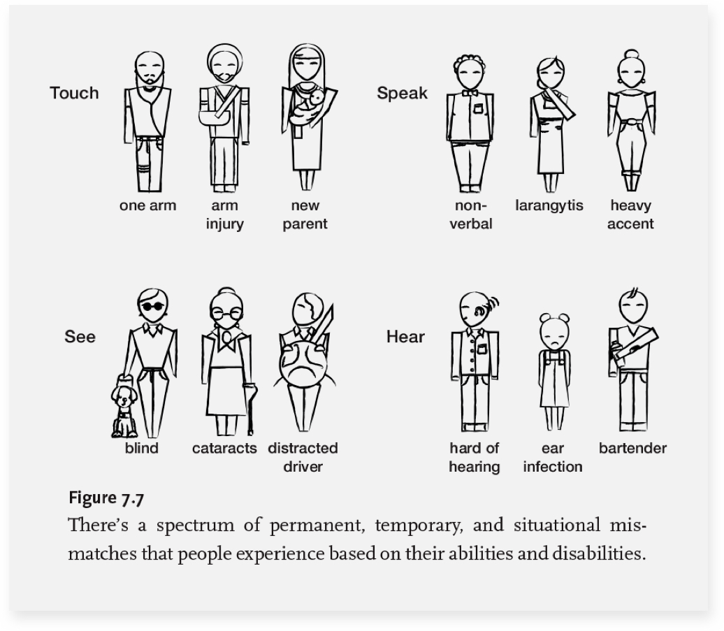
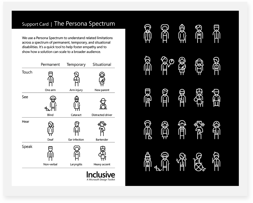
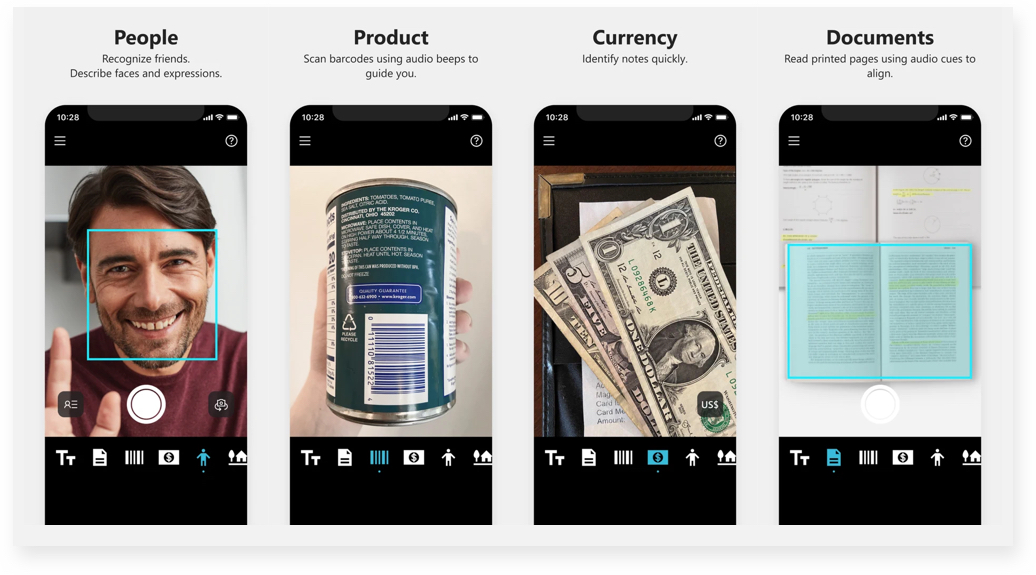
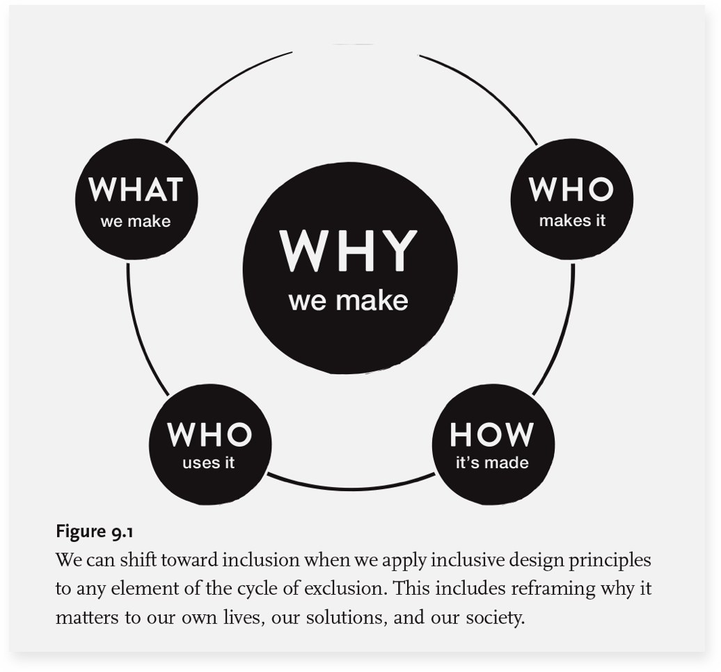
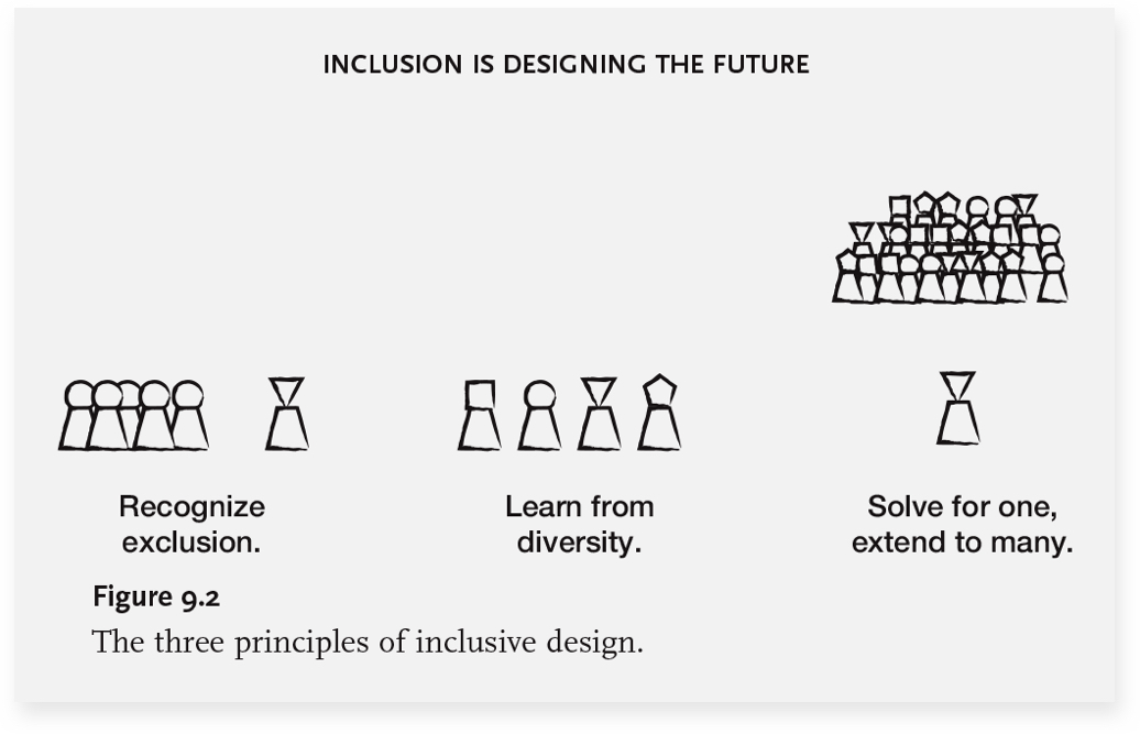
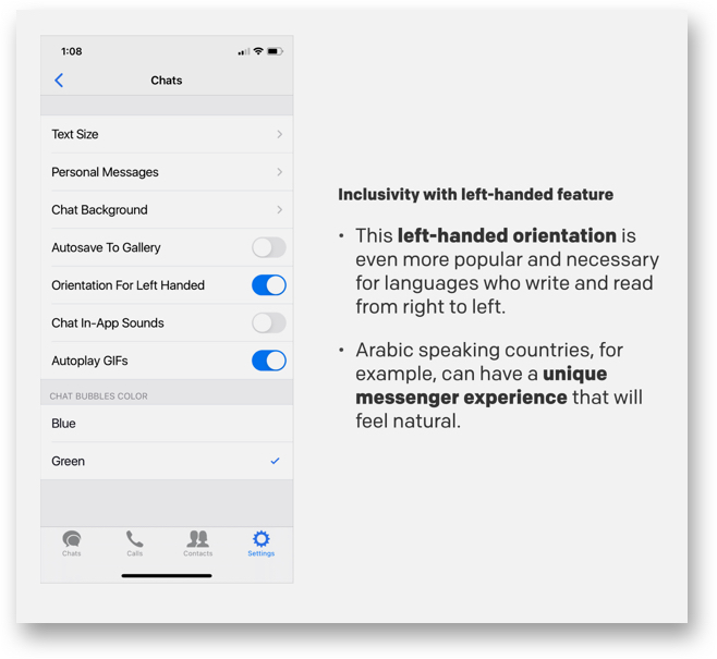
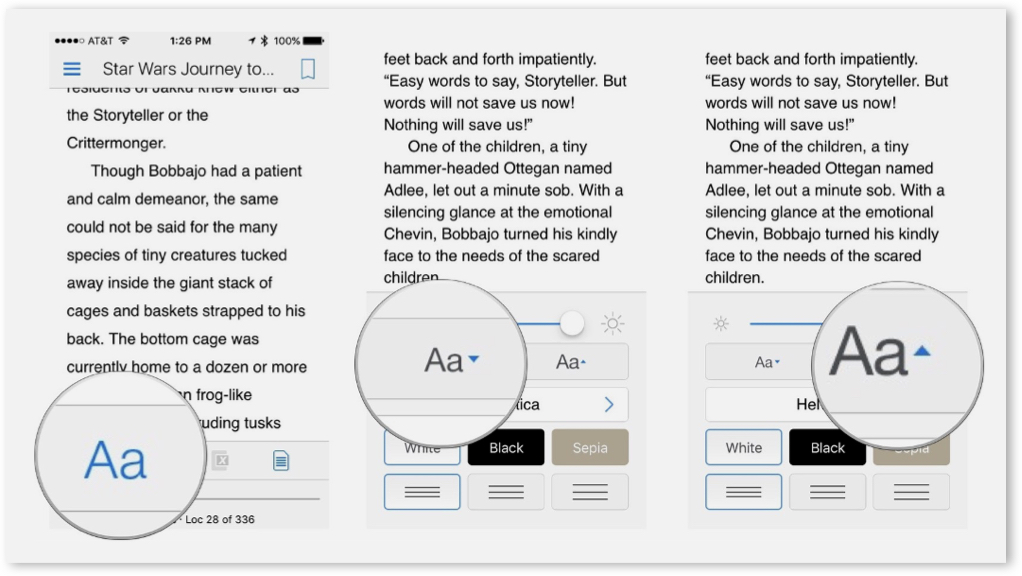
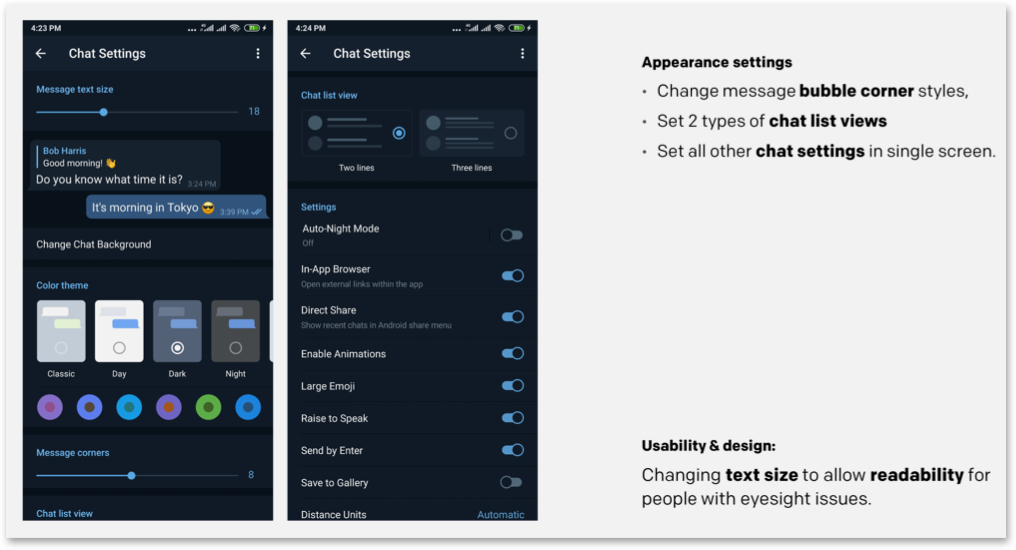
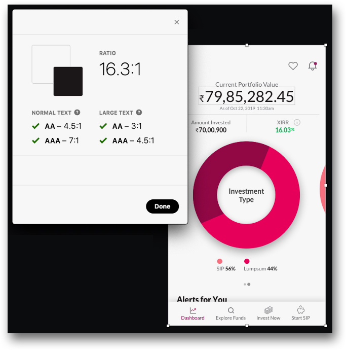
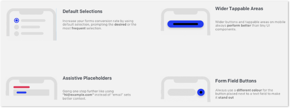
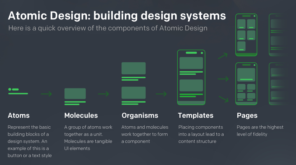
 3. Design Essentials for Inclusivity
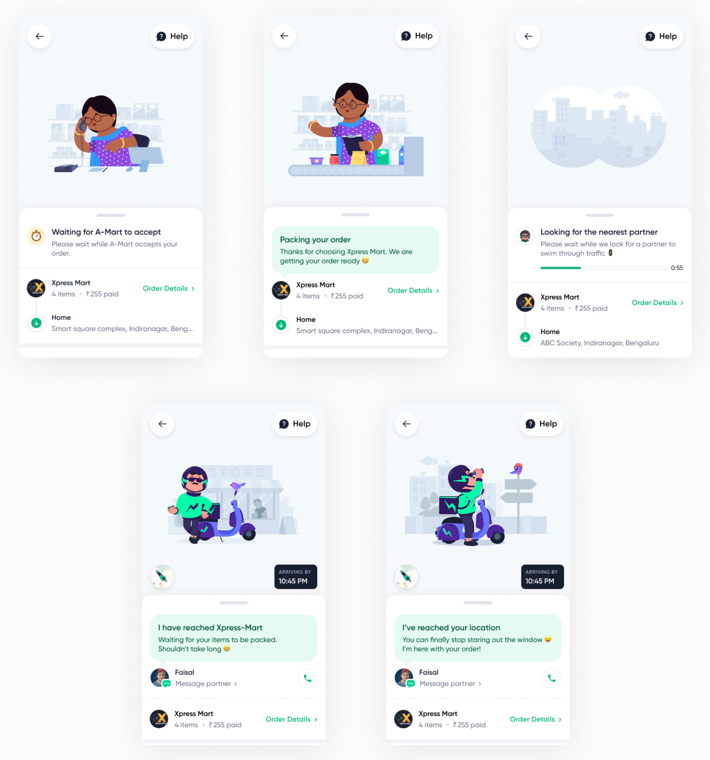


