Category : UX/UI Design

UX/UI Design

Your App’s Onboarding Experience Is Your Single Biggest Retention Lever

mobile_app_onboarding_Thumbnail_blog

There is a moment in every mobile product that matters more than any other. It is not when a user discovers an unexpected feature. It is not when they complete their first transaction or reach their first goal.

It is the moment, usually within the first three minutes of opening an app for the very first time, when they decide whether it deserves their continued attention.

That decision is rarely conscious. It is felt. The app either makes sense, or it does not. It either delivers value quickly enough, or it demands too much before giving anything back. It either feels designed for someone like them or it feels generic and effortful.

Once that feeling takes hold, it is nearly impossible to reverse. Users who leave after the first session almost never return. Users who stay and find value are far more likely to come back. The gap between the two groups is almost entirely determined by the quality of the app onboarding experience.

What we see consistently across mobile products

Across the mobile products we have built and rebuilt, one finding holds striking consistency: the variable that most reliably predicts whether a user returns on day one is not the quality of the core product. It is whether the user experienced genuine value before the first session ended.

That difference shows clearly in the numbers. Day one retention rates vary enormously across products in the same category, and the gap between 25% and 40% may sound modest, but compounded across a meaningful user base over any significant period, it represents an enormous difference in active users, engagement, and ultimately revenue.

  • 25% Typical day-one retention without intentional onboarding
  • 40% Achievable day-one retention with a well-designed app onboarding experience
  • 3 min window in which most users decide whether to stay

In almost every case where we have investigated that gap, onboarding is where the divergence originates: whether the user understood what the product was for, whether they experienced its value before being asked to give anything in return, whether the first session felt worth repeating.

These outcomes are not accidental. They are designed or, more often, they are left undesigned in the decisions made about onboarding before the app ever ships. Understanding mobile app onboarding best practices begins with recognizing the patterns that consistently undermine them.

Three things most mobile app onboarding experiences get wrong:

Explaining the product instead of demonstrating it 

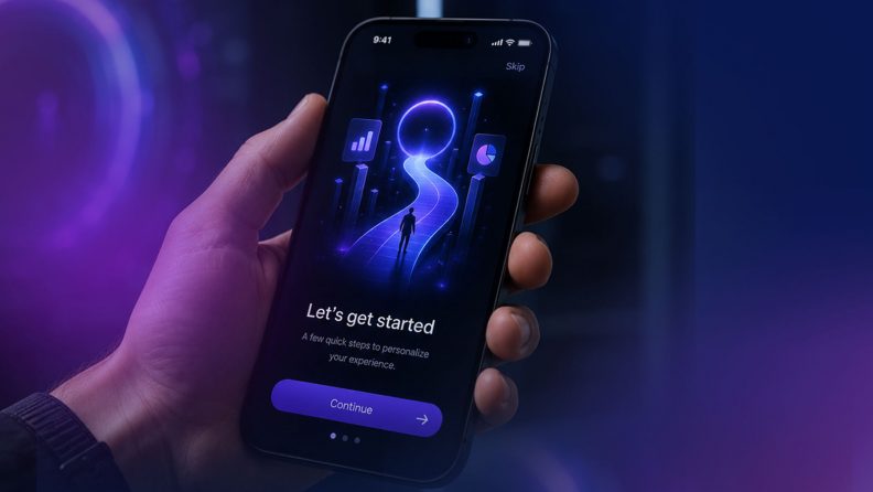
The most common onboarding mistake is using the first session to tell users what the app does rather than showing them. Feature walkthroughs, capability lists, and permission requests presented before any value has been delivered ask users to invest attention before they have any reason to do so. The onboarding experiences that retain users get to value first and explain later. 

Designing for the average user instead of the individual 

A generic app onboarding experience treats every new user identically. But the signals are already available from the very first interaction: device type, location, time of day, referral source, and early in-app behavior. Effective app onboarding UX uses these signals to make the experience feel personal from the outset, not dramatically, but enough that the product begins to feel relevant rather than generic from the very first session. 

Building onboarding at the end of the project 

This is the most consequential mistake, and the least discussed. Most mobile product projects treat onboarding as an afterthought, designing the core product first and fitting the onboarding around what already exists. The result is an onboarding experience that mirrors the product’s internal structure rather than the user’s journey through it.

mobile_app_onboarding_Manish_quote

Getting to value quickly requires knowing, from the very start of a project, which moments in the product are most likely to drive the decision to return, and designing the entire onboarding experience around reaching those moments as directly as possible.

What great onboarding does

The mobile app onboarding experiences that drive long-term retention share a set of characteristics that are straightforward to describe and genuinely difficult to execute well.

  • They deliver value before asking for anything. Users understand what the product can do for them because they have experienced it, not because they have been told about it.
  • They are short. Not because brevity is a virtue in itself, but because every additional step between installation and first value is an opportunity for the user to leave. The best onboarding experiences are ruthlessly disciplined about removing anything that does not directly accelerate the path to that first meaningful moment.
  • They set accurate expectations. Users who understand both what a product is for and who it is designed for are more likely to stay. Those who misunderstand it are more likely to leave when reality does not match what they imagined.
  • They treat the end of onboarding not as a destination, but as the beginning of a continuous process of personalization and value delivery, one that evolves as the product learns more about the individual user.

The role of AI in onboarding

Most discussions of AI in mobile products focus on the ongoing experience: recommendations, personalization, and intelligent search. These matter. But AI has an equally significant role to play in onboarding specifically.

The signals available during a user’s first session, combined with contextual data available at the point of installation, are sufficient to begin building a clear picture of who that user is and what they are likely to value. A product that uses those signals can begin shaping the app onboarding experience from the very first interaction, rather than waiting until a usage history has accumulated. The effect of those early decisions on day one retention and long-term engagement is substantial.

And, like every other aspect of onboarding, it must be designed from the start of a project, not retrofitted once the core product exists.

The first experience shapes every experience after 

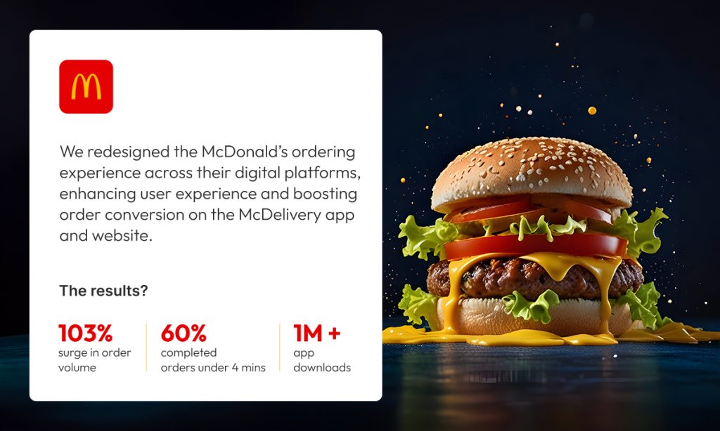
When Robosoft rebuilt the McDelivery platform for McDonald’s India, onboarding UX was not treated as a wrapper around the core product. It was treated as the first commercial moment. The question was not how to explain the app to a first-time user; it was how to get someone who is hungry right now to their first order as quickly and as confidently as possible. 

That reframe changed every onboarding decision: what was shown first, what was deferred, how much information was requested before the first order was placed, and how the experience was designed for someone making a decision under time pressure with a specific outcome in mind.

onboarding_UX_Praphull

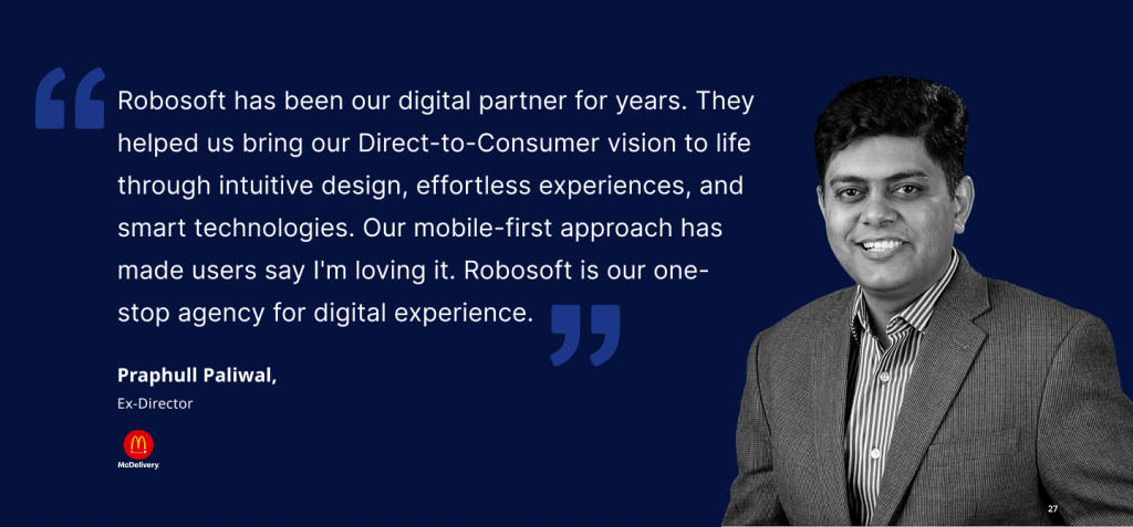
The result: a 55% increase in mobile orders and over 1 million downloads, sustained through repeat behavior rather than acquisition spend.

The same thinking shaped the Invesco Mutual Fund platform rebuild. The onboarding was designed to get an investor who already knew what they wanted to the information they needed as directly as possible.

onboarding_UX_Haresh

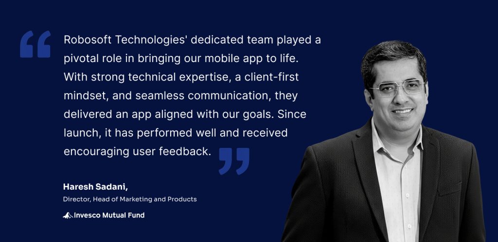
Downloads tripled within six months, and the platform sustained 800,000 monthly active users.

The questions worth asking about your own onboarding

Most teams can answer detailed questions about their core product with confidence. The same precision is worth bringing to onboarding.

  • How long does it take for a new user to experience the first moment of genuine value in your product?
  • What percentage of users who install your app actually complete the onboarding?
  • At which point do most users who leave choose to leave?
  • When was your onboarding last redesigned from the user’s perspective, rather than updated to accommodate a new feature?

The answers reveal more about long-term retention prospects than almost any other set of metrics. They are worth knowing and acting on before the next release cycle, not after the next retention review.

Robosoft Technologies builds mobile applications for some of the world’s most demanding consumer and enterprise brands, from platforms driving 55% increases in mobile orders to fintech apps sustaining 800,000 monthly active users. If you are thinking seriously about the role onboarding plays in your mobile product’s retention performance, we would be glad to have that conversation.

Get in touch: [email protected] · www.robosoftin.com

Read More
UX/UI Design

Your Customers Are Moving On. Is Your Digital Experience?

Digital customer experience featured image

Most digital CX strategies are solving for a customer who is changing faster than the strategy can keep up. They are optimizing for the person tapping through screens, but the most forward-moving customers are increasingly delegating that experience entirely to AI agents that act on their behalf. When those agents hit friction in your experience, they do not complain. They do not churn in any way your analytics will catch. They simply never come back. 

That is not a technology observation. It is a strategic problem that is quietly compounding in most organizations right now. 

Physical and digital touchpoints are converging. AI agents are beginning to browse, compare, research, and transact on behalf of customers. And the gap between how well leadership thinks the experience is performing and how customers actually feel about it remains stubbornly wide. 

Building a future-ready digital customer experience means designing for this new reality, not the one that existed three years ago. The organizations doing this well share five common traits. 

  1. They Stopped Mapping Journeys. They Started Owning Them

Forrester predicts that two-thirds of CX teams will abandon traditional journey mapping in 2026. The response in many boardrooms has been confusion: if journey mapping is failing, what replaces it? The answer is not a new methodology. It is a different ambition. 

Traditional journey maps document how customers move through an experience. They are, by definition, backward-looking. What leading organizations are building instead are intelligent platforms where context, intent, and progress carry forward at every handoff, digital to digital, digital to physical, in real time. The journey does not get mapped. It gets owned. 

CASE STUDY: Brightline 

Brightline, the only privately-owned intercity railroad in the US, came to us with five disconnected systems: mobile booking, QR-based station entry, GIS-powered parking navigation, integrated ridesharing, and physical station infrastructure. This was a customer digital transformation challenge at its core. Passengers were being handed off to each other with no continuity. The insight driving our redesign was not that the systems needed better integration. It was the passenger’s intent, getting from A to B with as little friction as possible, that should persist across every touchpoint without them having to restate it. We rebuilt across native apps, responsive web, and kiosks with that principle as the foundation. One seamless experience emerged from five fragmented ones. 

  1. Personalization Based Only on History Is a Broken Promise

Most personalization engines tell a customer who they are. The best digital experiences tell customers you understand what they need right now. These are fundamentally different capabilities, and the gap between them is where trust is won or lost. 

Historical data has real value. But it creates a ceiling. A customer who researched retirement funds last quarter may not be researching them today. A business user who typically accesses a dashboard from their desktop now needs it on a phone, in a meeting, in thirty seconds. Contextual awareness, understanding where someone is in their decision, what they are trying to accomplish, and what they are holding is what closes that gap. 

CASE STUDY: Invesco 

When Invesco needed to bring advisor-investor workflows into a single mobile-first experience, the design challenge was not building a better dashboard. It was building the right dashboard for each advisor’s specific work context, at the moment they needed it. Portfolio performance, fund recommendations, and business indicators had to surface differently depending on whether an advisor was in a client meeting, preparing for one, or reviewing end-of-day numbers. We designed around real work patterns, not historical usage data. The result was a tool advisors actually changed their behaviour to use which is the only meaningful measure of whether contextual design has worked.

  1. Inconsistency Is Not a Design Problem. It Is a Trust Problem

When a customer encounters a different experience on your app, your web portal, or your customer service interface, they do not think: ‘Their design team lacks coordination.’ They think: ‘I do not fully trust this organization.’ 

This is why Forrester expects 80% of companies to invest in design systems in 2026, not as style guides, but as infrastructure with dedicated product budgets and ownership. A design system is the difference between CX that moves at sprint speed and CX that moves at customer speed. It also breaks the dependency between content teams and engineering, which creates bottlenecks whenever a customer-facing change is required. 

CASE STUDY: BSI (British Standards Institution) 

BSI operates across 193 countries, serves over 80,000 businesses, and runs five interconnected platforms spanning mobile audit tools to supply chain risk dashboards. Inconsistency at that scale does not just frustrate users it undermines the credibility of an organization whose entire value proposition is the reliability of standards. We began with design thinking workshops, then built a system of 100+ UI/UX components and a comprehensive style guide, now underpinning every platform. The design system became the product. Everything built on top of it became faster, more consistent, and more trusted by the users who depend on it. 

  1. One Metric Should Govern Everything 

The most expensive mistake in digital CX is building something that looks sophisticated but does not move the number that matters. Leadership celebrates the launch. The metrics barely shift. The team cycles into the next initiative without understanding why. 

Future-ready CX is designed backward from a North Star Metric: a single measurable outcome the experience exists to drive. Not a suite of engagement metrics. Not a balanced scorecard. One number. Every design decision, every feature prioritization, every technical trade-off is evaluated against it. 

This discipline becomes even more critical as AI agents enter the picture. When an agent mediates the experience, the customer evaluates the result not the interface, not the process, not the visual design. Outcome-based design is how organizations stay relevant in an era of agentic CX. 

CASE STUDY: McDonald’s

McDonald’s India’s McDelivery app was underperforming against expected order volume. The instinct in many organizations would have been to improve the UI. Our instinct was to start with behavior. Observational research at physical outlets showed where customers were abandoning the digital path not because the app was poorly designed, but because the digital journey was competing with, rather than complementing, the physical ordering behavior customers already trusted. The redesign put flexible order modes on the first screen, introduced personalized recommendations, and stabilized the backend. North Star: more orders through digital. Result: 103% growth in mobile orders, over 10 million downloads. The lesson is not that better design drives better metrics. It is that the right design question asked before a single pixel is drawn is what drives better metrics. 

  1. The Next Frontier Is Not a Better Interface. It Is No Interface at All

This is where the conversation gets uncomfortable for organizations still measuring CX by app store ratings and session lengths. 

The industry is moving from AI-assisted to AI-native. Customers are increasingly delegating tasks, research, comparisons, bookings, purchases to AI agents that act on their behalf. When those agents cannot navigate your digital experience, the human behind them chooses a competitor whose experience the agent can use. You never see the drop-off because there was no session to record. 

The real strategic question is not how to build your own AI agent. It is about making your experience work for the agents your customers already trust. This is a shift from interface-centric to intent-centric design. At its furthest point, it leads to what the industry is beginning to call zero UI: value delivered without customers navigating screens at all. Intent expressed, agent executes, outcome delivered. 

Building for this means designing products that are machine-readable as well as human-readable. It means experiences that sense intent rather than wait for input. It means human validation loops that keep the system honest when agents make decisions on behalf of customers who are not in the room. 

Organizations that treat this as a future problem are already behind. The customers most likely to use AI agents are, by definition, high-intent and high-value. They are exactly the segment every business is trying to reach. 

Lead design strategist quote

What Separates the Companies Customers Will Choose Tomorrow 

The organizations winning on digital customer experience share a common trait that has nothing to do with budget or technology. They have stopped treating CX as a layer applied to a product and have started treating it as the product itself. 

Design has shifted from screen-centric to relationship-centric. Context compounds over time rather than resetting with every session. AI-native experiences are built on conversational journeys, voice-first interactions, and prompt-driven thinking, all grounded in outcome-based design and human validation. The companies building for this shift today are the ones customers will choose tomorrow. 

The ones waiting to see how it plays out are running a risk they may not yet be able to measure, but their customers already can. 

Robosoft Technologies 

We work with enterprises across Fintech, Travel, Retail, Media & Entertainment, and others to build AI-native digital products, combining experience design, software engineering, and data and AI as an integrated discipline, driving CX transformation. If your digital CX is due for a harder look, we would like to have that conversation.

Read More
UX/UI Design

Engineering Next‑Generation Connected TV Experiences for the Big Screen

A household group watching an immersive Connected TV experience on a large screen, with a live sports broadcast extending beyond the screen into the living room

Connected TV is no longer a distribution surface. It is becoming the operating system of the living room, where household engagement, monetization, and retention are decided.

Next‑generation CTV is shifting from browsing to intent‑predicted engagement, powered by AI, household‑level data, and resilient platform engineering. Streaming businesses that treat CTV as a full‑stack capability, spanning performance, intelligence, monetization, and operational resilience, will outpace competitors still approaching it as “mobile on a bigger screen.”

Where households decide to stay or leave

First‑session abandonment on Connected TV remains stubbornly high. Subscribers download apps, browse briefly, and exit before content value is fully assessed. 

In those early moments, households were not judging catalog depth. They are judging whether the service belongs in the living room: onboarding friction, navigation clarity, discovery effectiveness, and playback reliability. 

Connected TV is where streaming businesses are won or lost, yet it is frequently where product organizations are least operationally prepared.

Ashish Gohel Lead UI/UX Designer

CTV apps are becoming intelligent living‑room platforms

This is not a UX trend. It is a capability shift.

Next‑generation CTV reduces decision fatigue by anticipating intent rather than waiting for explicit input:

  • Predictive discovery based on household viewing patterns
  • Context‑aware recommendations shaped by time‑of‑day and session type
  • Mood‑driven search using natural language intent
  • Cross‑device intent recognition, where discovery begins on mobile and resolves on TV
  • Real‑time personalization across household profiles, not static personalization

Discovery is no longer a menu problem. It is an engagement system.

What AI is changing in CTV

AI is not just improving recommendations. It is restructuring the economics of content discovery.

The cost of serving the right title to the right household at the right moment is falling to zero. The cost of a wrong recommendation, an abandoned session, a cancelled subscription, a household that never returns, is rising. That asymmetry is what makes AI infrastructure a strategic investment, not a feature.

Concretely, this means:

Generative AI is rewriting the discovery interface

Voice input powered by large language models moves beyond keyword search into genuine intent understanding. A household saying “something light for after dinner” gets a relevant result, not a confused one. First‑session success rates improve. Personalization signals accumulate faster.

AI is collapsing with the gap between signal and action

Earlier generations of recommendation engines updated on a cycle, daily or weekly. Real‑time AI inference means the platform responds to what a household is doing now: switching profiles mid‑session, abandoning a title at the twelve‑minute mark, returning after a two‑week gap. Each signal feeds back into the model immediately.

AI-curated home screens are replacing static content rows

The home screen is no longer a merchandising decision made by an editorial team once a week. It is a continuously updated, household‑specific surface, the single most valuable piece of real estate on the platform, dynamically managed at scale.

The platforms investing in this infrastructure now are not building a better recommendation engine. They are building a compounding retention advantage that widens every quarter.

The multi‑device reality: CTV as the household hub

Households move fluidly across devices. Discovery often starts on mobile, continues on tablets, and culminates on the TV, sometimes within the same session.

The engineering target is not a single‑screen experience but continuity across the household’s device graph: maintaining play state, profile context, and discovery intent across environments.

Beyond the “10‑foot experience”: intelligence determines outcomes

Usability fundamentals, including legibility, safe areas, focus behavior, and accessibility, remain at table stakes. The differentiator is what sits on top of them.

Navigation becomes an intent flow

Next‑gen platforms reduce steps by arranging UI around predicted household intent. Navigation shifts from finding to confirmation.

The remote becomes conversational

Voice input, increasingly powered by Generative AI, enables contextual discovery, faster first‑session success, and continuously strengthening personalization signals.

Monetization expansion: FAST and commerce move to center stage

FAST platforms, including Pluto TV, Roku Channel, Samsung TV Plus, and Tubi, are expanding globally, creating a hybrid streaming ecosystem where subscription and ad‑supported experiences coexist within the same household environment. This raises the operational bar significantly: dynamic ad insertion, household targeting, and governance requirements must coexist with playback stability and experience quality.

Content and commerce are also converging through shoppable overlays, QR‑driven flows, and contextual product placement, transforming the TV into a retail media surface and creating a new unit of value: revenue per session, not just per subscriber.

Data infrastructure: household signals become strategy

A mature CTV data layer captures household co‑viewing patterns, peak‑time behavior, intent signals (browse vs. play vs. abandon), and cross‑profile consumption flows.

At scale, these signals inform dynamic subscription bundling, FAST inventory and targeting strategy, content acquisition decisions, and retention interventions during early sessions.

Data evolves from analytics into an operating control surface, and it is the fuel that makes AI infrastructure perform.

Engineering the platform beneath next‑gen CTV

CTV experience quality in the living room is determined less by interface design than by platform engineering. Five critical layers define whether a platform performs in real households or only in controlled environments.

Five-layer platform engineering stack for CTV design spanning performance architecture through operational resilience

1) Performance architecture

CTV platforms must support low‑latency live‑event scaling, real‑time personalization without playback degradation, and safe over‑the‑air update governance across device fleets. Few organizations can deliver all three without stability trade‑offs.

2) Content delivery

Content delivery must account for extreme hardware variability, from premium Apple TV devices to constrained Android TV environments.

3) Design systems at scale

Component‑based, token‑driven systems enable consistency across Roku, Fire TV, Apple TV, Samsung, LG, and Android TV without fragmenting experiences.

4) Data and intelligence infrastructure

Personalization, recommendations, and cross‑device continuity require unified signal processing across household profiles. This is the layer where AI either compounds or collapses, and it is only as good as the data architecture beneath it.

5) Operational resilience

Living rooms are unpredictable environments. Graceful degradation and intelligent recovery are non‑negotiable.

Building Discovery+ across mobile, web, and smart TVs required every one of these layers to work in harmony, under the pressure of live production environments across fragmented device ecosystems. It is precisely this kind of at-scale, multi-platform engineering that reveals where theoretical frameworks meet real-world complexity.

Client testimonial on Robosoft's Connected TV engineering capabilities from the Discovery+ multi-platform project

What the next three years of Connected TV will look like

Next‑gen CTV platforms are already incorporating capabilities that move well beyond content delivery:

  • AI‑curated home screens replacing static content rows
  • Retail media becoming a primary monetization layer alongside subscriptions
  • Voice‑first navigation replacing remote‑driven search
  • Cross‑platform identity graphs enabling seamless, continuous viewing
  • FAST ecosystems rivaling traditional broadcast channels in reach and targeting
  • Mood‑driven search using natural language
  • Cross‑device intent recognition, with mobile to TV continuation becoming a standard expectation
  • Dynamic personalization evolving continuously, not set once at onboarding

The platforms investing in these capabilities now will define household viewing habits for the next decade.

The Robosoft perspective

Connected TV should be engineered as a household platform capability, where experience design, data intelligence, monetization systems, and operational resilience are built together, not layered sequentially. This is what separates functional CTV applications from platforms that deliver sustained retention and monetization.

When CTV is engineered as a platform:

  • Household economics improve as multi‑user engagement compounds lifetime value
  • Switching friction increases once routines and personalization are established
  • Brand perception strengthens because the big screen is the most visible proof of quality

For media and entertainment organizations, the question is whether Connected TV is engineered to deliver intent‑predicted engagement, FAST‑ready monetization, and living‑room reliability across fragmented device ecosystems.

Robosoft partners with streaming teams to design and engineer next‑generation CTV platforms that scale under peak conditions and perform consistently in real‑world household environments.

Let’s discuss your CTV strategy.

Read More
UX/UI Design

Designing for Connected TV: all you need to know to capture attention on the big screen

The way people consume content today is no longer confined to a single screen. The rapid adoption of Connected TV (CTV), the surge in mobile and tablet usage, and the explosion of streaming platforms have redefined viewing behavior.

The Leichtman Research Group highlights this shift in behavior. It reveals that two-thirds of U.S. TV households use more than one type of connected TV device, with an average of nearly four devices per home.

This evolving CTV ecosystem presents both an opportunity and a challenge for design teams. This blog explores the key design principles and real-world practices that can help product design teams create consistent and intuitive CTV experiences across devices.

Understanding the Connected TV ecosystem

Connected TV (CTV) refers to devices that let users stream video content directly to a television screen using an internet connection. This includes Smart TVs with built-in apps, streaming media players like Roku, Amazon Fire TV, and Apple TV, as well as gaming consoles such as Xbox and PlayStation.

CTV ecosystem

While CTV is a part of the larger OTT (Over-The-Top) ecosystem, it’s important to note the distinction. OTT covers all internet-based streaming, including mobile phones, tablets, laptops, and CTVs. But CTV is focused entirely on the TV screen experience, which often becomes the centerpiece of home entertainment. 

CTV design best practices

Designing for Connected TV isn’t just about scaling up mobile or web interfaces. It demands its own design thinking. 

The following best practices tackle the challenges faced while designing for CTV. Drawn from our work on platforms like Discovery+, these guidelines form a practical roadmap for building seamless, intuitive CTV applications that delight viewers across devices.

Visibility and clarity

1. Design for the 10-foot CTV experience

Designing for TV screens is about rethinking how people interact with content from a distance. Most users view Connected TVs from 6 to 10 feet away, in a relaxed, lean-back position. This unique setting changes everything about how your UI needs to behave. 

The 10-foot experience requires larger, bolder interface elements and a layout that communicates clearly from afar. 

What we encountered

When designing the Discovery+ CTV platform, we noticed that poster titles and CTAs weren’t consistently visible on all TV models. This happened because some TVs, especially older or lower-end ones, still apply overscan, where the edges of the screen content are cropped to fit the display. As a result, critical UI elements near the bottom and sides of the screen would sometimes get cut off, making them hard to read or interact with.

How we solved it

We defined safe margins (5% padding) across all edges to prevent cutoff and ensured that critical elements like show titles and episode actions appeared in center-aligned zones, where the viewer’s attention naturally falls. We also refined gradients so they never interfere with text visibility.

10ft UI Connected TV experience design

Image: Adapting layout, typography, and element placement for users in a lean-back mode

2. Design for overscan and safe areas

Not all TVs display content edge to edge. Some older or lower-end models still apply overscan, cutting off the outer margins of the screen. That means anything placed too close to the edge risks being partially or completely invisible to users.

Users may miss navigation cues, buttons, or labels that fall outside the “safe” visual zone. This can disrupt content discovery and lead to frustrating experiences where key actions (like ‘Play’ or ‘Watchlist’) are hidden from view.

What we encountered

In our early Discovery+ TV prototypes, poster titles and action buttons near the bottom and corners were inconsistently visible across screen models. Text overlapped with the gradient on some TVs or was pushed out of view entirely. This created confusion during usability testing, especially when users tried to interact with shows directly from thumbnail rails.  

How we solved it

We implemented platform-specific safe area guidelines, maintaining at least a 5% margin on all sides. On a 1920×1080 screen, that’s roughly 48 pixels horizontally and 27 pixels vertically. We also reworked the gradient overlays used behind posters so they didn’t obscure titles, and relocated actions like ‘Play’ or ‘Add to Watchlist’ into the safe zones, either center-aligned or inset with adequate spacing.

Visbility and overscan safety for CTV

Image: Designing within the platform-specific margins to prevent critical UI elements

Ease of interaction

1. Optimize navigation for D-Pad using remote control

Unlike mobile apps that rely on touch or desktop apps that use a cursor, CTV apps are controlled primarily through four-directional (D-pad) navigation. That means every interaction needs to be linear, predictable, and instantly responsive to remote input.

D-pad navigation design for CTV

D-pad navigation reduces the number of actions users can take at a time. This makes clarity of focus and smooth directional movement essential. If users can’t immediately see where the focus will move next, or worse, get stuck, it creates friction that leads to drop-offs. 

What we encountered 

While designing for Discovery+, we noticed that users had trouble switching between episodes and rows. Some users struggled to reverse actions or weren’t aware they could move between thumbnail rails. Simple tasks like finding the next episode became unnecessarily complex without visible feedback or directional cues.  

How we solved it 

We created a D-pad simulation prototype and tested it across multiple TV models and remotes. This helped us fine-tune how the focus ring behaved, especially during transitions across rows and within episode carousels. We introduced subtle motion effects and highlight cues to clearly show the user where they were and where they could go next.

Optimize with Axis for Connected TV

Image: This layout ensures users can move smoothly between content blocks with clear directional focus

2. Design for voice interactions

Typing on a TV with a remote control is slow and often frustrating. As more users turn to voice assistants for navigation, search, and content discovery, supporting natural voice interactions across your CTV experience is essential.

Remote-based input makes complex interactions like logging in, searching for a show, or filling out a form time-consuming. Voice control offers a faster, more intuitive path. If your app doesn’t support or prioritize voice input, it can cause drop-off right at the entry point.

What we encountered

During usability testing for Discovery+, we noticed users instinctively looked for the voice icon before attempting to type using the on-screen keyboard. In some cases, users delayed interaction because the voice search was not prominently positioned. Others tried to use their native smart assistant (like Alexa) even when the app hadn’t been optimized for it.  

How we solved it

We repositioned the voice search icon as the first-choice input method on the search screen. We also designed the UI to reflect a voice-first experience, allowing users to bypass typing unless absolutely necessary. For returning users, we reduced login friction by enabling authentication via mobile-to-TV handoff and highlighting it during onboarding.

Connected TV design for voice interactions

Image: The search screen design prioritizes voice input over keyboard input. The voice icon is placed first in the input flow for easier access

3. Designing for accessibility

A well-designed Connected TV experience isn’t complete unless accessible to everyone. People with low vision or blindness rely on screen readers and audio cues. Those with hearing difficulties need clear visual alternatives to any sound-based feedback.

What we encountered

During our design process, we identified accessibility challenges around quick access to previously watched shows and episodes within them. Users also had difficulty identifying selected states or navigating between episodes. People relying solely on audio or voice inputs also struggled due to insufficient feedback or context around these interactions.

How we solved it

We reworked the “Switch Episodes” and “Continue Watching” rail with stronger contrast, added a clear focus ring, and paired visual states with subtle audio ticks. Hence, users receive visual and audible confirmation. Also, we enabled shortcuts, “Play next episode,” “Add to Watchlist,” and “Skip intro.”

Switch episode CTV design best practice

Image: Accessible navigation with clear focus states for seamless episode switching

Continue watching option in CTV

Image: High-contrast highlights for easy content resumption 

Personalization for shared devices

1. Support multi-profile personalization

Unlike mobile or personal laptops, Connected TVs are shared household devices. That means your design must serve multiple users with different preferences, age groups, and viewing habits, often on a single screen.

A personalized experience increases engagement, retention, and satisfaction. Without profile-specific settings, users may encounter irrelevant content, lose their watch history, or face inappropriate recommendations, especially in homes with both adults and kids.

CTV multi profile personalization

Image: Custom profiles support personalized content and parental controls. Visual cues and icons help differentiate user types at a glance

What we encountered

In our Discovery+ design exploration, we realized that a single user profile wouldn’t serve a typical household. Users wanted their own watchlists, tailored recommendations, and age-appropriate content controls. The absence of these features often led to confusion and frustration, especially when kids used the platform unsupervised.

How we solved it

We implemented a multi-profile entry screen that appears at app launch, allowing each household member to pick or create their own profile. Each profile carried personalized preferences, viewing history, and even watchlist continuity across devices. For child profiles, we activated parental controls that filtered out adult content and enabled safer exploration.

Privacy while designing apps for TV

Image: User profiles restrict content based on user age with Parental Controls. e.g. kids-friendly profile – Disney+ Kids Mode ensures children see only family-friendly movies and shows

2. Ensure UI consistency across streaming platforms

A single household might stream content on a Roku TV in the bedroom and an Apple TV in the living room. While each platform has its own design guidelines, users expect a consistent experience across all of them.

Inconsistent navigation, layout, or visual styles across devices can lead to confusion. If users feel like they have to relearn your app every time they switch platforms, it creates friction, and they may choose a more familiar service instead.

What we encountered

During the Discovery+ rollout, we had to support a wide variety of platforms, including Roku, Fire TV, Android TV, Apple TV, and WebOS. Each had unique limitations, remote behavior, and UI rules. For example, Fire TV had stricter safe zones, Apple TV emphasized integration with Top Shelf and system features, and Roku had performance limitations on lower-end devices.

How we solved it

We designed using a component-based system built in Figma, with reusable tokens for typography, spacing, and color. These tokens were exported via JSON and synced with our developers’ codebase using the Style Dictionary plugin. This ensured the core design structure remained consistent while allowing each platform to inherit its native interactions and system behaviors.

component-based system built in Figma for CTV design handoff

Image: Discovery+ UI components adapted for Apple TV, Roku, and Android TV. Core layout and interactions stay consistent while following platform-specific design norms

While no guideline is one-size-fits-all (gaming UX, for instance, follows its own unique rules), the practices above offer dependable direction for creating seamless, intuitive experiences across CTV and companion devices.

Conclusion

The Connected TV market is set to double (from USD 267B in 2024 to USD 530B by 2030) in the next five years, making it the ideal moment for designers and product teams to stake their claim in this rapidly growing space. By understanding each platform’s nuances, designing for real-world viewing environments, and following proven best practices as demonstrated in this guide, we can craft captivating, user-friendly TV applications that delight viewers across devices and platforms.  

At Robosoft, we’ve partnered with leading media, news, and entertainment brands to build end-to-end OTT solutions with capabilities across product strategy, design, engineering, analytics, and monetization. Whether targeting a regional Smart TV market or aiming for global reach, our team can help deliver world-class multi-device experiences across platforms. Ready to connect with your audience on every screen?

contact us for CTV experience design

Read More
UX/UI Design

Design Systems for startups and enterprises: the foundation of digital experiences and long-term success

A blueprint conjures up visions of a plan, a model, or a template. It can be replicated and saves time and effort. Similarly, in the digital world, Design Systems act as the blueprint for creating consistent, scalable, and efficient product design.

Any physical or digital product needs a defined process to establish a unique identity. This becomes crucial in today’s crowded marketplace, full of parity products and services.  The quality of customer experience on digital platforms is often a differentiating factor for brands and becomes the basis of customer engagement and loyalty.

Creating a robust design system is essential for startups and enterprises aiming to deliver consistent, scalable, and efficient digital experiences. For senior design professionals, mastering their creation and governance is key to driving product quality, team efficiency, and brand integrity across complex organizations. This blog explores the best practices in building and maintaining Design Systems. It covers the need for Design Systems, how to build them, their benefits in redesign projects, and strategies for maintenance and scalability.

What is a Design System? Why do we need one?

Design System combines branding and UI/UX principles, establishing a shared vision to ensure each user touchpoint reflects the brand’s values and personality. Such consistency promotes familiarity and memorability, vital assets in a digital marketplace crowded with similar offerings.

Today, organizations must deliver seamless user experiences across multiple platforms and products. A design system addresses this by providing a shared language and reusable components that unify design and development efforts.

Without a design system, product teams risk inconsistent UI elements, leading to fragmented user experiences and brand dilution.

Building a Design System: best practices

Building a design system is a structured process that requires careful planning, collaboration, and iteration. Here are the Design System best practices and key steps:

  1. Analyze your current design process

Start by auditing your existing design assets, tools, and workflows. Understand the design maturity of your teams and identify pain points such as inconsistencies or inefficiencies. This baseline helps tailor the design system to your organization’s needs.

  1. Define guiding principles

Establish design principles that reflect your organization’s values and goals. These principles act as a north star, guiding design decisions and ensuring alignment across teams. For example, if accessibility is a priority, include actionable guidelines for inclusivity and compliance with standards. Airbnb’s Design Language System centers on “belonging,” influencing warm colors, approachable typography, and inclusive visuals that make every interaction feel personal.

  1. Conduct a UI audit and catalog components

Inventory all UI elements—buttons, forms, icons, colors, typography, grids, and patterns. Evaluate each component’s usage and relevance, keeping only those that serve user needs and business goals. This creates a component library that forms the core of your design system.

  1. Create a visual language

Define your brand’s visual identity through colors, typography, spacing, and iconography. Introduce grid systems and layout rules to ensure consistency across screens and devices. This visual language should be documented clearly for easy reference.

  1. Build and document components

Develop reusable UI components with clear usage guidelines, including behavior, anatomy, and accessibility considerations. Documentation should be comprehensive, covering when and how to use each component, supported by code snippets and design files.

  1. Establish governance and collaboration models

Design Systems evolve continuously. Define a governance strategy to manage updates and contributions. Common models include:

  • Solitary: one person or a small team owns the system.
  • Centralized: a dedicated team manages the system.
  • Federated: multiple teams share responsibility.

Choose a model that fits your organization’s size and culture, ensuring clear communication and version control. IBM’s Carbon Design System encourages regular review sessions and open channels for feedback, balancing governance with community contributions.

  1. Roll out and promote adoption

Communicate the design system’s value and usage across teams. Provide training, create accessible documentation hubs, and encourage feedback. Use tools like Slack channels or project management software to keep everyone informed and engaged.

Benefits of using a Design System

Redesigning digital products is complex and resource-intensive. Leveraging a design system during redesign offers significant advantages:

  • Reduction in design time: on average, screen design times reduced significantly by around 30-40%, thanks to the library of pre-designed elements.
  • Reduced feedback time: stakeholders reviewed designs faster due to the predictable structure and consistent patterns.
  • Minimized errors: with standardised components and design patterns, inconsistencies across screens and platforms dropped significantly.
  • Pre-built components: designers could leverage reusable UI components, eliminating the need to start designs from scratch.
  • Reduced iterations: pre-approved design standards minimised back-and-forth revisions during the design phase.
  • Efficiency in the hand-off process: developers received well-documented, pixel-perfect designs, reducing guesswork and errors during implementation.
  • User-centered improvements: Design Systems often incorporate accessibility and usability best practices, ensuring the redesign enhances the overall user experience.
  • Scalability for future growth: a well-maintained design system supports ongoing iterations and expansions without starting from scratch, making redesigns more sustainable.
  • Cross-functional alignment: Design Systems foster collaboration between designers, developers, and product managers by establishing clear guidelines and standards. This shared understanding minimizes miscommunication and streamlines workflows.

In essence, a design system is not just a style guide but a strategic asset that drives product quality, team productivity, and business growth.

Design System in action

We recently created a Design System for a leading audit brand in the US.  Our journey began with building a robust design system based on the product requirements, new brand guidelines, and foundation DSM created for the website. This foundation ensured that our approach was both strategic and aligned with core values and vision of enhanced experience.

We built the design system using the Atomic Design framework, defining and designing everything from tokens to layouts.

Design Systems Framework

We then set out the design goals, a design style guide, design tokens and components.

Design TokensHow we built design systems

As we transitioned to redesigning the training platform, we carefully adapted the design system. Our approach focused on addressing challenges like inconsistencies and scalability while retaining the brand essence.

Key stages for setting design systems

Key takeaways

  • Design Systems are essential for delivering consistent, scalable, and efficient digital experiences across products and teams.
  • Building a design system involves auditing current assets, defining guiding principles, creating a visual language, developing reusable components, and establishing governance.
  • Using a design system in redesign projects accelerates workflows, improves consistency, reduces technical debt, and enhances collaboration.
  • Maintenance requires continuous updates, clear ownership, scalable architecture, thorough documentation, and effective communication.
  • Choosing the right governance model and fostering cross-functional collaboration are critical for long-term success.
  • By investing in a well-crafted design system, startups and enterprises can streamline their product development, improve user experiences, and maintain a competitive edge in the digital marketplace.
  • This strategic approach to Design Systems empowers product managers and design experts to build cohesive, user-centered digital products that scale efficiently and adapt to evolving business needs.

Design Systems best practices

Read More
UX/UI Design

Usability testing: a practical guide for accelerating your product development cycle

A guide to conduct usability testing for digital products

Creating a successful product isn’t just about adding the right features, it’s about ensuring users’ ease and delight in interacting with it. That’s where usability testing comes into play. 

This comprehensive guide breaks down the what, why, and how of usability testing to help you design user-centric digital products. 

We also introduce our RAPID framework (an easy-to-use design thinking approach). 

What is usability testing?

Usability testing is a structured, user-centric approach to evaluate how intuitive, efficient and satisfying your digital product is. More than just functionality, it’s about observing real people as they try to complete tasks using your product. Where do they pause? What causes confusion or frustration?

It makes you understand the user experience of a particular instance of the prototype you are testing for. Whereas the user interview would provide a holistic view of user psychology. 

Elements of usability testing 

According to the popular user experience community, Nielsen Norman Group, usability testing has three elements. However, we believe there exist a fourth element as the facility:

  • The Facilitator – the guide who creates the tasks and sets the tone. 
  • The Participant – the real-world user who brings authentic interaction. 
  • The Tasks – the practical product journeys you want the user to navigate. 
  • The Facility – that has testing tools, prototypes, and digital assets. 

Core elements of usability testing

Why usability test? 

You might wonder, “If we’ve hired expert UX designers, why do we still need usability testing? Shouldn’t their experience and talent be enough?” 

Think of it this way: every choice on the interface has countless variables, and each user brings unique perspectives and preferences. The combination of these factors is vast, and there’s no shortcut around it. Usability testing is the key to unlocking those insights. By observing users engage with your product or service, you get a clear view of what resonates and what needs a second look. 

How does usability study drive conversions? 

UX often segments customers into continued journey vs drop-offs. Carefully crafted UX walks users toward their goals, whether exploring content, making a purchase, or downloading an app. Visitors who move through your platform easily are far more likely to complete desired actions. Conversely, even minor usability lags can leave potential customers feeling frustrated or lost, leading to high bounce rates and lost opportunities. 

UX testing methods 

Usability testing transcends the mere act of checking if buttons are clickable or verifying that date fields can be personalized. Instead, it incorporates a range of methods designed to find how users genuinely interact with your product. Below are several core methods to consider: 

Moderated testing 

In this method, you (the researcher) walk participants through a series of tasks, observing their actions and inquiring about their thought processes in real-time. Because you have the chance to ask for clarification, moderated testing works well for complex or lengthy workflows that might confuse new users. 

Unmoderated testing 

Here, participants complete tasks independently, often through an automated platform. This approach allows for faster feedback and covers a broad spectrum of users, but you lose the ability to ask follow-up questions during the session. 

In-person and remote testing 

Usability testing can be conducted in person or remotely. These are not separate testing types but delivery modes that complement both moderated and unmoderated formats. 

In-person sessions allow you to be physically present with participants, making it easier to observe non-verbal cues like facial expressions, body language, or moments of hesitation. These cues are valuable for capturing deeper user insights. 

Remote sessions, on the other hand, are conducted online using screen-sharing tools or dedicated usability platforms. They are ideal for distributed teams, global user bases, or scenarios where logistics make in-person testing impractical. 

 UX testing methods

The journey doesn’t conclude with data gathering. Post-testing, the real challenge begins – analyzing your findings for actionable insights. This is where we can step in. 

How to conduct usability testing: a step-by-step framework 

Effective usability testing goes beyond checklists and surface-level observations. At Robosoft, we follow a proven methodology called RAPID (Robosoft Accelerator for Product Innovation in Digital), a plug-and-play, Design Thinking–based framework. 

We have conducted extensive usability testing for a wide range of consumer and enterprise apps. One such engagement was with Motif, a US-based photobook editing app for iOS. Here’s how we put theory into action. 

 How to conduct usability testing

STEP 1 – Preparation stage: project setup 

Preparation stage is the foundation of a successful empathy-based usability testing project. It ensures that the research objectives are clear, and the right users are recruited. 

For example, in our work with Motif, we segmented users into age-based cohorts (Gen Z, Millennials, and Gen X). Each with different levels of photo-editing experience. This helped us set realistic goals, such as selecting photo book types, uploading images, and customizing layouts. 

STEP 2 – Testing phase: unmoderated usability testing 

This phase involves evaluating the live product or prototype to identify usability and product issues.  

In Motif’s case, we conducted task-based unmoderated tests where participants interacted with the app on their iPhones and iPads. Tasks included selecting a book type, choosing photos, editing layouts, and checking out. The sessions revealed valuable insights, such as frequent confusion around image selection sliders and theme previews, and helped identify friction points like long loading times during checkout. 

Empathy Interview (Follow up)

This step involves deeper user conversations to explore motivations, challenges, and emotional responses, adding context to what was observed during task completion. 

For Motif project, we conducted empathy-driven interviews to understand not just what users did, but also why they performed particular action. For instance, users who skipped the guided tours shared that the language was too dense or repetitive. Others expressed frustration over not being able to preview themes before selection. These emotional insights proved crucial in shaping product-level recommendations. 

STEP 3 – Usability report phase: insights and recommendations 

The final stage involves analyzing the findings and presenting them in a structured report, as well as supporting the planning of the next steps. 

Our final report for Motif consolidated effectiveness, efficiency, and desirability scores. We prioritized findings into Must Fix, Should Fix, and UI/UX Upgrades, helping the product team quickly focus on what mattered the most. 

Usability testing report snapshot

While the above Motif case study offers a glimpse into our usability testing approach, it’s just one of many success stories. At Robosoft, we’ve partnered with several global brands across industries to improve user journeys through thoughtful research and design. 

Usability testing best practices 

Use these guidelines when planning, conducting, and analyzing usability tests. It focuses on ethical considerations, data accuracy, and meaningful product improvements. 

  • Get consent from participants: clearly explain the study’s purpose and how you will use the data. Request written or verbal agreement before starting.
  • Recruit relevant users: target participants who match your product’s user profile. Their feedback will reveal issues and requirements that matter the most.
  • Record and analyze results: document the observations throughout testing. Review data to identify pain points and prioritize improvements.
  • Test in the real environment: simulate actual usage conditions (devices, environments, connection speeds). This approach highlights issues that emerge in day-to-day scenarios.
  • Conduct relevant compatibility checks: ensure usability is tested in the environments your users will actually use. If your product is mobile-first, focus on device and OS diversity. If it’s web-only, browser compatibility might matter more. Instead of a blanket cross-platform approach, align testing environments with real-world usage scenarios.
  • Conduct iterative testing: integrate usability tests at different stages of your development lifecycle rather than treating it as a one-time activity. By revisiting the product repeatedly, you catch potential issues sooner and refine the UX at every stage, saving considerable time and resources in the long run.
  • Prioritize usability over visual perfection: instead of focusing on pixel-perfect interfaces or polished UI elements, prioritize making features intuitive, accessible, and functional. A well-designed feature loses value if users can’t understand or effortlessly access it. 

Taking your product to the next level 

Usability testing is one of the most valuable investments you can make in your product’s success. It helps build customer confidence, identify hidden issues early, and fine-tune the user experience before launch. 

Depending on the need and state of the project, usability testing can be conducted for the specific type of results that one intends to get out of it. It does incur initial cost, but the long-term benefits are invaluable. 

Once your product moves into the prototype phase (before any code is written), usability study helps validate ideas and gather early feedback on new implementations. Testing at this phase enables faster design iterations and ensures that only user-validated features move forward, reducing rework and saving both time and cost 

If you wish to be more closely involved, our RAPID methodology offers a structured, collaborative approach. Both you and your team can observe and analyze test sessions together. Perhaps you are wondering how many users to include, whether you should personally review the findings, or if you would prefer a comprehensive report. You don’t need to have all the answers right now. We are here to guide you step by step. Contact us to explore how usability testing can fit seamlessly into your workflow.

Learn more about our experience design service

Read More
UX/UI Design

Top UI UX design trends shaping digital experiences in 2025 and beyond

UI UX design trends

Technologies that shape how we consume digital experiences are ever changing. So do short-term fads and maybe even long-term trends. However, the fundamentals of how humans interact with digital experiences have not changed and will not change for eons.

At Robosoft, we believe consumers prefer experiences that strike an emotional chord – especially those which make them feel positive & productive as they effortlessly complete whatever task they set out to do in the digital world. We believe this fundamental truth will still hold good for 2025 and beyond. UI UX teams play a crucial role in understanding and adapting to new developments which can help them ‘engineer’ a better digital experience. Let us look at a few such trends that are likely to make an impact in experience design and how we must adapt.

Key UI UX trends impacting experience design

Let’s explore select UI UX design trends set to redefine digital experiences in 2025:

  1. Micro-interactions with haptic feedback: small animations or tactile responses on hover or click provide instant feedback to users, making the interface more interactive and satisfying.
  1. Voice-activated interfaces and conversational UI: voice commands and chat-driven interfaces will improve accessibility and provide hands-free solutions, catering to users on the go or those with disabilities.
  1. Design for augmented and virtual reality experiences: these offer huge scope to enhance user engagement in apps related to shopping, gaming, education, and healthcare.
  1. AI-powered personalization: tailored experiences based on user behavior, preferences, usage habits, and patterns, by leveraging AI and Machine Learning. This includes dynamic content recommendations and predictive interfaces. For example, Spotify can analyze much larger volumes of data beyond user listening history. It can also evaluate contextual factors such as time of day, location, what device is being used, and even what mood the user is in. Such personalization helps in crafting smarter, context-aware experiences. AI-powered personalization will also empower designers to craft experiences that not only meet users’ functional needs but also align with their emotional preferences, creating deeper and more meaningful connections.
  1. Effortless efficiency with minimalist UI design: traditionally, the financial sector has witnessed clunky, cluttered design. But banking and productivity apps will increasingly adopt clean, easy-to-navigate UIs. This segment will also witness minimalistic designs with soft gradients to create a visually pleasing, intuitive UI while reducing cognitive load.
  1. Super apps will redefine convenience with all-in-one experiences: apps are evolving into multi-functional platforms where users can access various services (e.g., messaging, shopping, payments) without switching apps, creating convenience and seamless navigation.
  1. Accessibility-friendly apps: with scalable font sizes and minimalistic designs will see increasing adoption. Dark mode will become more adaptive, adjusting based on ambient light and reducing eye strain during prolonged app usage.

UI UX design trends

How can product, design, and engineering teams collaborate better amidst these developments?

  1. Product UX UI must explore generative AI tools and platforms to help create pilot projects across different industry verticals and apps and larger solution.
  2. Software engineering leaders must leverage design systems that promote reuse and assembly to build digital products with effective UX designs quickly,
  3. User experience (UX UI ) professionals with strong creative thinking, behavioral science, design strategy, and prompt design skills will be in high demand, as generative AI automates lower-order tasks such as wire-framing, screen design, and basic copywriting
  4. For UX UI designers, the emergence of distinct interaction patterns and principles for designing AI-assisted experiences.

AI-centric use cases for designers to explore

Designers can explore these innovative use cases to prototype solutions that leverage conversational interfaces, personalization, and accessibility.

  • Design and develop AI-driven applications with conversational or visual elements.
  • A shopping app that personalizes product categories, offers, and navigation based on each user’s shopping habits.
  • Customer service chatbot for a pilot project.
  • Healthcare app chatbot that guides users to find the right doctor, schedule appointments, and track medical history.
  • Banking or Airline app that uses voice-controlled navigation and screen magnification for visually impaired users.

Designers can further explore these as research areas:

  • Design tools and plugins to generate lo-fi UX wireframes/flows and imagery graphics based on brief user inputs (e.g., industry type, key features).
  • Use AI to analyze user feedback (reviews, surveys, app ratings) to prioritize UX UI improvements.

Conclusion

The real value of UX designers is not just in creating great wireframes and UI but also in solving problems, thinking strategically with the product-strategy team, and having a big-picture vision to create the design experience.

As UI UX design trends continue to evolve, staying ahead of these innovations will be crucial for shaping both the physical and digital experiences. While the tools, technologies, and trends evolve, the core principle remains unchanged: delivering intuitive, meaningful, and emotionally led design experiences that empower users.

By embracing advanced tech such as AI-driven personalization, immersive design interfaces, and super apps, design teams can explore newer opportunities to enhance user engagement and increase retention. The future of UX UI resides in the ability to adapt, innovate, and empathize with the end-user needs while leveraging emerging technologies to create experiences that are not just functional but truly memorable.

Connect with us to craft engaging digital experiences that build customer loyalty.

Read More
UX/UI Design

Food ordering: is creating customer-centric digital experiences on your menu?

digital food ordering experiences

More than half of US consumers believe that ordering delivery and takeout from restaurants is an “essential part of their lifestyle”. The trends would be along similar lines across the globe. In some countries, ordering 3-6 times a week is common among the 25-34 age group. While ordering food delivery via third-party aggregator apps or websites is common, a significant number opt to order directly through a restaurant’s website or app 

Aggregator platforms provide initial reach, but also restrict branding, charge high commissions, and limit direct customer engagement. Food ordering via one’s own website or mobile app makes business sense for restaurant and QSR chains. A user-centric approach and digital experiences that prioritize customer needs are a critical need for such an initiative. The starting point for this journey is service design. 

What is service design in online food ordering? 

Service design is all about creating an experience that aligns with customer needs and preferences. It is about thoughtfully designing processes, touchpoints, and interactions that align with those expectations. It also involves understanding how customers interact with your app or website – from browsing menus to placing orders and tracking deliveries. 

Effective service design takes into account every element involved in the ordering process, including digital and physical environments, employee-customer interactions, and all service touchpoints. The real value of service design comes from involving all stakeholders in the process. Through collaborative efforts, such as design thinking workshops, businesses can gather diverse perspectives and incorporate them into the design process. 

Benefits of a seamless digital experience for QSRs  

A well-designed food ordering system can turn peak-hour chaos into a streamlined operation and meet evolving customer preferences. Here are a few benefits that can introduce your restaurant to new customers. 

  • Faster service during peak hours through automated queuing and order management.
  • Gain insights into customer preferences and test the market for new menu items.
  • Expanded reach by integrating third-party delivery platforms.
  • Enhanced customer satisfaction with real-time updates and delivery tracking.
  • Better marketing opportunities through targeted digital campaigns based on customer data.
  • Reduced overhead costs through improved staff scheduling and resource allocation.
  • Enhanced kitchen inventory management and optimizing supply.
  • Increased order accuracy with mobile ordering systems.

Food ordering experiences commonly overlooked by QSR brands 

Customers are more likely to share bad experiences than good ones. Therefore, it’s essential for QSR brands to continually optimize their app design to avoid common pitfalls, such as:

Missing favorites: many QSRs miss the option to allow customers to save and quickly reorder their favorite meals. Without a favorites list, customers are forced to reselect items from scratch, which can lead to longer ordering times. Including a simple “favorites” option enhances convenience and encourages repeat orders.

Visual appeal of food: another common oversight in digital ordering is the absence of photos for some menu items. You don’t order what you don’t see. Providing high-quality images for all menu items creates a more engaging and appetizing customer experience. Brands that prioritize visually appealing menus stand a better chance of attracting and retaining customers.

Lack of customization: customers appreciate the ability to tailor their orders to their preferences, whether that means adding extra toppings, choosing portion sizes, or selecting dietary preferences. For example, features like “Add cooking request” allowing special instructions or additional comments during order customization, make the experience feel more tailored and accommodating. 

Limited filtering options: customers value the ability to filter options based on their specific needs, such as distance, fastest delivery time, or even toggle between delivery and pickup options. Many QSR apps overlook this, forcing users to scroll through irrelevant options, which can be time-consuming and lead to missed opportunities for restaurants to capture potential orders. Offering advanced filtering options allows users to make quicker decisions, provide more control and convenience.

Difficulty finding cart: another common challenge users face is the difficulty in locating the cart. When customers are ready to check out, they want easy and immediate access to their cart without navigating through multiple screens. If the cart icon is not clearly visible or accessible throughout the ordering process, it can lead to increased cart abandonment. 

Creating seamless digital food ordering experiences 

We must remember that the customer ordering food online is also a user of several other mobile & app experiences across categories. The intuitive design and user experience of one app or mobile site in one category makes them expect a similar or better experience in all categories.

User-friendly QSR web and mobile app design 

While mobile apps lead the way in online food delivery, websites remain an essential part of the QSR ecosystem. They offer a convenient platform for users who prefer browsing menus on larger screens or placing orders from desktops, particularly in office settings. Websites also serve as a critical entry point for first-time customers who discover services through web searches.

Customers interacting with your platform expect effortless navigation and mobile optimization to accommodate their fast-paced lifestyles. The layout should be intuitive, with well-organized menus and a responsive design that adapts seamlessly across devices. It’s also crucial to prioritize accessibility by following WCAG guidelines to ensure that all users, including those with disabilities, can easily navigate your platform. This enhances inclusivity and broadens your customer base.

Additionally, visual appeal plays a crucial role in capturing attention. A clean, aesthetically pleasing interface with high-quality images and clear fonts creates a professional, welcoming experience that encourages users to explore further and complete their orders. 

Personalization 

Personalization is the key ingredient that transforms casual users into loyal customers by making them feel valued and understood. By analyzing customer data, QSRs can offer personalized recommendations that suggest meals based on:

  • Past orders
  • Customer demographics
  • Loyalty program data
  • Feedback and reviews
  • Seasonality (or limited time offers)

Additionally, enabling customizable profiles allows users to set preferences, dietary needs and even create profiles for different family members, ensuring that every suggestion or offer feels relevant to their specific needs. Dynamic content further enhances this by adapting menus and promotions in real-time based on user data, making each interaction feel exclusive and relevant. Personalizing the experience ensures that repeat visits become a deliberate outcome of the design strategy rather than a matter of luck. 

Efficient delivery and order fulfillment process  

Customers expect their orders to arrive fresh and fast. Providing real-time order tracking offers transparency and builds trust by allowing customers to follow their order journey from preparation to delivery.

Offering flexible delivery options is another way to elevate customer satisfaction. Whether customers want fast delivery for immediate cravings or more budget-friendly options for larger orders, having a variety of choices ensures their needs are met.

Accuracy in order fulfillment is equally critical. Partnering with reliable delivery services ensures that meals are delivered on time and without errors, building a positive and consistent experience.

Incorporating sustainable practices, such as eco-friendly packaging or fuel-efficient delivery methods, aligns with modern customer preferences and demonstrates a commitment to responsible business practices.

Simplified onboarding and checkout 

A user-friendly onboarding means effortless app navigation. The goal is to make both processes quick and frictionless by only requesting necessary information, such as an email, delivery address, and payment options. Offering a guest checkout option is especially useful for first-time users, removing the barrier of mandatory account creation and encouraging immediate completion.

Customers appreciate having various payment options, including credit cards, digital wallets like Apple Pay and even Buy-Now-Pay-Later services. Additionally, integrating local payment methods, such as PayPal, builds trust and reduces hesitancy during checkout. 

Customer reviews: building trust through genuine feedback 

Customer reviews are the modern equivalent of word-of-mouth, influencing the decisions of potential buyers. Displaying positive reviews and testimonials prominently on your platform acts as social proof, encouraging new customers to trust your brand based on the experiences of others.

However, negative reviews shouldn’t be ignored. Addressing them with transparency and professionalism not only resolves customer concerns but also showcases your commitment to improving service quality.

Beyond managing feedback, user-generated content (UGC) like customer-shared photos and videos brings a layer of authenticity to your brand. Additionally, tapping into popular review platforms like Yelp, Google Reviews, and local directories boosts your online visibility and credibility, ensuring your business stands out in the crowded digital landscape.

Digital food ordering experiences

Building a user-centric online food ordering experiences requires thoughtful planning, design thinking, feature-rich development, and seamless integration. Our design practice also places a strong emphasis on emotional design, creating digital experiences that resonate deeply with users, evoking feelings of joy, trust, and excitement. These human-centric emotional pillars, along with empathy, form the foundation of our product design approach.

At Robosoft, we have gained insights into consumer behaviour in online food ordering after extensive work in the category including a complete UI/UX revamp of McDonald’s web & app (which resulted in 103% increase in orders via the mobile platform), a unique website for ARK Restaurants allowing for reservations for 22 of their outlets across the US and a last-mile delivery platform for food delivery brands in the Middle East, among others.

We are an Experience Engineering company offering a full suite of services in digital product design & development.  We are recognized as a Top Product Design Company, and a Top User Experience Company, and are committed to helping you create a delightful QSR digital platform that enhances that builds customer engagement, loyalty and your bottom line. Delicious, isn’t it?

Read More
UX/UI Design

Designing for Vision Pro: the coming spatial experience

As the real and virtual worlds continue to converge, Apple has introduced Vision Pro, a device designed to deliver immersive mixed-reality experiences. Vision Pro enables endless possibilities for exploring human-to-system interactions and spatial dynamics. Users can interact with the digital world more naturally using the mixed-reality headset. It overlaps digital content in the real world, allowing users to simultaneously see and interact with both worlds. Vision Pro is slated for limited release to the public next year, but Apple has already given a demo to select developers.

Vision Pro features two high-resolution micro-OLED displays that project images directly onto the user’s retinas, creating a “screenless” (screen without a screen) experience. The headset has 12 built-in cameras for tracking the user’s head, eyes, and hands, a LiDAR scanner for depth perception, and an Apple M2 chip with 10 CPU and 32 GPU cores.

Vision Pro is designed with accessibility at the center, using gestures, voice, and combinations of these input modes as critical enablers. This was showcased in the launch event video, where users could interact with the headset using gestures to browse the web, watch movies, and play games. Designing for Vision Pro requires understanding these input modes and providing solutions for users to have a seamless journey.

Apple Vision Pro Gestures Feature

Source: MacRumors Apple Vision Pro Gestures

Designing for a spatial experience

Design principles for traditional screens may not work for the future of spatial experiences, which are more immersive and interactive. Designers need to adapt these principles to consider the unique features of spatial experiences. Spatial experiences allow users to interact with the environment more naturally, so designers must create interfaces that are easy to use and understand.

Vision Pro’s spatial capabilities allow designers to create visually captivating and user-friendly interfaces that feel intuitive and natural to navigate. This focus on user-centric design enhances the user experience across various applications. Below are some key aspects to consider while designing for glass-style UI:

Iconography

To create a seamless user experience, Apple has reimagined the feedback mechanism for icons on the home screen. When a user looks at an icon, it expands as if it is being hovered over. Designers design icons with subtle depth by adding specular shadows and highlights.

To design a great icon, start by creating multiple layers. The system uses these flat layers to create a three-dimensional effect. The icon should be converted to 1024×1024 pixels, with transparent foreground layers. Do not use large regions of semi-transparent pixels, as they will blend with the shadow behind them.

Consider these additional recommendations when designing icons:

  • Maintain a uniform color scheme and style throughout your icons.
  • Make sure your icons are clear and easy to understand.
  • Use high-quality images and graphics.
  • Test your icons on different devices and screen sizes to ensure they look good everywhere.

apple vision pro icons for spatial immersive experiences

Source: App icons | Apple Developer Documentation

Glass panels design

Apple has introduced glass material to create a more spatial and lightweight user experience. This material allows users to see what is behind a window, such as other apps or people, without feeling suffocated.

Therefore, when designing an app window, it is essential to avoid using solid colors. Too many opaque windows can make the interface feel heavy. Instead, use a lighter material to bring attention to interactive elements, such as buttons, or a darker material to separate sections of the app.

For example, if you want to design a lock-up with a lighter button, you can place it on top of the glass material. Or, if you’re going to create more contrast, you can use a darker cell behind the button. However, it is crucial to avoid stacking lighter materials on top of each other, as this can impact legibility and reduce contrast.

Consider these bonus tips for designing with glass material:

  • Use glass material sparingly. Too much of it can make the interface feel cluttered.
  • Use glass material to create a sense of depth. For example, you can use a darker glass material for the background and a lighter glass material for the foreground.
  • Use glass material to highlight essential elements. For example, you can use a lighter glass material for buttons or other interactive elements.

apple vision pro glass material design for spatial immersive experiences

Source: Materials | Apple Developer Documentation

Legibility

Typography

The font-weight can be slightly increased to improve text contrast against vibrant materials. For example, on iOS, regular weight for the body text style must be used; on this platform, a medium can be used. And for titles, instead of semi-bold, bold can be used. This makes the text more legible, even when displayed on a vibrant background. System fonts, which are designed for optimized legibility, can also be used.

Vibrancy

Vibrancy is another crucial detail for maintaining legibility. It enhances the foreground content by bringing light and color from the background forward. On this platform, vibrancy updates in real-time to ensure your text is always legible, even when the background constantly changes. Vibrancy can indicate hierarchy for text, symbols, and fills. Primary vibrancy can be used for standard text, and secondary vibrancy can be used for less critical text.

Pointers for using typography and vibrancy:

  • Use a heavier font weight for text that needs to be legible, such as body text and titles.
  • Use system fonts or other fonts that are designed for optimized legibility.
  • Use vibrancy to brighten foreground content and make it stand out from the background.
  • Use primary vibrancy for standard text and secondary vibrancy for less critical text.
  • When using custom fonts, make sure they are designed for readability.
  • Avoid using small or lightweight fonts, which can be challenging to read, especially on large screens.
  • Consider using a darker shade for the pop-over background to make the text more legible.

apple vision pro legibility typography vibrancy for spatial immersive experiences

Source: Typography | Apple Developer Documentation

Colors

When designing a glass-style UI, use white text and icons on a colored background. This will make the text and icons stand out and be more legible.

  • Use system colors whenever possible. System colors are designed for legibility and look best on a glass background.
  • If you need a custom color, use it sparingly and make sure it contrasts nicely with the background.
  • Avoid using dark colors for text or icons. Dark colors will blend in with the background, making the text and icons challenging to read.

Here are some additional tips for designing glass-style UIs:

  • Use a light overall color palette. This will help to create a sense of spaciousness and airiness.
  • Use transparency and blur effects to create a sense of depth.
  • Use shadows to add dimension to the UI.
  • Use gradients to add interest and visual interest.

apple vision pro colors design for spatial immersive experiences

Source: VisionOS – Apple Developer

How Vision Pro can transform businesses

Businesses of all sizes and across some industries are excited about the potential of Apple Vision Pro, which is still in its early stages of development. The technology has the potential to transform operations, improve customer experiences, and boost overall performance. Still, which industries will most successfully adopt it remains to be seen.

Entertainment

  • Create immersive gaming experiences that blur the line between the virtual and real worlds. To illustrate, game developers can use Apple Vision Pro to create realistic first-person shooter games where players can interact with the environment lifelike.
  • Create interactive storytelling experiences. Filmmakers can use Apple Vision Pro to create 3D movies, transporting viewers into breathtaking cinematic worlds.
  • Provide real-time translation of foreign language text. For example, language learners can use Apple Vision Pro to get a real-time translation of foreign language text while traveling or interacting with people from other cultures.

apple vision pro application for spatial immersive experiences for entertainment and sports

Source: How will Apple Vision Pro VR influence industries | Merge Development

Education and training

  • Provide students with interactive learning experiences. For instance, teachers can use Apple Vision Pro to take students on virtual field trips to historical sites or to conduct experiments in a safe and controlled environment.
  • Offer virtual field trips. For example, students can use Apple Vision Pro to visit museums or other educational institutions without leaving their homes.
  • Provide real-time translation of foreign language text. Concretely, language learners can use Apple Vision Pro to get the real-time translation of foreign language text while taking a class or reading a book.

Healthcare and medical

  • Provide realistic surgical simulations and training scenarios. In other words, doctors and medical students can use Apple Vision Pro to practice procedures without risking harming a patient.
  • Offer remote consultations with patients. For example, doctors can use Apple Vision Pro to consult with patients in remote areas.
  • Visualize and analyze medical data. For instance, researchers can use Apple Vision Pro to visualize and analyze medical images and data to understand diseases better and develop new treatments.

apple vision pro application for spatial immersive experiences in healthcare medical industry

Source: How will Apple Vision Pro VR influence industries | Merge Development

Real estate and architecture

  • Give potential buyers virtual tours of properties. Real estate agents can use Apple Vision Pro to give potential buyers a 360-degree view of a property without meeting them in person.
  • Collaborate with clients and stakeholders on 3D design projects. Architects can use Apple Vision Pro to collaborate with clients and stakeholders on 3D design projects in real time.
  • Visualize furniture and decor in a physical space. For example, interior designers can use Apple Vision Pro to visualize how furniture and decor will look in a room before making a purchase.

Meetings

  • Join virtual meetings from anywhere. For instance, remote workers can use Apple Vision Pro to join virtual discussions from anywhere.
  • Collaborate in real-time and share information. For example, participants in virtual meetings can use Apple Vision Pro to collaborate in real time and share information.
  • Track customer behavior and improve the shopping experience. Concretely, businesses can use Apple Vision Pro to track customer behavior in a retail store and use that data to enhance the shopping experience.

apple vision pro application for spatial immersive experiences in workspace education and meetings

Source: Apple’s Vision Pro: Revolutionizing Industries Through Spatial Computing| ELEKS

Finance and banking

  • Visualize financial data. For example, financial analysts can use Apple Vision Pro to visualize financial data to understand the market better and make informed investment decisions.
  • Help clients track their spending. For example, personal finance managers can use Apple Vision Pro to help clients track their spending and reach their financial goals.
  • Visit virtual bank branches. Concretely, customers can use Apple Vision Pro to visit virtual bank branches to conduct transactions or speak to a banker.

Retail and e-commerce

  • Try on clothes and accessories before making a purchase. To illustrate, shoppers can use Apple Vision Pro to try on clothes and accessories before purchasing.
  • Provide personalized shopping recommendations. Retailers can use Apple Vision Pro to provide personalized shopping recommendations based on a shopper’s past purchases and browsing history.
  • Offer in-store navigation. For instance, businesses can use Apple Vision Pro to offer in-store navigation to help customers find the products they are looking for.

apple vision pro application for spatial immersive experiences in retail ecommerce fashion

Source: Apple Vision Pro and The Future of ECommerce (codilar.com)

Vision Pro: the flip side

Innovation can be exciting, promising a brighter future with endless possibilities. However, carefully considering the potential consequences of new technologies is essential. While innovation often brings benefits, it can also come with risks, such as privacy concerns, surveillance risks, and impacts on mental health and social isolation. Balancing progress with responsibility when developing and using new technologies is essential.

Comfort and ergonomics

Early reports suggest that the Vision Pro is well-built but slightly uncomfortable to wear for extended periods. The headset is front-heavy due to its metal construction, which could make it difficult to wear for long periods. Additionally, the headset’s weight distribution and heat management could further impact user comfort. If the Vision Pro is not designed to be comfortable, it may limit its appeal to consumers and businesses.

Privacy at stake

The Vision Pro raises fundamental concerns about personal privacy. The headset’s ability to project floating screens onto our vision while observing our environment could collect vast data about us. This data could include our eye movements, facial expressions, and surroundings. The potential for this data to be used to track our movements, monitor our behavior, and even identify us is a serious privacy concern. Establishing robust safeguards and ethical boundaries is essential to protect individuals’ privacy in the digital age.

Mental health and social isolation

While technological advancements can enhance our lives, we must also consider their potential impact on mental well-being and social dynamics. The Vision Pro’s immersive AR experience could be a double-edged sword. On the one hand, it offers captivating virtual overlays of reality that could tempt users to immerse themselves in a captivating digital realm. On the other hand, this allure could come at the risk of isolating individuals from their physical surroundings and authentic human connections. As we increasingly detach from the present moment and substitute genuine interactions with virtual experiences, the potential for social isolation and its associated mental health consequences is serious.

apple vision pro designing for spatial immersive experiences

Source: Apple Developer Forums

Apple’s Vision Pro hasn’t even been released yet, but the company is already planning a smaller and lighter version of the headset and is deep into work on follow-up products.

Conclusion

Apple Vision Pro can redefine how we interact with technology in a human-centric way. Its spatial capabilities allow designers to create visually appealing, user-friendly interfaces that feel natural. This focus on human-centric design will enhance and transform businesses of all sizes and industries by enabling immersive, interactive, and personalized experiences in various applications, from gaming and entertainment to education and training. While Vision Pro can be a powerful tool for good, it is essential to remember that it is also a new technology with potential risks. Our collective responsibility is to ensure that Vision Pro is used responsibly in a human-centric way.

Read More
UX/UI Design

RAPID: an accelerated approach to digital design thinking for innovators in every industry

In today’s fast-paced world, innovation isn’t just a business goal; it’s a necessity. Producing new products, improving existing ones, and creating solutions for future needs make Digital Transformation a requirement in every industry.

What is Digital Transformation?

At Robosoft Technologies, we define digital transformation as “the incorporation and unification of digital technologies into all areas of a business resulting in positive changes in how businesses operate and deliver value.”

We know, we know. That’s a mouthful. But, more importantly, it’s an informative reminder that our current consumer culture demands that businesses constantly challenge the status quo. As Howard King, head of data and analytics at Rufus Leonard, wrote in an article for The Guardian, “Businesses don’t transform by choice. Why would they want that? It is expensive and risky! They transform because they have no alternative.”

RAPID

Because we understand the necessities and risks surrounding Digital Transformation, we work with our clients to implement change based on the principles of a holistic problem-solving framework — Design Thinking.

What is Design Thinking?

Design Thinking is a creative but practical method for problem-solving that has evolved from fields as varied as engineering, architecture, and business. It helps companies understand the hidden loopholes, not to mention the potholes they have to confront when finding the best answer to a problem. Design Thinking can also measure a project’s success or lack thereof. Within the Design Thinking framework, Robosoft and our clients can challenge the scope of our thought processes and ability to push their boundaries. That’s why Design Thinking is the foundation of our Digital Transformation strategies.

Three significant elements of Design Thinking: Empathy, Iterativeness, and Collaboration.

Although there are several renditions of Design Thinking, we’ve found that Empathy, Iterativeness, and Collaboration seem common to all. Many companies, realizing how important design advances are to profitability, are beginning to invest in Design Thinking initiatives. So, we are now offering our clients a cutting-edge innovation focused on creating new digital products. It’s called RAPID – an acronym for Robosoft Accelerator for Product Innovation in Digital.

Here’s How an Accelerator for Digital Product Innovation Helps Business

Virtually every product category is witnessing a constant and continuous need to keep up with business, technology, and user trends. If that weren’t challenging enough, new features and products could be copied or improved upon by the competition. So, speed is of the essence, along with user-centricity. And the Robosoft Accelerator for Product Innovation in Digital (RAPID) fills this need.

RAPID can accelerate innovation in all three stages of a product’s life cycle: Ideation, Development, and Continuous Improvement.

RAPID

How RAPID Works in Just Eight Weeks

1. Commencement Phase-

In the Commencement Phase, we lay down the groundwork for the project. This covers initial planning and a discovery process with select business stakeholders that includes:

  • agreeing on the product’s intent and vision.
  • conducting empathy-based user research
  • defining key challenges and pain points
  • conducting a competitive analysis and benchmarking

2. Co-creation Phase-

In the Co-creation Phase, the longest part of the process, immersive workshops are held for key business stakeholders, and team members agree to follow a common goal. Together, the team validates requirement features and scope.

3. Consolidation Phase-

In the Consolidation Phase, the team considers UX/UI Design Prototypes. Bringing all of the project’s elements together, they refine them and create a final proposal for the project’s design and development.

RAPID

Five More Reasons RAPID Makes Business Sense

  • It Reduces Risk: Through iterative testing and prototyping, RAPID helps to reduce the risk of investing resources in products or services that may not meet customer needs.
  • It Increases Efficiency: Using an iterative Design Thinking process; organizations can identify and address potential issues early on, reducing the need for costly revisions later.
  • It Ensures Stakeholder Engagement and Buy-in: By involving stakeholders in the Design Thinking process, companies can better see the complete product development process. It helps all stakeholders to stay on the same page.
  • It Enhances Customer Satisfaction: Design Thinking puts the customer at the center of the process, ensuring their needs and preferences are understood and met. This leads to more satisfied customers and higher customer loyalty.
  • It offers a Competitive Advantage: Creative problem-solving helps organizations identify new and innovative solutions. When combined with an understanding of user expectations, creative problem-solving provides a competitive advantage to companies by delivering more relevant and compelling products and services.

Strategizing with Design Thinking Greatly Improves Corporate Performance

According to Fortune, businesses incorporating Design Thinking into their corporate strategy may outperform industry rivals by as much as 228%. But to continue this success, cognitive science and user experience expert Don Norman suggests that companies must evolve away from designs that center only on single users to those that focus on solving the community’s needs. Ultimately, this human-centered design will lead to corporate goals that solve global problems while satisfying individuals. And, in this fast-paced digital world, RAPID can lead the way in creating more satisfied customers and profitable companies.

Read More
1 2 3