In his book, ‘Measure what matters’, the venture capitalist John Doerr said famously ‘Ideas are easy. Execution is everything’. In business, last mile delivery of virtually any idea, especially in services sector is akin to getting the execution right. In retail, it is even more critical as it refers to the last leg of a package’s journey; from the time it is picked up at the transportation hub to when it reaches the customer. We can say that while first impressions matter, this is a powerful moment for brands to make a lasting impression. Not surprisingly enterprises are betting on last-mile delivery to be quick, smooth, and as frictionless as possible.
As online buying continues to boom, the environment is one of intense competition. Exclusive offers, online buyer engagement, delivery times, and easy returns are important differentiators and factors influencing customer loyalty. That’s why a streamlined and cost-effective delivery process can promote brand affinity and become a business edge.
Tech that collaboration
Technology is the fundamental enabler of this entire last-mile segment, now an industry of its own. Estimated at USD 40.5 Billion in 2021, the global last mile delivery market is predicted to return revenues of USD 123.7 Billion in 2030.
In every delivery aspect of e-commerce, technology is already bridging the demand-supply gap between the seller and buyer through innovative solutions and services. For instance, specialized and affordable, online, on-demand services like Postmates, Deliveroo, DoorDash have truly gone the extra mile to help smaller, local retailers in overcoming the delivery limitations of global logistics giants such as UPS and FedEx.
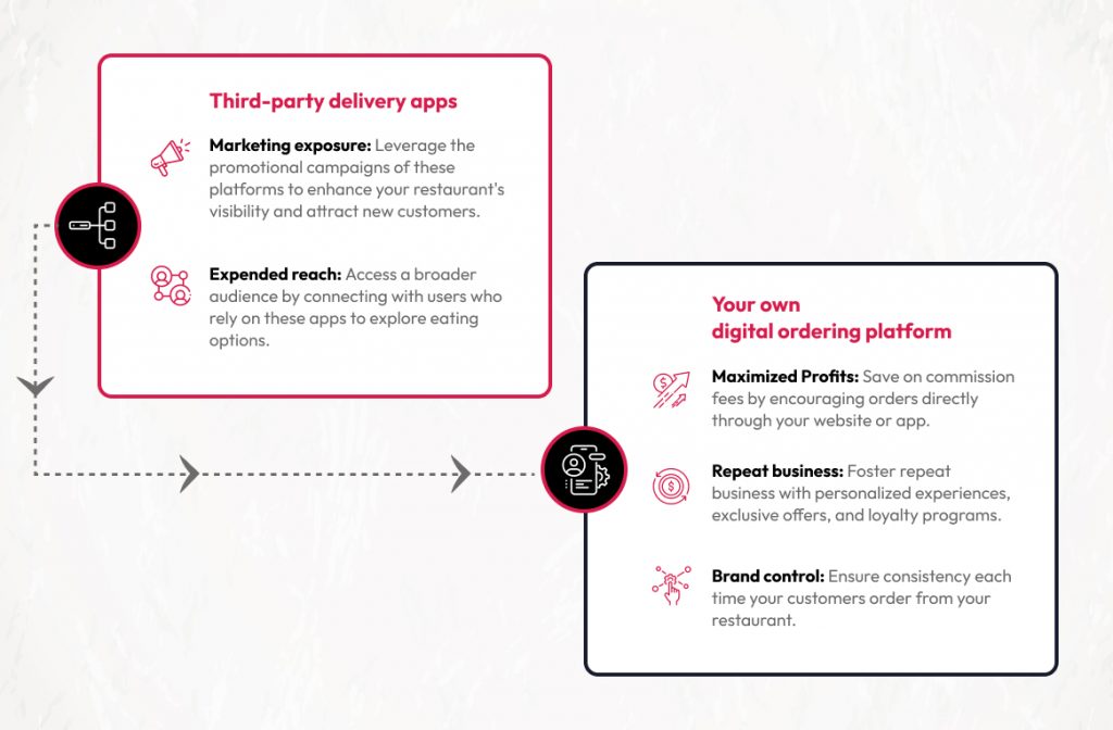
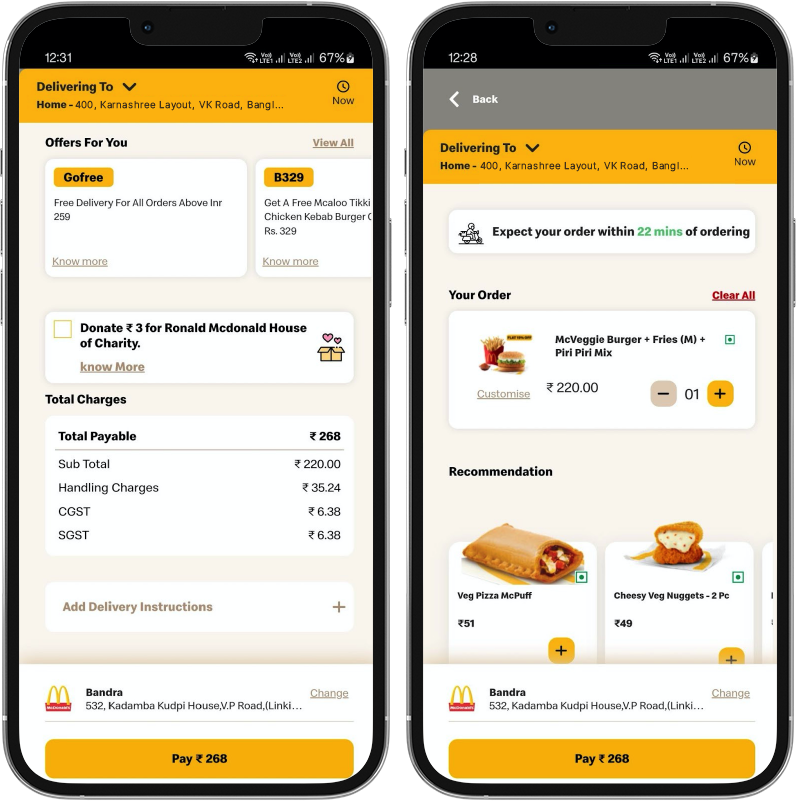
Technology interventions also enable opportunities for retailers to experiment with delivery models, innovative solutions, and collaborations to create market differentiation and optimize costs. When fast-food chains like Domino’s and McDonald’s built in-house delivery capabilities, they turned to technology to orchestrate online customer experience, automate order taking, and coordinate driver delivery, giving them greater control over the delivery experience. Emerging technologies continue to redefine the last mile segment, offering businesses new ways to evolve all the time.
Here are some innovative technology solutions that truly stretch the possibilities of the last mile for ecommerce players and delivery service providers:
• Drones complement autonomous delivery modes
The use of drones to deliver packages has immense potential to solve last-mile reach and challenges of speed and cost, while also offering an environmentally safe and sustainable option to ground-based delivery vehicles like trucks or cars. In 2021, retail giant Walmart partnered with DroneUp, a global leader in drone technology, to launch multiple airport hubs that would cater to delivery on demand. Today, Zipline’s drones drop off medicines and healthcare products in parts of the US as well as the remote corners of Ghana and Rwanda.
• Bots which help buyers
While home delivery bots are not yet fully autonomous, they are drawing a lot of investor attention. Starship Technologies is one example; the company uses self-driven delivery bots that can cover short distances, moving at pedestrian speed to deliver parcels, groceries, and food. They have successfully fulfilled millions of orders around the world without human intervention. Domino’s partnership with robotics company, Nuro is another example where bots deliver pizzas.
• On-the-go traceability and route optimization through GPS
GPS technology has been the foundation of the last-mile delivery segment. Using GPS tracking for customer orders not only helps the retailer/fleet service provider track the number of orders out for delivery but also optimize the number of drivers deployed, chart faster routes and service pending orders. In fact, driver management and route optimization by robust algorithms are making a huge difference in improving operational efficiencies and reducing fuel consumption. A delightful benefit of tracking technology is that customers are able to see where exactly their order is, and delivery staff can coordinate directly, reducing the load on operations teams and customer service. Static optimizers which create one-time optimal routes for delivery can become ‘dynamic’ by taking into account real-time traffic scenario of the area and re-adjusting the route.
Technology is set to play an even bigger part in transforming last mile delivery
While millions of stores have rapidly adopted technology, they have not completely eliminated last-mile challenges like cost and process inefficiencies. Traditional retailers need to make additional investments to match up to the popularity of direct-to-consumer brands who have ready access to mature last-mile solutions and logistics service providers.
They need to choose from the wide array of technologies available to them, to understand the capability and benefits, as well as the integration, scalability and security challenges of each.
Besides GPS, which is the backbone of last mile delivery to customers, it’s also important to integrate technologies that link up the warehousing and storage aspects with the delivery to customer service sector.
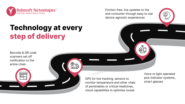
Like the RFID tags popular in warehousing for tracking inventory, barcode and QR code are set to play a key role in last mile delivery wherein the delivery person scans the code that sets off a notification and status update corresponding to it. Feedback links can be sent to the customer so that they are fully engaged during the last-mile journey of the package.
Sensors are proving to be a cost-effective means to are being delivered. They can also be strategically used in automating certain processes of warehouse management, which is now a critical area as retailers scramble to fulfil reduced turnaround times.
Using GPS live tracking for customer orders will not only help the retailer/fleet service provider track the number of orders out for delivery but also optimize the number of drivers deployed and available to service pending orders. Here too last mile fleet solutions like GPS and Google Maps Platform are helping ensure the end-user is able to track and review the last leg of order fulfilment.
Technology is also available to help the system to accurately pick the item from the nearest store in which it is available thus speeding up the process. These include pick indicator systems, which could be voice- or light-operated that locate the item and apprise the system accordingly. Smart glasses like the ones offered by Google Glass are making their way into warehouses helping operators locate, pick, and place the item(s) for delivery.
Last mile delivery software and cloud capabilities embedded in shipping will help optimize routes and direct delivery operators with updated information and maps throughout the journey. The software eliminates guesswork by mapping routes based on actual data of traffic jams, road repairs, detours, weather forecasts etc. and thus, averts stressful traffic situations and delays for drivers.

Designing the UX for the last mile in retail needs business insight and user contexts
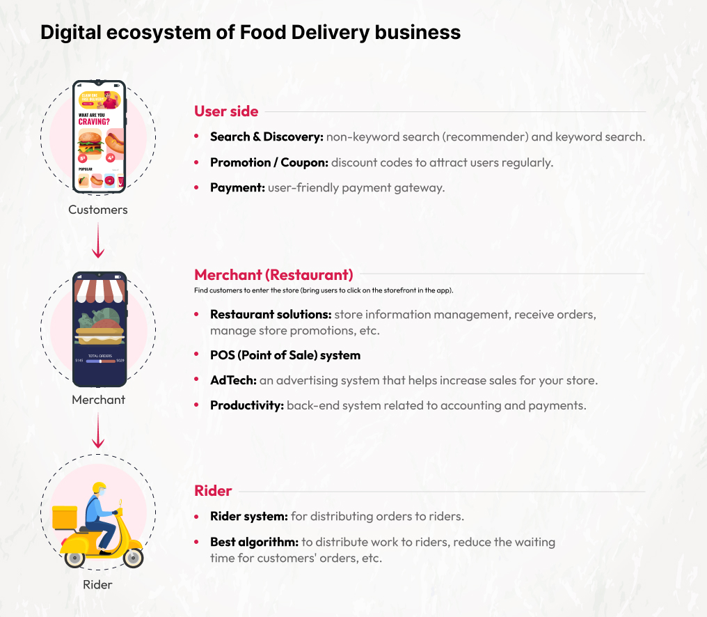
The ecosystem of the last mile is like the players of a complex symphony in which technology plays the role of an orchestrator – bringing together the warehouse, the products and inventory, the delivery staff and the customers. It unifies and coordinates the roles of different players who come with deep understanding of their specific domains and processes. Therefore, designing any application in the last-mile must draw from the needs of the multiple users – the warehousing staff, fleet operators and drivers, delivery staff, customer service staff and of course, the customer.
To start with, they’ll need to design apps and websites that have the right architectural framework, audience connect and personalization with end-users, and integrate seamlessly with last mile delivery platforms and warehousing. Like ecommerce giants such as Amazon, Walmart, Alibaba, and Otto, they must capitalize on technological advances to enhance the overall customer experience and secure their brand loyalty.

Here, thoughtful design that draws its information from technology, can play a crucial role in addressing changing expectations and needs of modern buyers while ensuring the last-mile-delivery platform is set up in a way that facilitates fast, frictionless, and enduring experiences.
Typically, last mile delivery can be split into four main stages based on which design of the user interface can be developed by strategically thinking and mapping the various aspects and requirements of each stage.
Stage 1: Goods are picked up from the warehouse based on order requests that need to be delivered to the end users.
Stage 2: Routes are optimized, and delivery personnel allocated to fulfil the order.
Stage 3: Tracking of orders to avert any losses along the route.
Stage 4: At the drop location, the fulfilment of order needs to be verified.
At each stage, design thinking uses insights from technology to play an important role in ensuring seamless and smooth order fulfilment. At stage 1, for example, it needs to pivot around aspects such as:
• What is the type of delivery?
o Regular
o Refrigerated – medicines, blood, organs, food perishables- end to end cold chain
• What are the possible delivery methods?
o Delivery person/van/bot
o Drones (remote places, urgent deliveries, small payloads)
• What are the delivery options?
o Home delivery
o Kerbside delivery
o Pickup at nearest showroom/center
At stage 2, specific design considerations must be made. One essential design feature is for checking the end user’s availability at the time of drop so that the delivery route is worked out based on availability.
At stage 3, the tracking feature must be embedded in the design to ensure the delivery proceeds as per schedule and any changes or detours are noted, and updates are provided to the end user accordingly.
At stage 4, design needs to consider the delivery option chosen. For example,
• In case of kerbside delivery, the facility to generate a QR code must be embedded so that items can be matched with the customer’s details.
• If C.O.D is included, then a feature to collect inputs on the customer’s availability must be included.
The technology behind last mile can be anything from autonomous delivery modes using robots, drones to big data analytics and forecasting using IoT systems, connected vehicles, sensors, and even smart dust. All of them want to remove any cause of friction, delays, and unnecessary expenses in this all-important phase of delivery.
With thoughtful design, countless innovation possibilities unlocked by technology will come alive for ecommerce businesses – from industry leaders to freshly sprung entities. And so, they can aspire to breach the last mile while guaranteeing the last impression of the brand is as good as the first.
