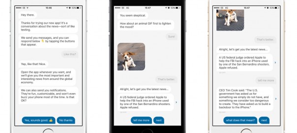
The new iPhone app from Quartz was all the rage in social media last week – it generated a lot of coverage and buzz. Dubbed as an ongoing conversation about the news, it breaks all the conventions about how a news app should be.
News apps have followed a certain look for a while: top or trending stories, sections on topics like tech, business, world news etc. Sure they have delighted consumers. Some of the apps in this space have a loyal base as it helps them navigate through truck loads of content as these are presented in neat little buckets – a reader can find a topic easily. Even personalised apps which present content based on one’s interests or those which present most ‘shared’ news articles follow a linear, one-story-after another approach. In this context, it is refreshing to see a news app which is not a simple replica of the website. The Quartz app (iOS only for now) is based on a bot UI model. Not only is the format refreshingly new, the interactions bring a smile, thanks to the use of contextual questions, emojis and gifs. The news about gravitational waves being detected evinced a ‘what took so long?’ question along with Screaming Face Emoji. There are a whole lot of other contextual questions and ‘reactions’ related to the news at hand.
It got me thinking about how mobile apps can evoke emotions in users and how it can impact the brand in a subliminal way. In my view the Quartz iPhone app is likely to make the reader feel happy while using the app, thanks to the contextual, often-light hearted reactions to a news item. So the micro moment when the app is used (the app sends out a ‘you are all caught up’ message after a few stories in any case), is made pleasurable, delightful. The app uses the notification centre too, but again differently with a ‘chart of the moment’. To me, these set of features subtly cue ingenuity and inventiveness and such emotions are then transferred on to the brand. Over time, such positive emotions build loyalty towards the app and actually make one look forward to using the app.
Our tagline ‘Emotion Engineering & Design’ in a way, is a summation of this approach. A mobile phone is an extremely personal device and interactions with a mobile app in it has the potential to trigger emotional responses. One-third of the time spent on a mobile device is on mobile apps – so it is critical to factor in features and interactions which have the potential to emotionally impact a user, right from the planning stage to the design stage. It is not just about how pretty an app looks. Next time you use your favourite mobile app – be it a news app or utility, think for a moment on how emotionally engaged you are with it. The Quartz iPhone app is certainly one such app.
An edited version of this article first appeared here.


