Tag Archives: Mobile Apps

Mobile Technologies

How mobile apps are bringing a new era of employee engagement

In the 1970s when Dave joined his first company, he was excited about the health benefits, insurance and other monetary benefits that his company was offering him. He stayed with this organization for over 30 years before retiring for a peaceful life.

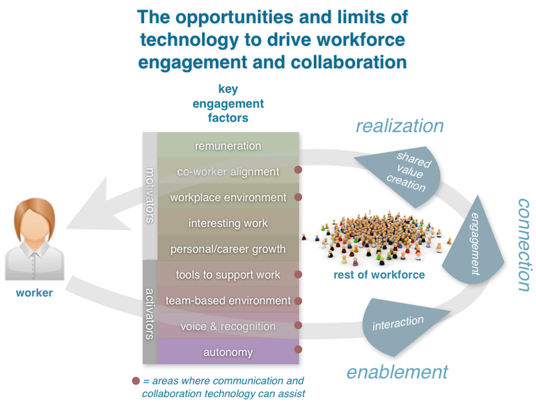
Today, Dave’s son Rob has shifted 3 jobs in a matter of 7 years of his experience. While he does look forward to the monetary benefits offered by the enterprises he joins, his criteria for choosing or staying in a job are poles apart from his father. For Rob, the critical aspects of a workplace are – flexibility of working from anywhere, interesting work opportunity and the overall workplace environment.

This scenario and Rob’s expectations from his workplace speak for the most of millennial generation today. Millennials will make up the largest age-group of the global workforce and most millennials expect their organisations to provide means of employee engagement.
Employee engagement social business digital mobile

Image source

However, what exactly is employee engagement? While it might seem that keeping employees happy and giving them benefits like – game rooms, Friday nights, bean bags, etc. is enough, employee engagement is much more than that.

According to Forbes –

‘’Employee engagement is the emotional commitment the employee has to the organization and its goals. This emotional commitment means engaged employees actually care about their work and their company. They don’t work just for a paycheck, or just for the next promotion, but work on behalf of the organization’s goals.’’

Employee engagement isn’t just about keeping employees happy or satisfied, it is about making sure they are giving their best to the organization in terms of productivity.

However, this is something that hasn’t been addressed by most organisations. According to a research, only 13% of employees working for an organization are engaged. For almost 42% of organizations, their top performers are not engaged with the workforce.

Now give this a thought; the top line of the enterprises, who are driving the maximum productivity for the company aren’t even engaged with the company, which in turn is affecting their productivity and finally company’s ROI. No wonder, this low rate of employee engagement costs US economy more than $500 billion per year.

It is clear that low employee engagement not just creates a negative work environment it is also affecting enterprises’ balance sheets. However, prudent organisations have started taking employee engagement seriously.

Over $720 million per year is spent on employee engagement in the US. After talent recruitment with right skills, companies see employee engagement as one of the critical challenges that they face.

Understandably so, because organizations with engaged employees outperform those with low employee engagement by a whopping 202%.

Hence, it is clear for enterprises that employee engagement isn’t a boat that should be missed.

As mentioned earlier, millennials and Gen Z are set to form the largest population of the workforce and their love for smartphones isn’t a hidden fact. Almost 70 percent of employees keep their phones “within eye contact” at work.

Today’s digital natives are constantly on their phones. When it comes to the workplace, they expect their enterprises to provide them with technology to engage them and make their lives easier, they want communication to be simplified and information to be immediate, interactive, and accessible everywhere.

According to Forbes, employee engagement is-

“the emotional commitment the employee has to the organization and its goals. What we have to realize is that an engaged employee is not just bothered about a huge salary and swanky benefits.”

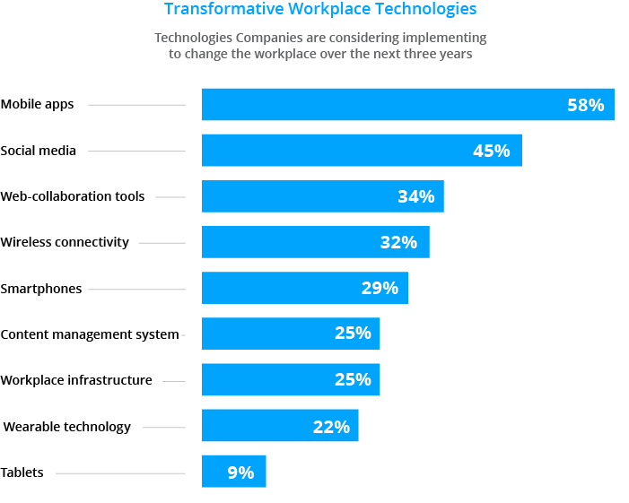
To meet the needs of the new-age employees, organisations are deploying various technologies to boost employee engagement and mobile apps top that list
Employee engagement

Image source

Here are some areas where mobile apps can be beneficial in boosting employee engagement.

Peer to peer communication

Millennials expect their workforce to be friendly, where communicating with colleagues is easy and informal. Today’s employees have smartphones with them all the time. Further, according to an Adobe research, almost 81 percent, say technology that helps them connect to colleagues more efficiently is important to their ideal workspace.

Having an app to make communication amongst employees will make their work easier and also help them respond at the earliest.

Payroll

Mobile access lets employees view payroll on their own time. Access payslips. Raise concerns/queries etc. It makes their lives easier because running to the finance department every time they need access to their play slips or need any clarifications on salary can be frustrating and time-consuming.

HR operations

While most enterprises use various SaaS solutions or their own microsites for managing things like filling timesheets, raising requests, apply leaves etc. most of these solutions can be only accessed on their PCs or desktops. These processes if available on a Mobile app, can make employees’ lives easier by giving them the flexibility to fill in timesheets or apply leaves at their convenience. These critical HR processes are typically housed in disparate systems across the organization.

By simplifying these processes, HR leaders can significantly reduce friction in their workers’ lives.

Internal communications

Millennials not just want to have a job, they want to feel valued and connected with their workplace. According to a survey by HBR, millennials rate ‘being valued’ as one of the critical aspects of being with an organisation.

As per Forbes

‘’An engaged employee wants to have a say in the business, they need to feel like they’re part of a team that’s working towards a common goal, and crucially, they need to feel that they are a valued member of the company – not just a tool for generating profit.’’

Keeping employees updated with the larger decisions of the organization and constantly communicating with them can help to keep the workforce engaged. More often than not, this critical aspect has been left to monthly newsletters and mass emails sent to employees, with no personal touch. No wonder most internal email newsletters have an abysmally lower rate of engagement. Despite this, most internal communication emails happen on desktops or PCs through official emails.

A mobile app can give a boost to the internal communication efforts of an organization. Using push notifications for alerting employees of news and events, can ensure higher engagement vs the ones received by employees on the company intranet from their office desktop/laptop. Also, by delivering time-sensitive materials, employees can quickly digitally sign and acknowledge receipt of policies in support of corporate governance and compliance. And because a mobile device is more personal than a desktop, HR can actually leverage mobility to get live employee input.

Interactive learning modules

According to a research by Deloitte – employees under the age of 25, rate professional development as their number one driver of engagement, and this is the number two priority for workers up to the age of 35. Providing interactive learning modules and solutions can help organizations fulfil this need.

Having a mobile app which facilitates learning can help employees grow and learn at their own convenience. Further, an app can help in providing an interactive learning platform for employees and studies show that interactive learning is much more effective than static learning. In other words, employees will absorb and retain more information through interactive modules than they would if you simply assigned them a book or an article to read.

Here are some mobile apps that are changing the game of employee engagement.

Microsoft Lync

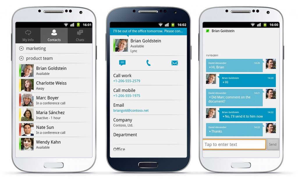
Microsoft Lync provides a unified communications platform, blending video, phone, instant messaging and collaborative work environments into one space. The app helps in-

  • viewing colleagues’ availability in real time and select the best way to communicate – initiating an instant message (IM), email, or a phone call.
  • connecting to conference calls with a single touch, without requiring long numeric passcodes or conference numbers.
  • forwarding or simultaneously ringing calls to Enterprise Voice (Lync ID) number so users never miss a call.
Microsoft lync Updated

Image source

Slack app

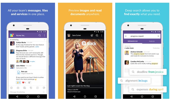
Slack app is like Facebook for the workplace. The Cloud platform is both a desktop and mobile internal team communication and engagement tool. The idea is to help teams consolidate their communications to one platform. Employees are part of “channels” which can be open or private. They can tag people, private message them and attach files. They can also search the whole archive on Slack to see what messages were sent.
Slack app

Image source

Engagedly

This is an employee engagement platform with built-in gamification for employee social collaboration, pulse survey tool, idea generation, and employee rewards. The app also allows for a 360-degree feedback, performance management, goal setting and eLearning. Engagedly takes a comprehensive and employee-driven approach to talent management.
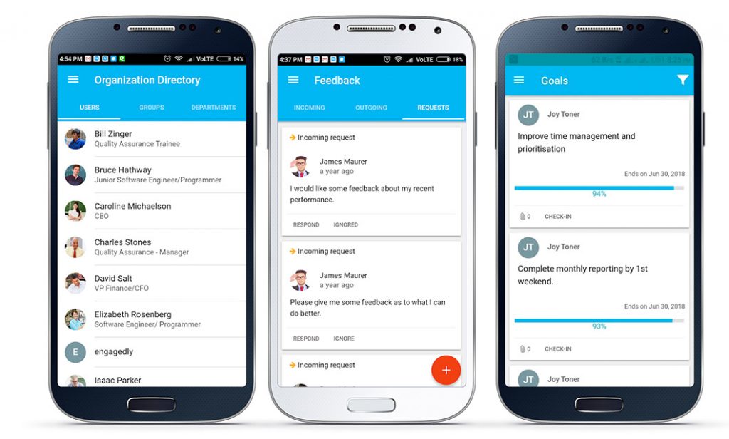
Engagedly

Image source

Developing a roadmap

Every organisation has its own structure and work culture. Depending on their needs, while for some organizations the ready-to-use software and apps suffice, others with disparate needs and innumerable departments and locations etc. might require a custom software or app for employee engagement needs.

Here’s is how enterprises can start their mobile app journey for employee engagement

Decide whether to have a custom app or an available suite of software

More often than not organizations tend to skew towards readily available SaaS tools in the market. However, it is essential to chart out one’s organization’s requirement thoroughly and then make a decision whether a custom solution or an already available product in the market will be best suited for your enterprise.

Voluntary vs. Mandatory

‘Engagement’ of any kind if forced isn’t engagement anymore. However, depending on which kind of tool the enterprise is deploying, it can be made voluntary or optional. For instance, while an app for internal communications or learning modules can be made optional. The one for team interaction can be made mandatory.

Choosing between a Native vs. Web App

While Native apps are a better employee engagement solution for various reasons, like their App Store deployability, user experience, and their ability to facilitate push notifications.

Web app is basically a website accessed through a mobile browser on a smartphone. Enterprises will have to carefully choose between the two, depending upon their budgets and requirements.

Deciding on the first Use Cases

Engagement apps in any organisations are deployed from the objective to create additional value for employees. Hence, the first use cases you roll out are so important. In order to ensure high onboarding numbers, it is important to launch the app with the right use-cases.

Deciding on the Content

While on a company intranet or microsite a lot of information can be shared. On a mobile app, it is important to keep the information to what is relevant. The storage space and user experience are critical reasons to carefully choose the content that should go on the app.

Modern intranets have come up with a growing number of new features and supported use cases. Mobile requires a new approach to content and functionality. When thinking about your app content, remember that it shouldn’t be a dumping ground for old intranet or newsletter content.

Ensure robust security measures

While a mobile app will give the flexibility and convenience to employees to access company information anywhere. It is critical to ensure security guidelines, to ensure that sensitive enterprise information isn’t leaked outside. Hence enterprises will have to think about app security inside the app as well as outside. For that first limit the information you put online. Every piece of content created for the enterprise’s internal website doesn’t need to be part of the app.

Align with the intranet roadmap

An employee app can be viewed as a channel displaying the intranet or as an addition to the intranet. What you need to decide is how content will be shared or not shared between the two platforms. Having a CMS solution might be an ideal situation in such cases. CMS system can help in customising and distributing information that isn’t highly confidential and is highly relevant to your employees. This way, content can be pushed to both the intranet and the app, while remaining safe.

Devise a rollout Strategy

When it comes to your launch, the question is whether to roll things out with a bang or to start with a soft launch. Experience has shown that a soft launch is more advisable.

A soft launch enables you to build your app from the ground up with the input of your employees and avoid the danger of launching a much-anticipated project that they don’t like and instead include them in the process.

In conclusion

In today’s digital world, an enterprise’s success depends on foresightedness, innovation and technology. However, using these three pillars are critical not just to connect with the consumers and the market outside, but also with the employees. To do so, companies will have to go outside their corporate comfort zone to design roles for a purpose-driven millennial workforce.

Mobile internal communication is the future of workplace communication, and mobile apps are enabling this change and paving the way for a more exciting and engaging work environment for the next-gen of employees.

Read More
Mobile Technologies

How healthcare services are getting smarter in the digital era

In today’s world ‘patient cycle time’ doesn’t start with a visit to a doctor’s clinic or a hospital and ends when the treatment stops.

It starts right from the time patients start researching on their ailments’ symptoms on the internet, look for doctors’ reviews online and book appointments on an app. And, this cycle goes on till patients get post-treatment consultations from their doctors via a chatbot or a chatting app like Messenger.

Digital technologies, especially in the area of Social, Mobile, Analytics and Cloud (SMAC), are helping in transforming the healthcare domain into an efficient, cost-effective, transparent and customized service.

Read More
Mobile Technologies

5 aspects brand owners should think about before ‘going mobile’

A brand is a collection of thoughts and images in a consumer’s mind. These are driven largely by product usage, communication experience and word of mouth. Brands are also businesses for brand owners – they need to deliver ROI in terms of profitability, consumer loyalty and a strong equity. So whether you are an established consumer or enterprise brand or a startup hoping to make it big, the rules of the game are the same.

Read More
Mobile Technologies

Let’s address the elephant in the room – How much does it cost to develop an app in 2017?

With billions of smartphone users across the world spending a humongous share of their day interacting with the device, every business is trying to get into the fertile land of mobile apps to engage with their customers. No wonder the number of apps in the app stores has skyrocketed to around 5 million. While every business big or small wants to get into the mobile platform, most aren’t sure of the investments they will have to make for a viable mobile app.

Read More
Mobile Technologies

Mobile Fintech vs Traditional Banking products: 15 awesome things winners do well

Both traditional banks and new fintech companies recognize that the ease of use of a digital product is paramount to client satisfaction. And as we all know – client satisfaction is key to overall customer engagement, sales, long term banking-client relationships and growth.

But do banking executives understand just how important an exceptional user experience is for consumers?

The short answer is no.

Read More
Mobile App

Mobile Fintech vs Traditional Banking products: 15 awesome things winners do well

Mobile Fintech

Both traditional banks and new fintech companies recognize that the ease of use of a digital product is paramount to client satisfaction. And as we all know – client satisfaction is key to overall customer engagement, sales, long term banking-client relationships and growth.

But do banking executives understand just how important an exceptional user experience is for consumers?

The short answer is no.

As of 2017, banking executives are completely missing the mark at correctly understanding the rise in popularity for fintech products. It all comes down to the user experience. Banks are misinterpreting and miscalculating the role user experience plays in the overall satisfaction customers have with a banking product.

In this article, we will show a series of 13 different user experience features which have reached mass adoption among consumers. In doing so, we want to help banking executives visualize the difference between what their digital experiences offer and what consumers expect. And, hopefully, help them bridge the gap.


Before we begin though – in case you’re wondering, here’s the data showing that banking executives and consumers are NOT on the same page when it comes to what is important for a banking product to satisfy the needs of an end user.

Fintech vs Traditional banks – attitudes and missed expectations

In 2016, Capgemini Consulting in collaboration with EFMA conducted a global study to gauge customers’ attitudes towards financial service companies – banks and fintech companies alike. As part of the study, the researchers asked customers to rate the most important reasons why they are using financial products coming from fintech companies. In parallel – they asked banking executives to do the same.

The results show a complete disconnect between what consumers want and appreciate about fintech and what banks think consumers appreciate about fintech products.

Image Source: Invoiceinterchange.com

To banking executive’s credit – 89% of them got it right. Ease of use is the number 1 catalyst for fintech adoption.

But what they completely missed is that 80% of consumers rank faster service and good experience as a primary reason why they’re using fintech products (the two being completely correlated). In contrast, only 40% of banking executives believe good service/ experience is critical to fintech’s rise in popularity. In addition, three key consumer reasons for choosing fintech over banks did not even make it to the banking executive’s list of reason for using fintech: faster service, more features, and lack of service by the primary bank.

Banking executives do not understand what consumers want.

This complete disconnect between consumer expectations and what banks are doing has had a significant impact on consumers’ overall attitudes on their primary bank. Consider the following stats to understand the result of banking executives missing the mark on user experience from the Millennial Disruption Index Report:

  • 71% of consumers would rather go to the dentist than listen to what banks are saying
  • 1 in 3 consumers are open to switching banks in the next 90 days if a better product is made available to them
  • All 4 of the leading banks in the US are among the ten least loved brands by Millennials
  • 33% of Millennials believe that in the next five years they won’t need to do business with a bank at all
  • Nearly 50% of Millennials believe that innovation in the banking industry will come from outside the banking industry
  • 73% of Millennials would be more excited about a financial service product coming from Google, Amazon, Apple, Paypal or Square than from their own national bank.

At its core of the disconnect between banking executives and consumers is the definition of user experience and faster service. Banks have put complex processes in place to cater for virtually every use case and customer complaint imaginable. But what did not do, for various reasons (compliance, security, silos etc.), is to integrate the various components into a seamless experience.

In other words, it may very well be that the definition and implementation of good user experience is where traditional banking is falling behind. To mitigate this, here’s a series of clear user experience best practices fintech companies use that keep customers happy – and make them transition from banks to fintech alternatives. It is worth noting that various banks use some of these UX practices as well. However, collectively, very few traditional banks adhere to the majority of these UX rules.

Integrated products & services (Mint and YES Bank)

Let’s face it. We use a wide variety of financial tools and services to manage our lives. Different companies, different mobile applications, different user experiences, different controls, different interactions.

It gets tiring to jump from one product to another at every given moment to get a good feeling of your overall financial life.

That is why Mint.com has managed to grow from nothing to 20 million active users in only 11 years. What Mint.com does is to order and organize your entire financial life in a seamless way to give to a bird’s-eye view of your financial life.

Integrated products & services (Mint and YES Bank)

Any company out there which believes complexity cannot be simplified and turned into an easy to understand financial product should sign up for Mint.com.

This is an excellent example of a fully integrated product which combines, cash, credit cards, loans, investments, real estate, budgets, notifications and recommendations. All in one simple to use dashboard from which users can then dig into any separate section for additional details.

Some foresighted banks have also taken note of the integrated user experience that today’s consumers seek and have started offering integrated platforms for them. One such example is YES bank

YES bank’s mobile solution, YES Mobile 2.0 is developed keeping in mind today’s customer’s mobile lifestyle. The app offers consumers with a seamless omnichannel experience across platforms – smartphones, tablets and smartwatches. Further, the mobile app also has some innovative features to enable easy transactions on the app. Some of these are:

  • One-touch bill payment.
  • Speech to text capabilities to enable hands-free complaints/queries registration
  • On-the-go bill payments from Wearables including Apple and Android smart watches.
  • Easy transfer of money to phone book contacts, Facebook friends and Twitter followers etc.

With an extremely simple and customisable UI, YES Mobile 2.0 scores high when it comes to being a user-friendly app.

YES Mobile 2.0


Personalized recommendations (Credit Karma)

Credit Karma is a simple credit history monitoring tool with an added benefit. Whereas they can use the service for free, they will receive personalized recommendations based on their credit reports, credit card usage and other factors. What is very interesting – and smart – for Credit Karma is that while offering these suggestions they also inform their users of their odds of acquiring a new line of credit – credit card, loans, mortgages and more. And most importantly, the user experience is clean, easy to follow and to act on it.

CreditKarma

But most importantly, Credit Karma leverages both business rules and UX best practices to create one of the most delightful experiences from a user point of view. For every recommendation – Credit Karma gives the user the approval odds, the annual fees and other terms, allow the user to start the application process or to read more about the fine print for each offer.

Effortless digital savings (MAXIT @ MyUniverse)

Some apps seem like they are from the future, and this is one of them. MAXIT is so far ahead of the game is seems unfair. One such example is Aditya Birla Group’s mobile app MAXIT @ My Universe which was launched to help customers save more money every time they spend through their credit/debit cards. Aditya Birla Group has businesses across verticals like retail, fashion, telecom, finance etc. They noticed that their customers carry most of their transactions through cards. However, they are not fully utilising the rewards and offers available to them. The MAXIT app helps users keep track of all their spends, discover best offers and use the best card for a purchase.

The app is extremely user-friendly with an intuitive interface and boasts of some interesting features like:

  • Curating best offers based on the users’ spending patterns.
  • Notifying the customer of the best offers based on their geo-location
  • Analysing customer’s spending patterns and design exclusive offers.
  • The MAXIT Savings Tracker keeps track of all the offers availed by the customer and also recommends how they could have saved more.
  • There is also a live feed in the app which helps customers monitor their transactions in real-time.
MAXIT 2


The beauty of this app is the ease of use. For banking institutions, they realize that ease of use is important, but this app really drives that home. Without even trying, it is able to recommend the best deals to save users, and that creates satisfaction. You may not be a deal saver as a bank, but banking institutions can definitely take a page from this book and help customers optimize card usage and other features for heightened customer satisfaction and loyalty!

Access credit card balance without logging in (Citibank)

Remember how users ranked “speed of service” as the second most important criteria on why they love fintech products? Citibank actually leads the wave of banking institutions that allow their customers to do just that. Instead of logging in to see the most frequently sought for account information, their mobile app allows users to get a glimpse of their account simply by firing the app:

Access credit card balance without logging in (Citibank)

It does not get any easier and user-friendly than this. Being able to access your checking balance, your credit card balance and due terms is the very definition of a quick and smooth user experience.

Touch ID fingerprint sensor (American Express, Citibank, Credit Karma, Paypal and more)

Touch ID single level authentication continues to grow in popularity for most applications in the App Store. It’s simple, elegant, secure, dead easy to implement for the banking companies out there. And yet – it is still not widely implemented in the banking world. Why?

Touch ID fingerprint sensor

Image Source: Amex Mobile iPhone app adds easy account login w/ Touch ID fingerprint sensor

Not only is Touch ID a great and speedy way to help people get to their financial information faster, but it is also becoming a standard that users expect. As Touch ID grows in popularity as an authentication protocols, banks who do not use it (JP Morgan Chase – we’re thinking of you!) risk to annoy their users by not adopting a commonly used user experience practice.

Instant usage notifications (American Express)

I bank with eight different companies – Citibank, American Express, Capital One, Pay Pal, Chase, Ally Bank and Bank of America and Discover. It is very surprising to me that of the eight companies, American Express is the only one which proactively notifies me every single time I swipe the card. As soon as a transaction goes through (in store or through digital means), Amex sends me a notification like the one shown in the screenshot below.

Instant usage notifications

A simple yet powerful user experience, these notifications serve a dual purpose: I get to know when a transaction has cleared my account, and it behaves as an anti-fraud mechanism. Imagine if I had received such a notification and I had not gone to Whole foods. I’d have immediately called Amex to dispute the charge and request a new card. It is

Seamless digital payment option (Apple Pay)

As a native experience inside of the iOS ecosystem, Apple Pay has an unfair advantage. It is literally impossible for banks to create something simpler than this. For readers who are not iOS users, Apple Pay works by double tapping the home button. It then pulls up the Wallet application allowing users to pay at different retailers with the default card on file.

Seamless digital payment option (Apple Pay)


For various reasons tied primarily to business decisions and strategic partnerships, a large number of US banks still do not allow iOS customers to add their credit card to Apple Pay. For banking institutions who hope their card becomes the “go to card” in the wallet, such a strategy is short sighted. As we mentioned, Apple Pay is the simplest, most convenient way for users to pay in the store. If you can’t beat them, join them. And, if you don’t want to join Apple, at least try to allow for mobile payments within your own mobile application.

Instant settlements (Amex)

One of the reasons financial experts are excited about blockchain technology and its future is the fact it allows for instant settlements vs the current 2-3 days wait time to reconcile the ledger with the payment made. American Express is one of the few companies in the financial sector which allows for payment settlement to occur immediately.

Instant settlements (Amex)

In other words, as soon as Amex users submit a payment on the website or the mobile app, their available balance and amount due are reconciled on the spot. That gives users an instant gratification with regards to leveraging Amex products and shows how the company is really invested in making it right by the user.

Text message notifications (Digit)

Digit is a fintech savings platform which analyzes a person’s checking account balance and spending habits and subtracts a small amount from the account every 2-3 days which is deposited in a savings account.

The company operates exclusively on chat bots and communicates with their users via text messages.

Text message notifications (Digit)

The beauty of Digit is its incredible simplicity, coupled with banking integration and a UI-less interface. In fact, Digit may very well be the first successful example of artificial intelligence in the banking sector. As a user, getting daily text messages around 9 am from Digit has become a habit – something I welcome and look forward to. Banks should explore the various chat bot options on the market today and figure out how they can make their customers’ user experience even more frictionless with the adoption of chat bot technologies. Also, Digit is pioneering the wave of conversational banking – by making interactions sound and feel natural through their jokes, informal communication styles ( “Yo, Codrin”) and more.

Location based services: seamless ATM/ branch locator integration (Spark for Business from Capital One)

There are very few recurring tasks that users of banking products would need to complete on an app on a recurring basis. Most of them are tied to checking the balance of a card, making a payment or looking at recent activity. Another use case is locating a nearby branch to complete a specific task. Spark for Business from Capital One makes this task incredibly simple by integrating an ATM location right on their dashboard. It looks like this:

Location based services

By natively integrating with a maps tool, Spark allows their users to easily locate a branch or ATM with a single tap without ever leaving the app.

In India, YES Bank makes this task incredibly simple and modern, by using Augmented Reality to help locate nearby ATMs and branches. Not only is this convenient, but also fun for users!

YES Bank allows their users to easily locate a branch or ATM with a single tap. Not just that, it also displays relevant offers based on the users’ geo-location.

Yesbank

These are some astoundingly simple examples of a user experience that is entirely customer focused which deserves mass adoption among the financial services companies.

Centralizing all account types in one simple digital experience (Chase)

In 2016, Chase bank underwent a substantial redesign of its digital platforms (online and mobile). When complete, industry specialists and UX designers praised the company for creating a very intuitive and simple to use interface. The new Chase experience looks like this:

Centralizing all account types in one simple digital experience (Chase)

In addition to a simple and clean UX design, the Chase platform is probably one of the most mature digital experiences in the world today.

The site and app are able to pull in information about all the different types of products a user is enrolled in with Chase regardless of its divisions. To that end, with one simple login, a user can access their checking balance, savings, credit cards and Home Mortgage information. And it can transact across all of them.

This may sound like a trivial functionality, but in a financial world marred by silos within the same company, this sort of holistic integration is NOT as common as it should be. And for the excellent user experience above and its integrated banking experience – Chase get a well-deserved thumbs up!

Reduce all complexity to the most critical user flows (Paypal)

Paypal is another big player in the financial sector which has undergone a substantial mobile app redesign in 2016. For a company where its users have a huge amount of tasks, they can potentially engage in, achieving simplicity and visual beauty is no simple task. Their dashboard – from where users can engage with the most critical flows – is simply beautiful and striking in its simplicity.

Reduce all complexity to the most critical user flows (Paypal)

Beyond its simplicity, PayPal gets a big hand of applause for visually and logically grouping the options presented to the end user by the three major tasks it allows customers to complete inside the app: manage their funds/ credit card, sending or requesting money, and paying for goods and services. In addition, the app allows users to add their loyalty cards to PayPal and quickly access them on demand. Beautiful, PayPal – simply beautiful!

Accessing statements natively (AMEX)

Most banks allow for a fairly smooth mobile and web experience but somehow moving away from the “paper” view remains an obstacle most financial institutions have yet to overcome. That is why the widest majority of banks today serve mobile users and web users with a pdf file for their statement. American Express is moving away from this old fashioned trend by natively serving the statement, in line, versus in the form of a PDP.

Accessing statements natively (AMEX)

With the new experience for the activity history and statement history, users can access any statement in the last six months and can see the statement balance, payments as well as each charge placed on the account for the respective billing cycle. Gone are the days when the user would be served with a PDF file that was not mobile responsible and could not be easily scanned or analyzed.

Password entering and password retrieval (Acorns)

Sometimes we forget our passwords – it’s natural, and I am sure it has happened to every user reading this article. Or sometimes we fat finger our password on a mobile device and the credentials are not recognized. The question becomes how easy can the user deal with these specific use cases. Of all the fintech and banking products out there, Acorns, a penny-saving fintech solution, has the single best user experience for both use cases.

First and foremost, Acorns has adopted the widely accepted retail practice of allowing users to unmask their password. This is an acceptable practice which reduces user authentication errors. By simply adding a “show” button, Acorns makes the login experience just a little easier.

In addition, the password reset flow is as simple as they come. Once the user clicks on reset password they are shown a simple 1 step screen requesting the user to enter their primary email address:

Password entering and password retrieval (Acorns)

Once the user enters their password, they will get a password reset email with a trusted link which in turn will quickly allow the user to reset their password.

Smart Watch Compatibility (Motilal Oswal Smart Watch App)

These days, everything is about speed. How fast can I get something done and move onto the next task. Motilal Oswal, an online share trading company gets this concept, and acted on it. What is quicker than looking at your watch and being able to check your investments. With the app, users don’t even need to pull out their phone; it’s that fast. With the Smart Watch App, this company is literally changing the game so investors can monitor stocks far easier than before, keeping afloat with the latest in the market and being able to make quicker decisions.

Motilal Oswal Smart Watch App

With this app, not only is the company filling a need, but creating customer satisfaction and engagement. Investors now have an app that they can use for far superior supervision over their holdings, so they are happy, but also are using this app constantly to check on these investments, creating engagement.

This is a win-win for all sides, and something banking institutions need to take a note from because filling a niche for quick access benefits not only the customer but also the bank when their product has high engagement!

Summary:

Contrary to what many banking executives believe, the user experience is of critical importance to why customers are running in flocks from the traditional banking experience. The World Fintech Report 2017 shows just how popular fintech alternatives have become in such a short period of time (five years).

World Fintech Report 2017

The graph above shows a steady transition from traditional banking products to non-traditional fintech solutions.

At its core, fintech products succeed because they take a user centric approach to designing their products. They use best UX practices, compete over simplicity and beautiful designs and make the use of their digital offers as frictionless as humanly possible.

In this article, we wanted to show you some of the best user experience principles that banks and fintech products alike are implementing in an effort to compete for the attention and business of digitally-savvy users.

Individually, contrarians may argue, none of these user experiences are likely to convert a user or to keep them engaged in the long term. And that is true.

But collectively, these 15 user experiences are helping customers get to the information they need faster so that they can quickly return to whatever they were doing before firing up their banking app.

And that’s the standard every bank should live up to if they want to stay relevant in this new day and age.

Read More
App Development Featured Mobile Technologies

The mobile user is searching for apps – are you there?

Today’s smartphone user is consuming mobile apps at a staggering rate. In 2016, the no. of app downloads increased by 15%. Mobile consumers spend almost 89% of their Smartphone time on mobile apps and have millions of apps at their disposal. There are almost 2.8 million apps in Android app stores and 2.2 million in the iOS app store.

Read More
Featured Mobile Technologies

A Glimpse in to The Future of Mobile Apps: 9 Fascinating Apps Beginning The Change

A few decades ago all we could do from our mobile phone was make a call. Later, the mobile phones evolved and started coming with simple Java games, calculator, text messaging and calendar. And now we have come to the era of smartphone apps that have dramatically affected the way we interact with our smartphones today. Soon, the mobile apps we know as of now would evolve further, changing the way we think, work and live our life.

Read More
Mobile Technologies

Lovie Awards 2016: Honouring the best in mobile apps

Launched in 2010, Lovie Awards is one of most prestigious pan-European awards and perhaps the only award to honour the full breadth of the Internet including Websites, Social, Mobile & Applications, Online Advertising and Internet Video.

Read More
Featured Mobile Technologies

7 Apps That Entrepreneurs Shouldn’t Be Without

Entrepreneurs are notorious for putting in long hours to make their business a success. A survey shows the average entrepreneur puts in 52 hours a week, which is 63 percent longer than the average worker.

Read More
1 2