Data visualization is the process of translating data into a visual format, such as a chart or graph, to make it easier to understand and interpret. It is the key to unlocking the insights hidden in your data. It is a powerful tool that can be used to communicate insights, identify trends, and make informed decisions.
Data visualization is becoming increasingly important in today’s data-driven world. Companies of all sizes use it to improve their operations, make better business decisions, and communicate their findings to stakeholders. However, data visualization can be complex to implement, and many companies face challenges such as a lack of expertise, limited resources, data silos, and compliance concerns.
A digital transformation partner can help companies overcome these challenges and get the most out of data visualization. With their expertise, experience, and resources, digital transformation partners can help companies develop and implement data visualization solutions tailored to their needs.
How to Get Value from Data Visualization: A Step-by-Step Guide
Data visualization is a powerful tool for communicating insights and driving action. However, simply creating charts and graphs is not enough. To get the most value from data visualization, it is essential to take a thoughtful approach that considers the goals of the visualization, the audience, the type of data, and the design principles involved.
Here is a step-by-step guide to help you get value from data visualization:
- Define your objectives: What do you want to achieve with your data visualization? Do you want to inform a decision, drive action, or communicate a complex idea? Once you know your objectives, you can choose the right visualization type and design approach.
- Know your audience: Who will be viewing your data visualization? Tailor the visualization to their knowledge and interests. Consider their level of expertise in the subject matter and preferred style of consuming information.
- Choose the right visualization type: Many data visualizations are available, each with strengths and weaknesses. Choose a visualization type that effectively represents your data and aligns with your objectives. Some common types include bar charts, line charts, pie charts, scatter plots, and heat maps.
- Simplify and focus: Keep your visualization simple and clutter-free. Remove any unnecessary elements that do not contribute to the message. Focus on highlighting the most critical insights or trends within the data.
- Use appropriate scales: Ensure that the rankings and axes in your visualization are relevant and do not distort the data. Use linear or logarithmic scales as needed. Label axes, including units of measurement, to aid interpretation.
- Emphasize storytelling: Craft a narrative around your data visualization. Explain the context, background, and significance of the data. Guide your audience through the story your data tells using annotations, captions, and headings.
- Interactivity: Consider adding interactive visual elements, such as tooltips, filters, or drill-down options. Interactivity can engage your audience and allow them to explore the data independently.
- Data integrity and accuracy: Ensure your data is accurate and current. Any errors or inaccuracies can lead to misleading conclusions or a lack of confidence in the tool. Cite your data sources and provide transparency about any data preprocessing or transformations.
- Design aesthetics: Consider design principles like color choice, font selection, and visual consistency. Use color purposefully to draw attention to essential elements or to represent categorical data. Today’s audiences typically react better to flat design principles.
- Test and iterate: Once you have created a draft of your data visualization, test it with a sample of your target audience to gather feedback. Continuously refine and improve your visualization based on user feedback and changing requirements.
- Mobile and accessibility: Ensure that your visualization is accessible to a wide range of users, including those who are color blind in some spectrums. Optimize for mobile devices, as many people access data on smartphones and tablets.
- Measure impact: After deploying your data visualization, measure its effects on decision-making or understanding. Analyze user engagement and gather feedback to assess whether your objectives were met.
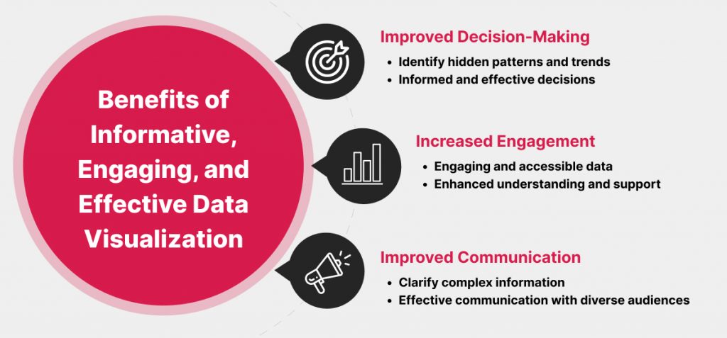
By following these steps, you can create data visualizations that are informative, engaging, and effective. This approach is valuable because it helps to transform raw data into meaningful insights that can inform decisions, drive action, and communicate complex information effectively. Effective data visualization can make data more accessible, engaging, and memorable, leading to better-informed decisions and improved communication of insights to a diverse audience.
Critical Attributes of a Data Visualization Tool
When choosing a data visualization tool, it is essential to consider the following critical attributes:
- Ease of use: The tool should have an intuitive interface that is easy to learn and use, even for users with limited technical expertise.
- Data integration: The tool should be able to import and connect to various data sources, including spreadsheets, databases, cloud services, and APIs.
- Visualization types: The tool should offer various visualization types, including bar charts, line charts, pie charts, scatter plots, heat maps, and maps.
- Customization options: The tool should allow you to customize the appearance of your visualizations, including colors, fonts, labels, and interactive elements.
- Interactivity: The tool should support interactive features, such as tooltips, drill-down options, filters, and hover effects, to enhance user engagement and exploration.
- Performance: The tool should be able to handle large datasets and complex visualizations without significant lag or slowdowns.
- Export and sharing: The tool should allow you to export visualizations in various formats, such as images, PDFs, and interactive web formats, and easily share them with others.
- Collaboration: If you need to collaborate on data visualization projects, consider tools that offer real-time collaboration features and version control.
- Integration with other tools: Check if the tool integrates with other software you use, such as data analysis tools, business intelligence platforms, or reporting software.
- Automation and templates: Some tools offer automation features and templates to streamline the creation of standard visualizations and reports.
- Data security: Ensure the tool adheres to security and compliance standards, especially when working with sensitive or regulated data.
- Cost and licensing: Consider the pricing model of the tool and the total cost of ownership.
Optimizing Data Visualization: Key Errors to Avoid
The most significant mistake data visualization users make is misrepresenting or misinterpreting data due to poor design choices or a lack of critical thinking. This can lead to misleading or inaccurate conclusions and poor decision-making.
Some common errors and mistakes include:
- Misleading visuals: They can include using inappropriate scales, truncated axes, or omitting data points.
- Overcomplicating visuals: Trying to convey too much information in a single visualization can overwhelm the audience and make it difficult to discern the key insights.
- Lack of context: Failing to provide sufficient context or background information to help the audience understand the data’s significance or the visualization’s purpose.
- Ignoring data quality: Using incomplete, inaccurate, or improperly cleaned data can lead to incorrect conclusions and decisions.
- Choosing the wrong visualization type: Select a visualization type that doesn’t align with the data’s characteristics or the message you want to convey. For example, using a pie chart to show time trends.
- Ineffective use of color: Poor color choices can confuse or mislead viewers. Using too many colors, inconsistent color schemes, or failing to distinguish between categorical and sequential data can be problematic.
- Omitting labels and legends: Missing or incomplete axis labels are often a key source of confusion. Data legends are also important. Be sure to include information about the represented start and end time period.
- Not testing with the audience: Failing to gather feedback from the intended audience or stakeholders can result in visualizations that don’t effectively communicate the desired message.
- Overloading with data: Visualizing massive datasets without proper aggregation or summarization can result in cluttered and unreadable visuals.
- Copying reports without adapting: Simply replicating the visualization format of previous information on new data without understanding the appropriateness for that unique situation or audience.
- Failure to update: Not updating visualizations with new data or changes in the underlying dataset can lead to outdated and potentially misleading information.
To avoid these mistakes, data visualization users should:
- Prioritize data accuracy: Ensure the data is clean, complete, and current before creating any visualizations.
- Maintain a critical mindset: Be aware of the potential for bias and deception in data visualization. Question your assumptions and challenge the status quo.
- Seek feedback: Get feedback from the intended audience or stakeholders before sharing your visualizations.
- Invest time learning best practices in data visualization: Many resources are available to help you create compelling and informative data visualizations.
Effective data visualization is more than just creating appealing graphics; it’s about accurately communicating meaningful insights from data. By avoiding the mistakes listed above and following the tips provided, you can create data visualizations that are informative, engaging, and trustworthy.
How can a Digital Transformation Partner Help Enhance Data Visualization?
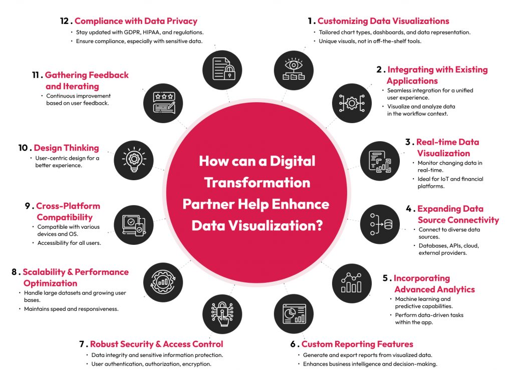
A full-service digital transformation partner can add significant value to a data visualization tool by:
- Customizing data visualizations: Developing custom data visualization components tailored to the specific needs and requirements of the company’s clients. This may involve creating unique chart types, dashboards, or data representation techniques not readily available in off-the-shelf tools.
- Integrating with existing applications: Integrating the data visualization tool seamlessly into the company’s software applications can help ensure a unified and streamlined experience, allowing users to better visualize and analyze data within the context of their workflow.
- Enabling real-time data visualization: Enabling real-time data streaming and visualization capabilities. This is valuable for applications that require monitoring and immediate insights into changing data, such as IoT (Internet of Things) applications or financial trading platforms.
- Expanding data source connectivity: Expanding the visualization tool’s capabilities by enabling connections to various data sources, including databases, APIs, cloud storage, and external data providers. This flexibility allows users to work with diverse datasets.
- Incorporating advanced analytics: Incorporating advanced analytics and machine learning capabilities into the data visualization tool. This can empower users to perform predictive analysis, anomaly detection, clustering, or other data-driven tasks directly within the application.
- Developing custom reporting features: Developing custom reporting features that allow users to generate and export reports based on visualized data. This is valuable for business intelligence and data-driven decision-making.
- Implementing robust security and access control: Security features like user authentication, profile-based access levels, and data encryption can help protect sensitive information.
- Optimizing for scalability and performance: Optimizing the data visualization tool for scalability and performance to handle large datasets and a growing user base without compromising speed or responsiveness.
- Ensuring cross-platform compatibility: Ensuring that the tool is compatible with various operating systems and devices, including web browsers, mobile devices, and desktop applications, to maximize accessibility.
- Applying design thinking: Ensuring the overall experience meets users’ needs.
- Gathering feedback and iterating: Continuously gathering user feedback to identify areas for improvement and refine the data visualization tool’s features and usability.
- Ensuring compliance with data privacy and regulatory requirements: Ensure that interactive user features such as drill-down capabilities do not inadvertently expose sensitive customer data in ways that were not intended.
Adding these value-added features and capabilities to a data visualization tool, a full-service digital transformation company can add considerable value and provide clients with more powerful tools for extracting insights from their data. This can increase customer satisfaction and create a competitive edge in industries that rely on data-driven decision-making.