Artificial Intelligence and its subset, Machine Learning, have dominated discussions across boardrooms over the last few months. CIOs, CTOs, CDAOs, and CMOs have all sought to dive deep into how the developments will impact various aspects of business. Let’s look at trends likely to have the biggest impact on the AI landscape in 2025.
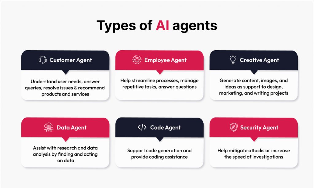
The proliferation of AI Agents
An AI agent is a system that uses AI to do three things: perceive its environment, process the information it gathers, and take action to achieve its goals based on that information. AI agents could be personal assistants like Alexa or Siri, automated systems for scraping information from the web, or financial trading systems. There are thousands of different possible AI agent use cases.
Since OpenAI is positioned to be a key player in this, let’s study it as an example of why this is on track to be a key trend. According to reports, OpenAI has 250 million weekly active users, and its leadership hopes to attain a billion users next year through AI agents that help people with their day-to-day tasks. Can that happen?
The money is certainly there. OpenAI raised over $6 billion in October and plans to raise even more money, including debt and equity. They’re spending over $5 billion a year on R&D and infrastructure. Meanwhile, more than 2,000 new employees have been hired, increasing headcount 5x over last year. Those new hires now include many people who are experts in building and monetizing consumer products.
We have three things going on here. First, the technology for agents is ready now. It’s possible now to build agents that are quite useful for everything from booking travel tickets to buying gifts for family and friends.
Second, OpenAI needs to monetize agents to keep investing at its current pace and maintain its leadership position. It has already assembled a team that intends to do just that.
And third, they have inked a deal with Apple, which gives them access to two billion owners of Apple products, and that rollout has already begun. That’s why some analysts say that OpenAI could achieve its aspirational goal of a billion users in the coming year. If you hit a billion users, you’re in the same class as Facebook and Google.
Meanwhile, Microsoft, Anthropic, and Google have also announced plans to launch AI agents in the coming year. Elon Musk, too, raised $6 billion to launch xAI.
Add it all up, and you can see that AI agents of various sorts are lining up to be a defining part of the AI and analytics landscape for the coming year.
Source: Google Cloud Report
Advancements in Generative AI, including multimodal applications
Another trend we’ll see is further advances in Generative AI, including multimodal applications that can process images, audio, video, and text. For example, AI can develop a much more cohesive understanding of a person’s emotions if it can process video of facial expressions, audio for tone of voice, and a transcription of the conversation. This is just one example of an emerging use case for multimodal GenAI.
Many companies, including OpenAI, Google, and Microsoft, are investing heavily in multimodal AI; meanwhile, edge devices are improving rapidly. We have better cameras, improved microphones, and more effective real-time processing capabilities.
Lightweight models on edge devices
Another significant trend we’ll see in the coming year will be a proliferation of lightweight models that perform well on edge devices at low cost. The cost of inference on top models has already fallen by 10x this year. But even lighter-weight models are coming into the market at about 3% of the latest cost for top models, so you can imagine who wins most of the market share in that story.
Of these AI trends, most of the hype and media attention will be on the rise of AI agents and multimodal GenAI because those are applications where technology directly touches businesses and consumers alike. The high-profile launches from each tech giant will get plenty of media coverage and capture the public imagination. By contrast, the emergence of lightweight, low-power models will be an important enabling development. Still, it’s not as sensational, so this will be a significant trend that gets comparatively less attention in mainstream media.
Connect with our data & analytics experts to kickstart the journey to make AI work for your business.