Tag Archives: Design

UX/UI Design

Designing for Connected TV: all you need to know to capture attention on the big screen

The way people consume content today is no longer confined to a single screen. The rapid adoption of Connected TV (CTV), the surge in mobile and tablet usage, and the explosion of streaming platforms have redefined viewing behavior.

The Leichtman Research Group highlights this shift in behavior. It reveals that two-thirds of U.S. TV households use more than one type of connected TV device, with an average of nearly four devices per home.

This evolving CTV ecosystem presents both an opportunity and a challenge for design teams. This blog explores the key design principles and real-world practices that can help product design teams create consistent and intuitive CTV experiences across devices.

Understanding the Connected TV ecosystem

Connected TV (CTV) refers to devices that let users stream video content directly to a television screen using an internet connection. This includes Smart TVs with built-in apps, streaming media players like Roku, Amazon Fire TV, and Apple TV, as well as gaming consoles such as Xbox and PlayStation.

CTV ecosystem

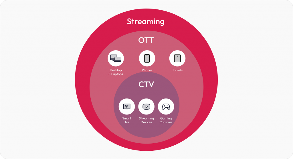
While CTV is a part of the larger OTT (Over-The-Top) ecosystem, it’s important to note the distinction. OTT covers all internet-based streaming, including mobile phones, tablets, laptops, and CTVs. But CTV is focused entirely on the TV screen experience, which often becomes the centerpiece of home entertainment. 

CTV design best practices

Designing for Connected TV isn’t just about scaling up mobile or web interfaces. It demands its own design thinking. 

The following best practices tackle the challenges faced while designing for CTV. Drawn from our work on platforms like Discovery+, these guidelines form a practical roadmap for building seamless, intuitive CTV applications that delight viewers across devices.

Visibility and clarity

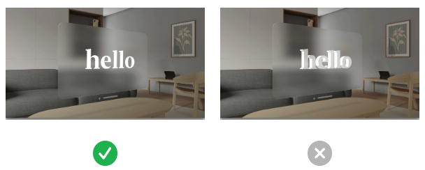
1. Design for the 10-foot CTV experience

Designing for TV screens is about rethinking how people interact with content from a distance. Most users view Connected TVs from 6 to 10 feet away, in a relaxed, lean-back position. This unique setting changes everything about how your UI needs to behave. 

The 10-foot experience requires larger, bolder interface elements and a layout that communicates clearly from afar. 

What we encountered

When designing the Discovery+ CTV platform, we noticed that poster titles and CTAs weren’t consistently visible on all TV models. This happened because some TVs, especially older or lower-end ones, still apply overscan, where the edges of the screen content are cropped to fit the display. As a result, critical UI elements near the bottom and sides of the screen would sometimes get cut off, making them hard to read or interact with.

How we solved it

We defined safe margins (5% padding) across all edges to prevent cutoff and ensured that critical elements like show titles and episode actions appeared in center-aligned zones, where the viewer’s attention naturally falls. We also refined gradients so they never interfere with text visibility.

10ft UI Connected TV experience design

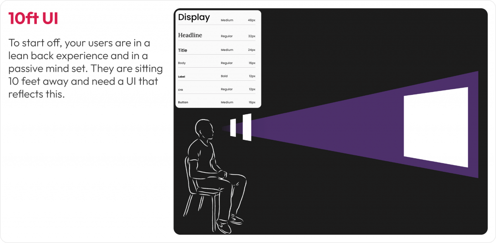
Image: Adapting layout, typography, and element placement for users in a lean-back mode

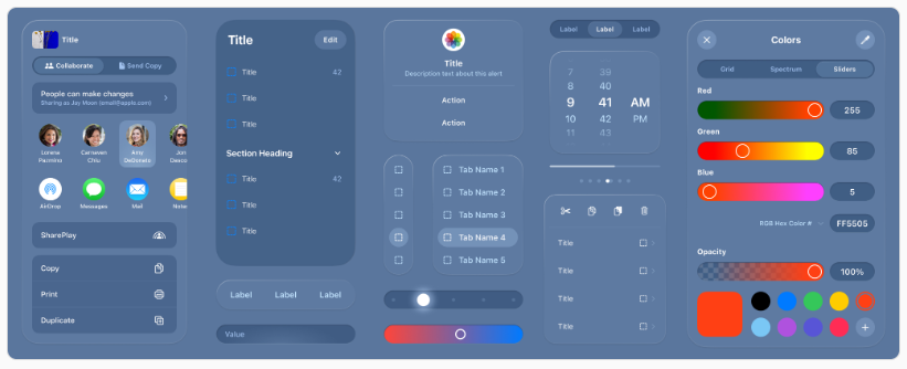
2. Design for overscan and safe areas

Not all TVs display content edge to edge. Some older or lower-end models still apply overscan, cutting off the outer margins of the screen. That means anything placed too close to the edge risks being partially or completely invisible to users.

Users may miss navigation cues, buttons, or labels that fall outside the “safe” visual zone. This can disrupt content discovery and lead to frustrating experiences where key actions (like ‘Play’ or ‘Watchlist’) are hidden from view.

What we encountered

In our early Discovery+ TV prototypes, poster titles and action buttons near the bottom and corners were inconsistently visible across screen models. Text overlapped with the gradient on some TVs or was pushed out of view entirely. This created confusion during usability testing, especially when users tried to interact with shows directly from thumbnail rails.  

How we solved it

We implemented platform-specific safe area guidelines, maintaining at least a 5% margin on all sides. On a 1920×1080 screen, that’s roughly 48 pixels horizontally and 27 pixels vertically. We also reworked the gradient overlays used behind posters so they didn’t obscure titles, and relocated actions like ‘Play’ or ‘Add to Watchlist’ into the safe zones, either center-aligned or inset with adequate spacing.

Visbility and overscan safety for CTV

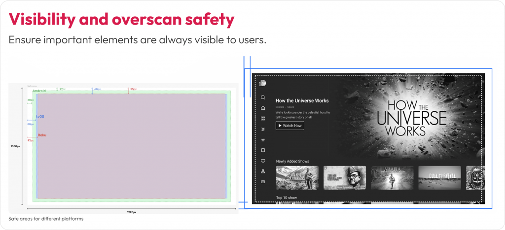
Image: Designing within the platform-specific margins to prevent critical UI elements

Ease of interaction

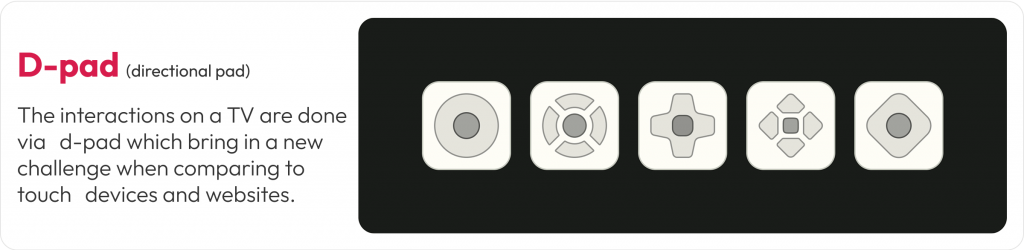
1. Optimize navigation for D-Pad using remote control

Unlike mobile apps that rely on touch or desktop apps that use a cursor, CTV apps are controlled primarily through four-directional (D-pad) navigation. That means every interaction needs to be linear, predictable, and instantly responsive to remote input.

D-pad navigation design for CTV

D-pad navigation reduces the number of actions users can take at a time. This makes clarity of focus and smooth directional movement essential. If users can’t immediately see where the focus will move next, or worse, get stuck, it creates friction that leads to drop-offs. 

What we encountered 

While designing for Discovery+, we noticed that users had trouble switching between episodes and rows. Some users struggled to reverse actions or weren’t aware they could move between thumbnail rails. Simple tasks like finding the next episode became unnecessarily complex without visible feedback or directional cues.  

How we solved it 

We created a D-pad simulation prototype and tested it across multiple TV models and remotes. This helped us fine-tune how the focus ring behaved, especially during transitions across rows and within episode carousels. We introduced subtle motion effects and highlight cues to clearly show the user where they were and where they could go next.

Optimize with Axis for Connected TV

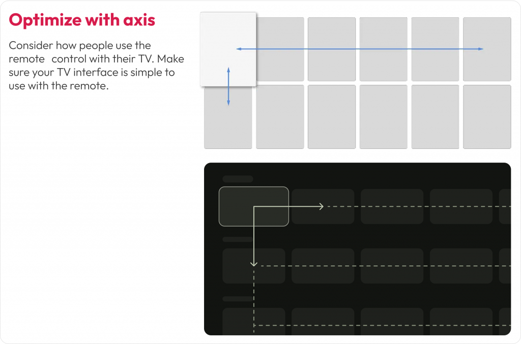
Image: This layout ensures users can move smoothly between content blocks with clear directional focus

2. Design for voice interactions

Typing on a TV with a remote control is slow and often frustrating. As more users turn to voice assistants for navigation, search, and content discovery, supporting natural voice interactions across your CTV experience is essential.

Remote-based input makes complex interactions like logging in, searching for a show, or filling out a form time-consuming. Voice control offers a faster, more intuitive path. If your app doesn’t support or prioritize voice input, it can cause drop-off right at the entry point.

What we encountered

During usability testing for Discovery+, we noticed users instinctively looked for the voice icon before attempting to type using the on-screen keyboard. In some cases, users delayed interaction because the voice search was not prominently positioned. Others tried to use their native smart assistant (like Alexa) even when the app hadn’t been optimized for it.  

How we solved it

We repositioned the voice search icon as the first-choice input method on the search screen. We also designed the UI to reflect a voice-first experience, allowing users to bypass typing unless absolutely necessary. For returning users, we reduced login friction by enabling authentication via mobile-to-TV handoff and highlighting it during onboarding.

Connected TV design for voice interactions

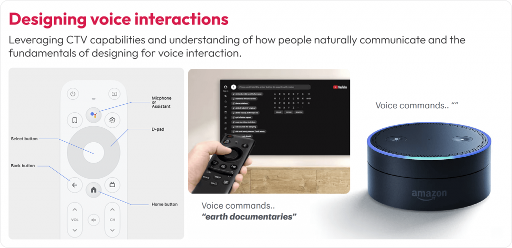
Image: The search screen design prioritizes voice input over keyboard input. The voice icon is placed first in the input flow for easier access

3. Designing for accessibility

A well-designed Connected TV experience isn’t complete unless accessible to everyone. People with low vision or blindness rely on screen readers and audio cues. Those with hearing difficulties need clear visual alternatives to any sound-based feedback.

What we encountered

During our design process, we identified accessibility challenges around quick access to previously watched shows and episodes within them. Users also had difficulty identifying selected states or navigating between episodes. People relying solely on audio or voice inputs also struggled due to insufficient feedback or context around these interactions.

How we solved it

We reworked the “Switch Episodes” and “Continue Watching” rail with stronger contrast, added a clear focus ring, and paired visual states with subtle audio ticks. Hence, users receive visual and audible confirmation. Also, we enabled shortcuts, “Play next episode,” “Add to Watchlist,” and “Skip intro.”

Switch episode CTV design best practice

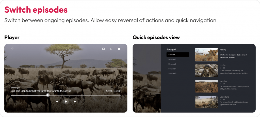
Image: Accessible navigation with clear focus states for seamless episode switching

Continue watching option in CTV

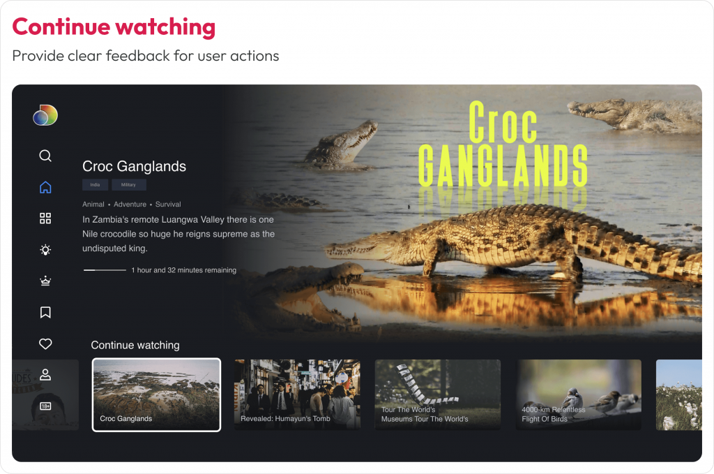
Image: High-contrast highlights for easy content resumption 

Personalization for shared devices

1. Support multi-profile personalization

Unlike mobile or personal laptops, Connected TVs are shared household devices. That means your design must serve multiple users with different preferences, age groups, and viewing habits, often on a single screen.

A personalized experience increases engagement, retention, and satisfaction. Without profile-specific settings, users may encounter irrelevant content, lose their watch history, or face inappropriate recommendations, especially in homes with both adults and kids.

CTV multi profile personalization

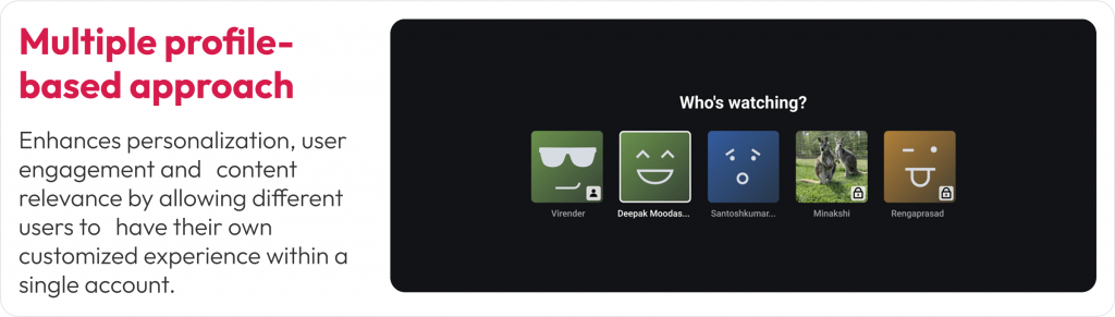
Image: Custom profiles support personalized content and parental controls. Visual cues and icons help differentiate user types at a glance

What we encountered

In our Discovery+ design exploration, we realized that a single user profile wouldn’t serve a typical household. Users wanted their own watchlists, tailored recommendations, and age-appropriate content controls. The absence of these features often led to confusion and frustration, especially when kids used the platform unsupervised.

How we solved it

We implemented a multi-profile entry screen that appears at app launch, allowing each household member to pick or create their own profile. Each profile carried personalized preferences, viewing history, and even watchlist continuity across devices. For child profiles, we activated parental controls that filtered out adult content and enabled safer exploration.

Privacy while designing apps for TV

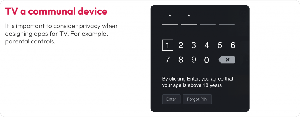
Image: User profiles restrict content based on user age with Parental Controls. e.g. kids-friendly profile – Disney+ Kids Mode ensures children see only family-friendly movies and shows

2. Ensure UI consistency across streaming platforms

A single household might stream content on a Roku TV in the bedroom and an Apple TV in the living room. While each platform has its own design guidelines, users expect a consistent experience across all of them.

Inconsistent navigation, layout, or visual styles across devices can lead to confusion. If users feel like they have to relearn your app every time they switch platforms, it creates friction, and they may choose a more familiar service instead.

What we encountered

During the Discovery+ rollout, we had to support a wide variety of platforms, including Roku, Fire TV, Android TV, Apple TV, and WebOS. Each had unique limitations, remote behavior, and UI rules. For example, Fire TV had stricter safe zones, Apple TV emphasized integration with Top Shelf and system features, and Roku had performance limitations on lower-end devices.

How we solved it

We designed using a component-based system built in Figma, with reusable tokens for typography, spacing, and color. These tokens were exported via JSON and synced with our developers’ codebase using the Style Dictionary plugin. This ensured the core design structure remained consistent while allowing each platform to inherit its native interactions and system behaviors.

component-based system built in Figma for CTV design handoff

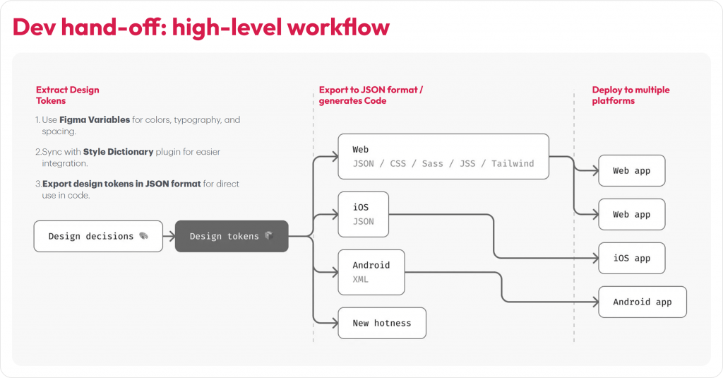
Image: Discovery+ UI components adapted for Apple TV, Roku, and Android TV. Core layout and interactions stay consistent while following platform-specific design norms

While no guideline is one-size-fits-all (gaming UX, for instance, follows its own unique rules), the practices above offer dependable direction for creating seamless, intuitive experiences across CTV and companion devices.

Conclusion

The Connected TV market is set to double (from USD 267B in 2024 to USD 530B by 2030) in the next five years, making it the ideal moment for designers and product teams to stake their claim in this rapidly growing space. By understanding each platform’s nuances, designing for real-world viewing environments, and following proven best practices as demonstrated in this guide, we can craft captivating, user-friendly TV applications that delight viewers across devices and platforms.  

At Robosoft, we’ve partnered with leading media, news, and entertainment brands to build end-to-end OTT solutions with capabilities across product strategy, design, engineering, analytics, and monetization. Whether targeting a regional Smart TV market or aiming for global reach, our team can help deliver world-class multi-device experiences across platforms. Ready to connect with your audience on every screen?

contact us for CTV experience design

Read More
UX/UI Design

Designing for Vision Pro: the coming spatial experience

As the real and virtual worlds continue to converge, Apple has introduced Vision Pro, a device designed to deliver immersive mixed-reality experiences. Vision Pro enables endless possibilities for exploring human-to-system interactions and spatial dynamics. Users can interact with the digital world more naturally using the mixed-reality headset. It overlaps digital content in the real world, allowing users to simultaneously see and interact with both worlds. Vision Pro is slated for limited release to the public next year, but Apple has already given a demo to select developers.

Vision Pro features two high-resolution micro-OLED displays that project images directly onto the user’s retinas, creating a “screenless” (screen without a screen) experience. The headset has 12 built-in cameras for tracking the user’s head, eyes, and hands, a LiDAR scanner for depth perception, and an Apple M2 chip with 10 CPU and 32 GPU cores.

Vision Pro is designed with accessibility at the center, using gestures, voice, and combinations of these input modes as critical enablers. This was showcased in the launch event video, where users could interact with the headset using gestures to browse the web, watch movies, and play games. Designing for Vision Pro requires understanding these input modes and providing solutions for users to have a seamless journey.

Apple Vision Pro Gestures Feature

Source: MacRumors Apple Vision Pro Gestures

Designing for a spatial experience

Design principles for traditional screens may not work for the future of spatial experiences, which are more immersive and interactive. Designers need to adapt these principles to consider the unique features of spatial experiences. Spatial experiences allow users to interact with the environment more naturally, so designers must create interfaces that are easy to use and understand.

Vision Pro’s spatial capabilities allow designers to create visually captivating and user-friendly interfaces that feel intuitive and natural to navigate. This focus on user-centric design enhances the user experience across various applications. Below are some key aspects to consider while designing for glass-style UI:

Iconography

To create a seamless user experience, Apple has reimagined the feedback mechanism for icons on the home screen. When a user looks at an icon, it expands as if it is being hovered over. Designers design icons with subtle depth by adding specular shadows and highlights.

To design a great icon, start by creating multiple layers. The system uses these flat layers to create a three-dimensional effect. The icon should be converted to 1024×1024 pixels, with transparent foreground layers. Do not use large regions of semi-transparent pixels, as they will blend with the shadow behind them.

Consider these additional recommendations when designing icons:

  • Maintain a uniform color scheme and style throughout your icons.
  • Make sure your icons are clear and easy to understand.
  • Use high-quality images and graphics.
  • Test your icons on different devices and screen sizes to ensure they look good everywhere.

apple vision pro icons for spatial immersive experiences

Source: App icons | Apple Developer Documentation

Glass panels design

Apple has introduced glass material to create a more spatial and lightweight user experience. This material allows users to see what is behind a window, such as other apps or people, without feeling suffocated.

Therefore, when designing an app window, it is essential to avoid using solid colors. Too many opaque windows can make the interface feel heavy. Instead, use a lighter material to bring attention to interactive elements, such as buttons, or a darker material to separate sections of the app.

For example, if you want to design a lock-up with a lighter button, you can place it on top of the glass material. Or, if you’re going to create more contrast, you can use a darker cell behind the button. However, it is crucial to avoid stacking lighter materials on top of each other, as this can impact legibility and reduce contrast.

Consider these bonus tips for designing with glass material:

  • Use glass material sparingly. Too much of it can make the interface feel cluttered.
  • Use glass material to create a sense of depth. For example, you can use a darker glass material for the background and a lighter glass material for the foreground.
  • Use glass material to highlight essential elements. For example, you can use a lighter glass material for buttons or other interactive elements.

apple vision pro glass material design for spatial immersive experiences

Source: Materials | Apple Developer Documentation

Legibility

Typography

The font-weight can be slightly increased to improve text contrast against vibrant materials. For example, on iOS, regular weight for the body text style must be used; on this platform, a medium can be used. And for titles, instead of semi-bold, bold can be used. This makes the text more legible, even when displayed on a vibrant background. System fonts, which are designed for optimized legibility, can also be used.

Vibrancy

Vibrancy is another crucial detail for maintaining legibility. It enhances the foreground content by bringing light and color from the background forward. On this platform, vibrancy updates in real-time to ensure your text is always legible, even when the background constantly changes. Vibrancy can indicate hierarchy for text, symbols, and fills. Primary vibrancy can be used for standard text, and secondary vibrancy can be used for less critical text.

Pointers for using typography and vibrancy:

  • Use a heavier font weight for text that needs to be legible, such as body text and titles.
  • Use system fonts or other fonts that are designed for optimized legibility.
  • Use vibrancy to brighten foreground content and make it stand out from the background.
  • Use primary vibrancy for standard text and secondary vibrancy for less critical text.
  • When using custom fonts, make sure they are designed for readability.
  • Avoid using small or lightweight fonts, which can be challenging to read, especially on large screens.
  • Consider using a darker shade for the pop-over background to make the text more legible.

apple vision pro legibility typography vibrancy for spatial immersive experiences

Source: Typography | Apple Developer Documentation

Colors

When designing a glass-style UI, use white text and icons on a colored background. This will make the text and icons stand out and be more legible.

  • Use system colors whenever possible. System colors are designed for legibility and look best on a glass background.
  • If you need a custom color, use it sparingly and make sure it contrasts nicely with the background.
  • Avoid using dark colors for text or icons. Dark colors will blend in with the background, making the text and icons challenging to read.

Here are some additional tips for designing glass-style UIs:

  • Use a light overall color palette. This will help to create a sense of spaciousness and airiness.
  • Use transparency and blur effects to create a sense of depth.
  • Use shadows to add dimension to the UI.
  • Use gradients to add interest and visual interest.

apple vision pro colors design for spatial immersive experiences

Source: VisionOS – Apple Developer

How Vision Pro can transform businesses

Businesses of all sizes and across some industries are excited about the potential of Apple Vision Pro, which is still in its early stages of development. The technology has the potential to transform operations, improve customer experiences, and boost overall performance. Still, which industries will most successfully adopt it remains to be seen.

Entertainment

  • Create immersive gaming experiences that blur the line between the virtual and real worlds. To illustrate, game developers can use Apple Vision Pro to create realistic first-person shooter games where players can interact with the environment lifelike.
  • Create interactive storytelling experiences. Filmmakers can use Apple Vision Pro to create 3D movies, transporting viewers into breathtaking cinematic worlds.
  • Provide real-time translation of foreign language text. For example, language learners can use Apple Vision Pro to get a real-time translation of foreign language text while traveling or interacting with people from other cultures.

apple vision pro application for spatial immersive experiences for entertainment and sports

Source: How will Apple Vision Pro VR influence industries | Merge Development

Education and training

  • Provide students with interactive learning experiences. For instance, teachers can use Apple Vision Pro to take students on virtual field trips to historical sites or to conduct experiments in a safe and controlled environment.
  • Offer virtual field trips. For example, students can use Apple Vision Pro to visit museums or other educational institutions without leaving their homes.
  • Provide real-time translation of foreign language text. Concretely, language learners can use Apple Vision Pro to get the real-time translation of foreign language text while taking a class or reading a book.

Healthcare and medical

  • Provide realistic surgical simulations and training scenarios. In other words, doctors and medical students can use Apple Vision Pro to practice procedures without risking harming a patient.
  • Offer remote consultations with patients. For example, doctors can use Apple Vision Pro to consult with patients in remote areas.
  • Visualize and analyze medical data. For instance, researchers can use Apple Vision Pro to visualize and analyze medical images and data to understand diseases better and develop new treatments.

apple vision pro application for spatial immersive experiences in healthcare medical industry

Source: How will Apple Vision Pro VR influence industries | Merge Development

Real estate and architecture

  • Give potential buyers virtual tours of properties. Real estate agents can use Apple Vision Pro to give potential buyers a 360-degree view of a property without meeting them in person.
  • Collaborate with clients and stakeholders on 3D design projects. Architects can use Apple Vision Pro to collaborate with clients and stakeholders on 3D design projects in real time.
  • Visualize furniture and decor in a physical space. For example, interior designers can use Apple Vision Pro to visualize how furniture and decor will look in a room before making a purchase.

Meetings

  • Join virtual meetings from anywhere. For instance, remote workers can use Apple Vision Pro to join virtual discussions from anywhere.
  • Collaborate in real-time and share information. For example, participants in virtual meetings can use Apple Vision Pro to collaborate in real time and share information.
  • Track customer behavior and improve the shopping experience. Concretely, businesses can use Apple Vision Pro to track customer behavior in a retail store and use that data to enhance the shopping experience.

apple vision pro application for spatial immersive experiences in workspace education and meetings

Source: Apple’s Vision Pro: Revolutionizing Industries Through Spatial Computing| ELEKS

Finance and banking

  • Visualize financial data. For example, financial analysts can use Apple Vision Pro to visualize financial data to understand the market better and make informed investment decisions.
  • Help clients track their spending. For example, personal finance managers can use Apple Vision Pro to help clients track their spending and reach their financial goals.
  • Visit virtual bank branches. Concretely, customers can use Apple Vision Pro to visit virtual bank branches to conduct transactions or speak to a banker.

Retail and e-commerce

  • Try on clothes and accessories before making a purchase. To illustrate, shoppers can use Apple Vision Pro to try on clothes and accessories before purchasing.
  • Provide personalized shopping recommendations. Retailers can use Apple Vision Pro to provide personalized shopping recommendations based on a shopper’s past purchases and browsing history.
  • Offer in-store navigation. For instance, businesses can use Apple Vision Pro to offer in-store navigation to help customers find the products they are looking for.

apple vision pro application for spatial immersive experiences in retail ecommerce fashion

Source: Apple Vision Pro and The Future of ECommerce (codilar.com)

Vision Pro: the flip side

Innovation can be exciting, promising a brighter future with endless possibilities. However, carefully considering the potential consequences of new technologies is essential. While innovation often brings benefits, it can also come with risks, such as privacy concerns, surveillance risks, and impacts on mental health and social isolation. Balancing progress with responsibility when developing and using new technologies is essential.

Comfort and ergonomics

Early reports suggest that the Vision Pro is well-built but slightly uncomfortable to wear for extended periods. The headset is front-heavy due to its metal construction, which could make it difficult to wear for long periods. Additionally, the headset’s weight distribution and heat management could further impact user comfort. If the Vision Pro is not designed to be comfortable, it may limit its appeal to consumers and businesses.

Privacy at stake

The Vision Pro raises fundamental concerns about personal privacy. The headset’s ability to project floating screens onto our vision while observing our environment could collect vast data about us. This data could include our eye movements, facial expressions, and surroundings. The potential for this data to be used to track our movements, monitor our behavior, and even identify us is a serious privacy concern. Establishing robust safeguards and ethical boundaries is essential to protect individuals’ privacy in the digital age.

Mental health and social isolation

While technological advancements can enhance our lives, we must also consider their potential impact on mental well-being and social dynamics. The Vision Pro’s immersive AR experience could be a double-edged sword. On the one hand, it offers captivating virtual overlays of reality that could tempt users to immerse themselves in a captivating digital realm. On the other hand, this allure could come at the risk of isolating individuals from their physical surroundings and authentic human connections. As we increasingly detach from the present moment and substitute genuine interactions with virtual experiences, the potential for social isolation and its associated mental health consequences is serious.

apple vision pro designing for spatial immersive experiences

Source: Apple Developer Forums

Apple’s Vision Pro hasn’t even been released yet, but the company is already planning a smaller and lighter version of the headset and is deep into work on follow-up products.

Conclusion

Apple Vision Pro can redefine how we interact with technology in a human-centric way. Its spatial capabilities allow designers to create visually appealing, user-friendly interfaces that feel natural. This focus on human-centric design will enhance and transform businesses of all sizes and industries by enabling immersive, interactive, and personalized experiences in various applications, from gaming and entertainment to education and training. While Vision Pro can be a powerful tool for good, it is essential to remember that it is also a new technology with potential risks. Our collective responsibility is to ensure that Vision Pro is used responsibly in a human-centric way.

Read More