The former article of this series outlines the various technologies that are driving the travel and tourism industry. In this article, we will discuss some of the most crucial UX Design strategies from top travel brands that can help enterprises in this niche to increase customer engagement, acquisition and make the most of their digital presence.
As a travel enterprise closely integrated with Technology, it is imperative to understand the finer nuances and underlying factors that influence customer decisions, which to a large extent, can be determined by the website’s UX Design.
UX Design is the process of creating products, processes, services, and omnichannel journeys that provide relevant and pleasant user experiences. It can also be used as a measure to monitor, control, and refine your digital presence to ensure it addresses the core requirements of your audience. Invariably your customer responses and reactions are all great hallmarks of the efficiency of the site’s user experience design.
“In order to achieve high-quality user experience … there must be a seamless merging of the services of multiple disciplines, including engineering, marketing, graphical and industrial design, and interface design.” –
Nielson-Norman Group
Let’s explore some of the essential UX principles that Travel Brands can integrate as part of their website design.
1. Neat Layout with Easy Navigation
Users need to know where to begin. As the homepage receives most clicks, engaging content, and a clean layout with an easy navigation process, that prompts the next steps at the homepage can help to increase engagement and keep visitors on your site. Too many options, search forms, and offers cluttered with no clear indication of where to head next can lead to page exits. Booking.com’s home page is a good reference of UX done right. The content and layout is neat and simple, with clearly segmented categories, including a mention of the average price based on the location, enabling users to choose based on their budget.
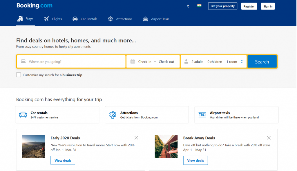
Image source
‘Booking.com has everything for your trip’ ‘Browse by property type’ ‘Homes guests love’ ‘Get inspiration for your next trip’ & more of such messaging on their homepage that helps to garner customer confidence, invariably driving a positive action. Each element supports & enhances the other, a perfect instance of a great UX design.
2. High Impact Imagery
A strong visual element, especially for a travel website, helps in invoking a greater connection, where users can get a feel of the holiday experience through high impact imagery. While a lot of brands use stock photos, an effective way to go about this is to invite users to share photographs as Tripadvisor does. TripAdvisor spices up its content by sharing user-generated images that are real and provoke user emotions that lead to greater customer loyalty.
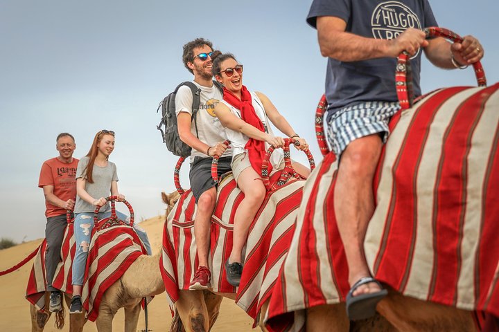
Image source
3. Keep It Simple
It’s always a good idea to keep things simple and focus on important information. This helps users consume information that is connected with action. Most websites overload users with too much information resulting in a heavy cognitive overload. Yes, it’s quite tempting to squeeze all special offers on the homepage, but keeping it simple lets the user focus on the main task. Trivago follows this UX principle well. It understands customers’ objectives and presents them with a clear and clutter-free search experience. Top suggestions are arranged in a neat grid with attractive thumbnails accomplishing both key aspects of UX, visually inspiring with easy navigation.
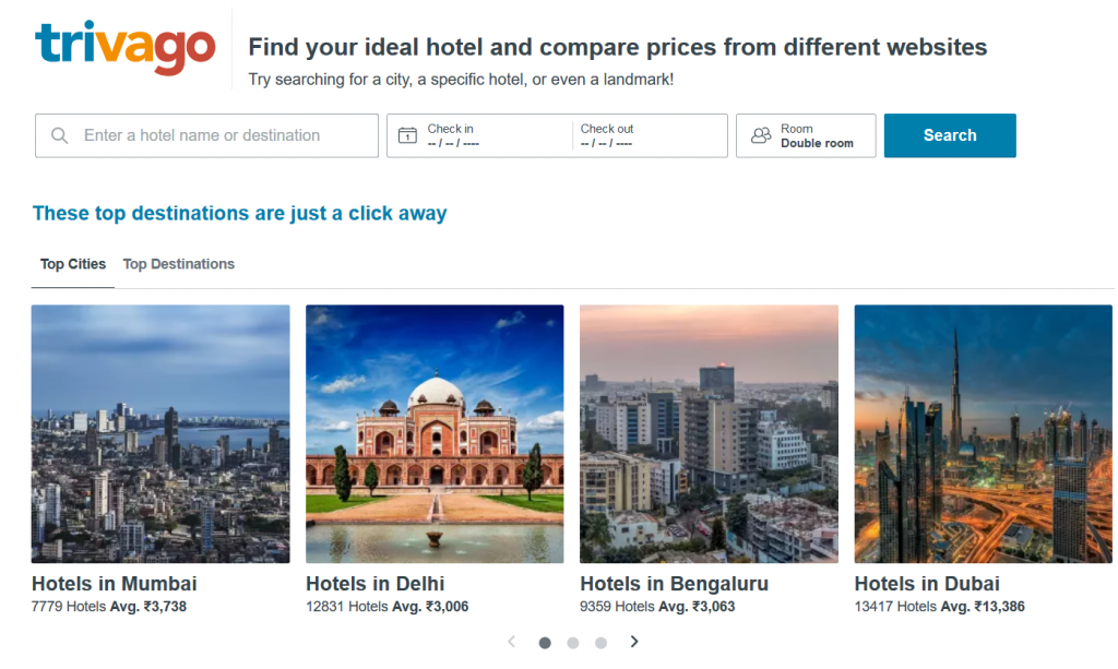
Image source
4. Have a Progress Tracker
Progress trackers are designed to guide users through a multi-step process in order to complete a specified process. A travel site with a well-designed progress tracker can keep users informed about the steps they have completed, the section they are currently on, the tasks that remain, and gives them a quick peek into where they stand in the buying cycle. This feature is a must-have for airlines, which helps users to logically structure the booking process while making it easy and intuitive, thereby maximizing conversion rates.
![]()
Image source
5. Use an Interactive Map
While locating an address, it is most likely that we look for a visual representation through a map or GPS. This is because it’s much simpler to understand the visual navigation, more so when you can view your destination or travel route.
An interactive map enables users with a dynamic method to screen holiday destinations. Travelers mostly prefer maps that refresh search parameters based on geography or destination-based pricing and find important landmarks, nearby events, and locations.
6. Personalize Messaging
It is reported that returning users are 2x more likely to make a purchase during a session. Personalizing the site based on your core user personas can have a great impact on results. Demarcate messaging for new visitors and returning visitors. Inspire new visitors by offering recommendations on popular locations. On the other hand, greet returning visitors with recently searched offers, which gives them a personalized experience.
7. Smart Calendars
Finding the right flight deals can be a long and tedious process and additionally get tough when the prices are volatile. Skyscanner makes search extremely easy based on its users. Choosing the dates on its calendar is extremely easy, an important UX parameter to have dates of the previous month and the subsequent month. Based on the flexibility of the user’s travel dates, Skyscanner also highlights the options of choosing months when the airfares are most economical.
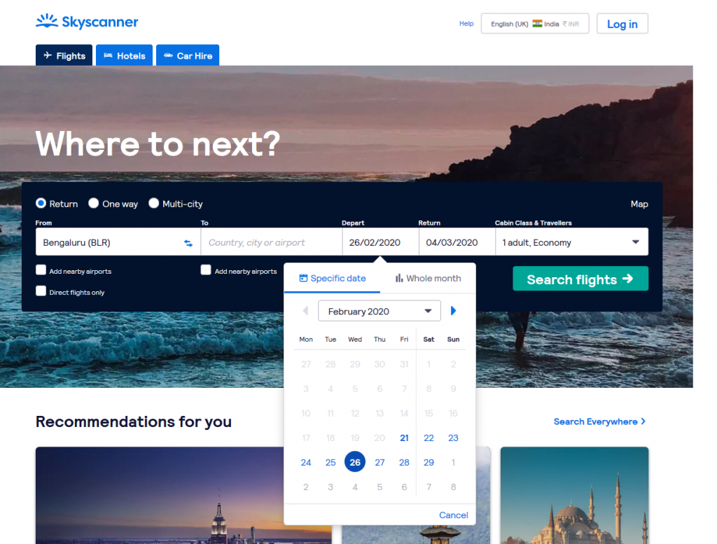
Image source
8. Use Action Verbs
Let’s admit it; a good copy is often an afterthought in UX. But a reassuring message can ease the anxiety related to the booking by giving more context and insights into the best options based on user dynamics. Also, action-focused words like ‘Discover,’ ‘See’ ‘Explore’ like on AirBnB’s site drives greater engagement, moving users from a passive to an active state. If you aspire to increase your site’s user experience by the virtue of your copy, don’t hesitate to use action verbs and optimize your site’s performance.
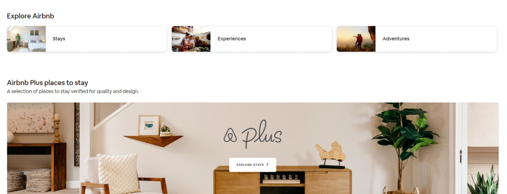
Image source
9. Streamline Forms
Too many fields and misleading content in the forms often lead to instant exits. One of the most crucial elements in a travel site is to streamline the forms with clear categories and sections that enable quick and easy action. Here’s a peek at Priceline.com’s search form on its homepage. The forms are hidden inside a handy horizontal tabbed navigation segment, and the tabs include different search forms related to their core services, enabling users to navigate to the service they are interested in directly. Quick, efficient & seamless – best UX attributes in a nutshell.
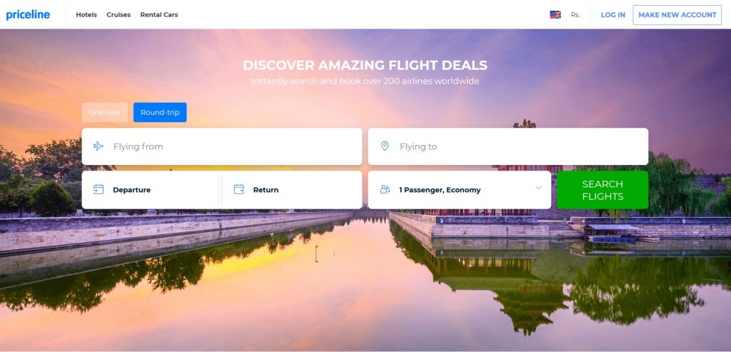
Image source
10. Make a Personal Impact
Increase user engagement with personal stories from customers. Social proof like testimonials, reviews, and brief travel journals can maximize your brand value, credibility, and overall performance. Invite your customers to talk about the positive experiences that made a memorable travel experience along with images that they will be willing to share online. Adventures of real people are always interesting and more inspiring than stock images and marketing babble.
11. Include Related Products & Benefits
Just like big e-Commerce players, include recommendations of related products and services based on popular choice and user search. The trick is not to sound pushy while letting users know of the various gamut of options available and associated benefits that can elevate their travel experience. Given that consumers today opt for luxury and comfort, it’s a good idea to use words that connote the experience like ‘indulgent’, ‘pamper’, ‘comfort’, and the like.
While customer satisfaction is one of the hallmarks of your sites UX design, no UX Design principle or technology mix can guarantee a satisfactory user experience. Brands need to identify the right combination of UX principles and a host of other diversified experiences like customer journey maps and human-centered design principles that align with their offerings. The need of the hour is for travel brands to constantly evolve alongside their customer requirements that are spoilt for choice with the mounting competition offering similar services. The trick is to stick to the core customer values you offer as a brand and ensure that these are deeply integrated as part of your user experience design.


