“Design is really an act of communication, which means having a deep understanding of the person with whom the designer is communicating.”–Donald A. Norman, The Design of Everyday Things.
Organizations that manage to make a positive emotional connection with their customers in the digital era will experience positive results. Given the rise in the average time spent on mobile and connected devices, brands must harness emotional data and create meaningful customer connections.
So how can we identify the influencers that drive these connections?
The surge of internet users around the world is at an all-time rise. 400+ million as we talk, representing an annual growth of 10 percent. And if the trends continue, we are soon to witness some truly remarkable digital milestones as we tread into 2022.
Considering the overwhelming surge in technologies and digital platforms, the way ahead for brands is to differentiate themselves by creating deeper customer connections and garner a competitive advantage. One of the most effective ways to achieve this is by incorporating a human-centered design approach. It can help brands build trust, loyalty & customer value, which will invariably influence customer acquisition & retention. Human-centered design triggers positive customer responses, that can amplify your business performance and boost ROI.
What is Human-Centered Design?
Human-centered design is a consumer-centered problem-solving approach that prioritizes the consumers’ needs when approaching a challenge. To be able to incorporate this as part of the creative design process requires a deep perspective of the challenges users encounter and what are the solutions they are most likely to embrace.
As per research conducted by Deloitte, 58% of consumers prefer a brand for an emotional reason overriding the other rational factors. This has perhaps made it evident for brands that the customer experience can no longer inspire brand loyalty, human-centered design is ruling the digital space. When emotional data, like user behavior patterns, pain-points, purchase triggers, and motivators are integrated as part of your creative process, consumers are more confident about your brand as they are heard and understood.
Regardless of the industry, you belong to, or the designation you hold, it’s imperative to understand the human-centered design principles to ensure that this ideology can be infused into the products you develop. Click to Tweet
With the overarching objective of serving your customers better, the human-centered design approach can help to nurture and retain your current users and garner your competitive advantage.
Stages of the Human-Centered Design Process
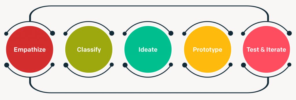
While there are many forms of the Human-Centered Design process, it can be broadly categorized under these 5 key stages.

- Empathize – The foundation of the human-centered design process is to truly understand the people who experience a problem before you begin to design a solution to serve them. As Design-consultants, it is crucial to directly engage with the people experiencing the problem, observe the environments they operate in, ask a lot of questions and completely grasp their challenges. This is one of the most integral parts of the design thinking process as it’s not about anticipating but participating with the consumer, to brainstorm, model and prototype.
- Classify – After gaining all insights and learning about the problem, define the challenge you wish to address. As a human-centered designer/brand, it is important to define the ‘why’ behind addressing the problem. It is ultimately the problem statement that will guide you towards formulating the potential solutions.
- Ideate- This phase is about arriving at as many solutions and more preferably in a team setting. The key is to generate many ideas without judging the idea, as it inhibits the creative process. This is the best way to arrive at solutions from a wider, bottom-up perspective.
- Prototype – This phase is all about experimenting with what you’ve created, whether it is a virtual interface or system. A good practice for designers is to create multiple prototypes to experiment with the ones that meet the requirements of the consumer.
- Test & Iterate – Put your ideas to test. This phase is about testing the prototypes you created, to identify the gaps in design and areas for further improvement. In an ideal scenario, it would be best to test your prototype with a few consumers, whom you created the prototype for.
While this may seem like the end, the human-centered design process is a dynamic and fluid process, that runs until all participants are satisfied with the solution that addresses the problem. It is often not a linear process, but you can ascertain the next steps while you’re mid-way into the design process. In the prototyping stage, for instance, one might realize that the prototype doesn’t align with the defined problem statement. This requires designers to be agile, constantly reiterate, brainstorm and go through the nuances of the problem more deeply and to most importantly keep in mind the overarching objective, which is to invoke a positive emotional response that will increase the likelihood of customer acquisition and retention.
How to create a Human-Centered Design that invokes positive emotions?
Emotion is the cornerstone of the human-centered design experience, which requires customer experience strategies to influence positive consumer emotions. Click to Tweet
With effective product testing, user-research and subsequent touch-point mapping, it is easy to gauge the impact of the product on end-users and the pain points users may address while using the product. A good design will not only focus on addressing these challenges but convert these pain-points into positive emotional experiences. A Human-Centered Design can transform functional products into memorable and enduring experiences.
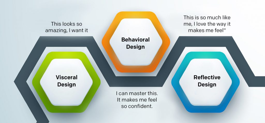
To create a successful product, the design elements should cover the needs to visceral, behavioral and reflective aspects, as per Don Norman’s seminal book on ‘Emotional Design’

Visceral Design
“This looks so amazing, I want it”
A visceral reaction is prompted by a preliminary sensory experience, which is an immediate, deep-level gut reaction to your product. It is the very first impression, the initial mood which sets the ground, due to which one begins to explore the product. As they say, there never is a second chance to make a positive first impression. Users are more likely to forgo faults in the future if the initial experience was overwhelming and positive. A visceral reaction can set a positive context for subsequent interactions. It impacts the perception of your product’s reliability, dependability, consistency, quality, appeal, and also the perceived ease of use.
Behavioral Design
“I can master this. It makes me feel so confident.”
A behavioral reaction is how we feel as part of being immersed in the product experience. It is the reactions and interactions with the product and the value we derive from the products we use, also referred to as the usability.
A product has to look good, feel good, and perform well. It’s ultimately about the pleasure associated with a product’s ease of use and effectiveness. A Behavioral design element focuses on how the structure or system, meets the requirements of the end-users. Invoking positive behavioral reactions allows users to feel more empowered, develop trust, reliability and invoke repeat reactions. A product will not last long if its design does not align with the user’s behavior. Here’s a fact: 77 percent of users never use an app again 72 hours after installing. Most successful apps are those which people can’t imagine life without, as a result of good behavioral design. From an emotional viewpoint, when our interaction behaviors are more familiar and anticipated, then we are in agreement and derive joy and contentment from the product’s usability. The behavioral design aspect covers functionality, performance, usability, and ease of use.
Reflective Design
“This is so much like me, I love the way it makes me feel”
A reflective reaction is about how we feel after experiencing the product. It is about whether we remember the experience and how it made us feel, which will determine if we desire to experience the product all over again. It’s about self-image, satisfaction, memories, reflecting on the experience. A positive, reflective design can invoke customer advocacy, by encouraging other users with their experiences. A good reflective emotional design captures the essence of the product, impact of thought, share-ability and the cultural impact.
For a design to have an emotional appeal, users need to feel connected to a product in a way such that life feels incomplete without it. Click to Tweet
Designers then, need to constantly strive towards creating products with a ‘personality’, something that simplifies real-life experiences; if they truly want their products/brand to be successful and meaningful.
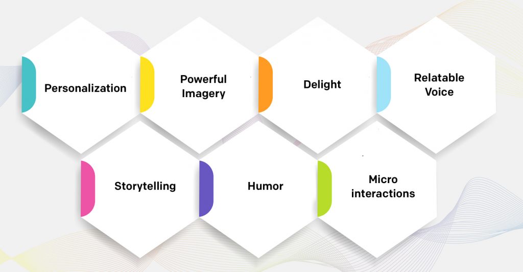
Techniques to Augment an Emotional Impact

- Personalization— Give room for the users to feel in-control with personalization. This makes them feel a sense of ownership, which gives them the power to tailor experiences based on their preferences.
- Powerful Imagery —Use of appropriate imagery that users can connect and relate with can have a significant impact on product success. Use images, colors, animations and illustrations that invoke empathy and trigger an emotional response.
- Delight— Try to keep the element of surprise alive, let there be something fun and pleasant to look forward to. Invoke positive emotional reactions by surprising and delighting your users.
- Relatable Voice— Relate to your users in a more empathetic Express compassion, encouragement, and emotion through a conversational user interface.
- Storytelling — Help users understand the journey of the experience with powerful, relatable and engaging stories that stay etched in their memory.
- Humor — Evoke a sense of joy, eliminate room for uncertainty and fear with a good sense of humor. Laughing and glee are powerful emotions that trigger a sense of joy and contentment.
- Micro-interactions — Subtle affordances and indicators make the product interface feel more vibrant and alive, which can influence greater user-engagement and interactions.
“The customer rarely buys what the business thinks it sells him. One reason for this is, of course, that nobody pays for a ‘product.’ What is paid for is satisfaction. But nobody can make or supply satisfaction as such—at best, only the means to attaining them can be sold and delivered.” – Peter Drucker
Heuristic Principles – Why are they integral to product interfaces?
What is a heuristic approach?
A heuristic technique is any approach to problem-solving, learning, or discovery that employs a practical method not guaranteed to be optimal or perfect, but sufficient to accomplish immediate goals. Heuristic principles are most appropriate when concise guidelines do not exist. In the absence of guidelines as with UI & UX design, heuristic methods can be used as a point of evaluation for optimal design solutions. They speed up the process of finding a practical solution while easing the cognitive overload of making a decision.
Jakob Nielsen, a web usability consultant collected and released a set of evaluation principles for usability heuristics that help in identifying the problems in a user interface design to address these as part of the iterative design process. As the Human-centered design augmented the importance of the user, design processes have adapted accordingly. However though Nielsen’s principles have remained universal across all digital product interfaces.
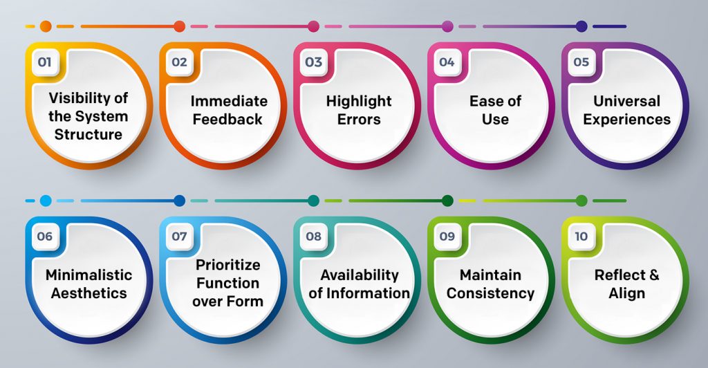
Here are ten heuristic principles that are inspired by human-centered design and usability thought leaders. They help as guidelines for usability evaluations to identify if the UI falls short of delivering a user-friendly experience.

1.Visibility of the System Structure
The UI should always allow transparency in the system structure and make the user feel in control. Make a few elements and structures visible so that the user has a complete understanding of the context. They should be able to understand where they are and where they can head to next. When the system is transparent, the user is in control of his journey and gains incredible confidence in the product interface.
2. Immediate Feedback
The user’s action should be followed by an immediate response, which confirms that the system is in receipt of the request. Instantaneous feedback reassures the user that his response is right and reveals what can be expected next. Without feedback, the user can feel frustrated and uncertain, which can lead to an interrupted journey.

3. Highlight Errors
Barriers and dead-ends often lead to interrupted product journeys. Users are bound to feel frustrated when they find themselves in a situation that does not accomplish their needs. When a user is given awareness about the errors, it helps in immediate recognition, diagnosis, and recovery from the error. Striking a perfect balance with simple & linear communication is the key to avoiding cognitive overload. Remember, all the user needs is to understand how to solve and prevent the error in the future.
4. Ease of Use
An interactive product experience must be independent of external user guidance. Whether it is a first time experience or the tenth, the interface should accommodate both scenarios. While a seasoned user has access to a deeper systematic understanding and short cuts, the new user should experience flexibility in maneuvering the interface without being interrupted. When the UI is flexible, the user can be in control and choose a journey based on their needs and capabilities. The key is to find balance, both, a restrictive or an overwhelming interface can be a frustrating experience.
5. Universal Experiences
Create design elements that relate to common human experiences and expectations. It is important to cater to universal user expectations as we spend more time involved in digital interfaces. A “+” sign ideally expands to give more information, by tapping into easily comprehensible references like these, users will understand its purpose and the interface becomes more intuitive.
6. Minimalistic Aesthetics
Create minimal design features and eliminate elements that can interfere with the overall experience. Display data in a manner that is clear and aids easy navigation. Stick to a theme by using a layout, color, and typography, that guides the user without any distractions.
7. Prioritize Function over Form
The visual design of an interface must always begin with defined functions. Design decisions focus on what an element is meant to do, rather than emphasizing on its visual style. When the style, overall look and trends are prioritized, it may perhaps draw a lot more attention, but functionality is the key.
8. Availability of Information
Make information available to ensure users have information available on their fingertips rather than having to rely on memory. One of Nielsen’s heuristic principles suggests the designer should “minimize the user’s memory load by making objects, actions, and options visible. The user should not have to remember information from one part of the dialogue to another. Instructions for use of the system should be visible or easily retrievable whenever appropriate.”It’s important to keep in mind that a user experiencing an interface for the first time will not have the knowledge and familiarity with the information that the designers do. While the repetition of information may seem excessive to design experts, this is very essential for new users.
9. Maintain Consistency
As humans, we are drawn to patterns, and use them to make sense of the world. Representing information in familiar frameworks like metaphors & schemas and consistent elements helps in creating a cohesive experience that’s easily retained.
10. Reflect & Align
To ensure that the design principles and usability heuristics align with the overall purpose of the product and user needs, it is important to reflect and align periodically. It is up to the design experts to establish the best decisions for their unique use cases. All in all, if the product is human-centered and built to align with the user needs, the design and product will have a strong sense of purpose.
Conclusion:
It’s no longer enough to create products that push the boundaries of technology. What’s more important is to understand your customers’ motivations and behavior patterns, and translate this into a robust design interface to deliver customer experiences that can garner your competitive advantage, brand recognition, and growth.
Regardless of the industry you belong to, it’s mission-critical that you are aware of the process of the human-centered design process. By putting your consumer at the forefront of your creative process, you can build products that beautifully align with your consumer’s needs. When done right, it can provide optimum user experiences, maximize engagement and have a direct impact on customer acquisition and retention.


