With the hustle and bustle of shopping bags, the excitement of the Holiday season hangs in the air. While customers may find themselves excited to hit stores to find that perfect gift for their special someones, e-commerce platforms must focus on giving those customers an unforgettable, seamless, enjoyable holiday shopping experience.
Online retailers get swamped with surges of traffic hitting their platforms during this season. In 2017 alone, companies such as Macy’s, Square, Walmart, and Amazon all saw web outages that likely cost them millions of dollars. These issues can lead to frustrated customers and sales losses this year and for years to come if online retailers cannot adequately mitigate these disasters before they occur.
In this article, we outline eight tips e-commerce platforms can follow to prepare for the holiday season to ensure a seamless experience for their customers.
Optimized for Mobile
“Mobile is undoubtedly the most disruptive force in retail since the onset of e-commerce,” says Salesforce Head of Consumer Insights Rick Kenney.
Your customers shouldn’t be restricted to your desktop site to find a seamless shopping experience when searching for those perfect holiday gifts. Based on a recent report from Salesforce, almost 70% of ecommerce visits and almost 50% of online orders were done using a mobile device.
Even while in-store shopping, 83% of customers between 18-44 years old are on their devices interacting with those retailers in real time. If you don’t prioritize the medium where they spend most of their time, you’ve missed the mark.
Even simple UX features can make a great impact when it comes to offering delightful experience on an e-commerce platform. For instance, online footwear retailer JustFab does an excellent job of simplifying their checkout page by allowing users to log in with their Facebook account to save time and effort filling in form fields.
Ensure Your Website Is Prepared
You can prevent your site from crashing during peak periods and sustained, heavy website traffic by preparing with a few of the following considerations far in advance of the season:
- Confirm (and update) your bandwidth and capacity for spikes
- Install new hardware and software
- Review performance expectations and SLAs
- Monitor SSL certificates for validity and expiration
- Host stress tests
Ensuring your company has made these preparations and advancements to your site will significantly reduce errors and blackouts, enhance your UX/UI design, and increase consumer confidence during an otherwise stressful season. Optimizing your site is one of the most critical things you can do to help increase e-commerce sales.
Add a Progress Bar to Your Checkout
Showing customers where they are in the online buying process gives them time to prepare the information they’ll need to have ready next to complete their purchase. Research shows that the greatest drop-off point is at the checkout stage. This simple design feature gives customers a sense of organization and control over their purchasing power, which instills a sense of trust and, subsequently, creates a loyal customer base.
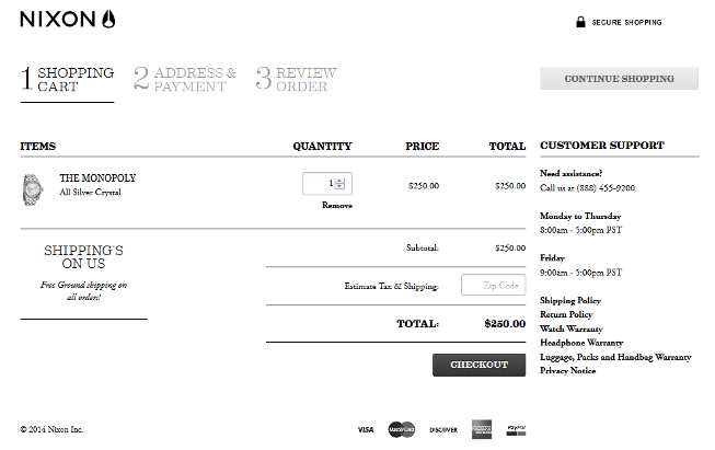
Nixon has only 3 tabs on its progress bar, enhancing the simplicity of the checkout process for customers while also offering other features on the related pages, such as guest or member sign-in and various payment options, as customers work their way from “Add” to “Purchase.”

Image Source
Save Their Spot
Customers appreciate small but significant features such as saving their spot from when they last visited your site, should they need to leave suddenly or want to return to shopping when they have more time and focus. Saving their spot gives customers the impression you have been patiently and eagerly waiting for them to return, at their leisure. Use local storage features to track and store unique customer data to ensure a smooth transition back to your site.
Walmart allows shoppers to select their items and return later to schedule a time for delivery or pickup, depending on the items and time frame they’ve selected.
Proper Labelling and Layout
Don’t leave your customers guessing what info you need from them to make a purchase. Make it clear and eliminate any unnecessary information, graphics, and words. Customers read in an F-shaped pattern, so consider what information is important and place it near the top left corner of your site or in bold headlines.
Stats show that “the average e-commerce site can gain a 35.26% increase in conversion rate” by designing a better checkout process, even for large retailers such as Walmart, Wayfair, and ASOS. This increase in conversion rates, through better page layout and design, means big dollars…of the roughly $740 billion USD e-commerce market in the US and EU, this could mean an additional $260 billion in sales.
Keep the Questions to a Minimum
Ensure your purchase process is simple from adding items to their cart to entering payment details. According to the Baymard Institute 2017 survey, “28% of US online shoppers have abandoned an order in the past quarter solely due to a too long/too complicated checkout process.”
For those questions that must be asked during the checkout process, ensure that you let your customers know why you are asking, so they can see the value to them if they answer.
Ensure Products Shown Are Available
As a rule, don’t show items that you can’t offer your customers.
If someone uses filters to narrow down exactly the right gift for their friend or relative, only to find out that it is out of stock, they’ll likely be frustrated and leave without purchasing anything…even if they had items in their cart when they left.
Live Chat Feature
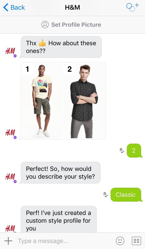
H&M is an excellent example of a retailer using chatbots effectively, providing fashion advice based on consumers’ preferences and offering to help if customers find themselves stuck on a decision about a product.
Chatbots and live chat features can offer customers an infinite amount of accurate product details.

Image Source
Summary
Retailers should remember that their potential customers begin preparing and planning well before the holiday season starts. A November 2018 report from the National Retail Federation reported that, of the 164 million customers that will shop through the Thanksgiving long weekend, almost 25% said that’s when they start their holiday shopping.
Many sites have compiled a handy checklist of UX basics retailers should consider when implementing UX strategies, especially when typical website traffic is expected to increase. Don’t be caught in a tidal wave of traffic that debilitates your customers’ experiences with your company.
As a famous, anonymous individual once said, “There’s only one shopping day left until tomorrow.”
With the growth of eCommerce market, retailers across the globe are working towards creating delightful digital experiences for their consumers. UX/UI design plays a critical role in creating such experiences.
Over the years, we at Robosoft have created such experiences for global retail brands and its an honor to be recognized for our work. We are thrilled to be named as one of the Top eCommerce web design agencies by Design Rush a leading listing platform for full-service agencies, web design companies, digital marketing firms & top technology companies.
You can see more of our work here.


