You sit in a café, enter a few names and numbers and click ”Send”, smiling when the confirmation page shows that you successfully paid your rent on time. Your company is expecting a large payment installment to come in from a client today and you need to confirm receipt of payment for the board meeting you have in 30 minutes. You check your phone on the way to the meeting and see that the funds have been transferred, but just past the payment deadline. You make a note in your calendar to follow up with the client about payment terms and fees, and head into your meeting with confidence knowing the numbers will be up to date.
These situations are examples of effective user experience (UX) and user interface (UI) design in mobile banking. Intuitive design understands, as well as anticipates, what users will need to easily control their money and information online.
But what happens when your financial app fails and customers find themselves stranded or stuck because of missing information? How can large and small institutions alike ensure that their customers remain happy and eager to remain loyal to their brand, products, and services? And how do they consistently gain those highly-coveted 5-star reviews online that new users are seeking when making their own purchasing decisions for their banking needs?
Discussions of the largely unbanked population across the globe aside, mobile banking has become ubiquitous in both personal and business financial markets. And while the financial industry could always be met with a groundbreaking, innovative shift in the near future, we find ourselves today focusing on the keys points that companies can use to better design their mobile banking apps. If you want to learn how to design and release a highly-rated banking application on the App Store, read on.
Determine Your Customer Base
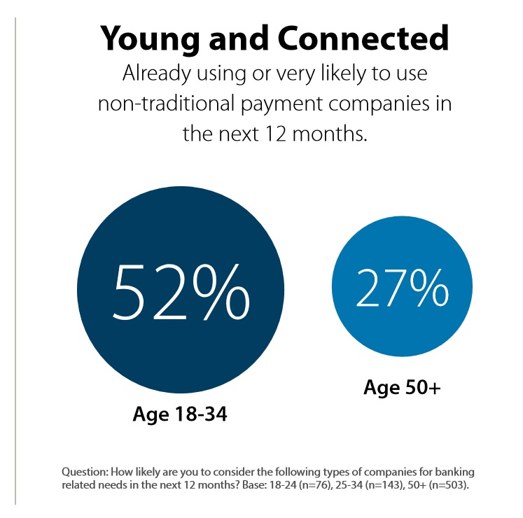
Who are you trying to reach? This can be a fairly broad category, but it’s important to understand who will be using your products and services, and to design your app in order to accommodate their needs. Is your customer base largely under 40 with readily available access to internet? Are they a Baby Boomer or Senior with limited technology experience but possessing robust financial knowledge? While this question may seem obvious, too few companies take the time necessary to dig into their ideal AND actual customer personas. Research shows that Baby Boomers and seniors are becoming more active in the online space for banking activity, while nearly half of Millennials using mobile banking are dissatisfied with the existing online banking services. While 43% of Millennials don’t feel their bank connects with them via their preferred channels, data from the Millennial Disruption Index shows that over 70% of Millennials are more excited about using non-traditional banking/payment features through a company they already use for other business transactions rather than their bank, companies such as Amazon, Apple, Google, PayPal or Square. Pay attention to these key metrics to see where your app can’t and exceed expectations.

Image source: www.fico.com
Are you targeting the US or North American market? Here you will find an already established network/infrastructure of technology, along with consumers’ desires for more efficient banking services in addition to the traditional services being offered. For those in countries that contain a considerable number of unbanked citizens, your team may want to consider what sort of technological restrictions you may face before implementing in those areas.
“As mobile devices reduce the cost to serve a customer by 50%-70%, it becomes profitable to offer financial services to a vast low-income population segment. And that is just one large market segment you may want to disrupt.”
Partnerships that Make or Break Your Success
How often have you heard of horror stories where companies failed to conduct due diligence on their vendors and platform partners, only to find out that the project remaining uncompleted, or worse, their IP or customer data had been stolen?
While due diligence may shift from company to company, these are the top areas you should consider when conducting due diligence with your vendors:
List of references
- This point is fairly industry standard when it comes to vetting a service provider. Be sure to watch for names of other reputable companies in their references list, companies that you recognize as industry leaders as well.
Financial solvency
- Unfortunately, many companies that appear successful are at risk for insolvency due to lack of financial controls. If you are concerned that project work could be drastically impacted by a vendor going under, reach out to them to request their latest financial statements.
Verification of insurance & license documentation
- Especially when working with sensitive, confidential client and financial information, it’s important to verify that all those touching this information. Ask for licenses that show the provider is up to date with their certifications, along with proof of insurance that covers both parties in the case of
Previous complaint history with BBB, FTC, etc.
- You may need to dig online for this on your own, but it’s important to read what other service partners and customers have written about their experiences with this vendor. If you see a marked pattern of neglect or repetitive mistakes, it might be best to move on.
Legal & regulatory compliance
- A key point of review for any company, but especially in financial services. If you encounter a vendor that is unaware of jurisdictional regulations and compliance procedures, this should be a red flag. Same goes for those vendors unwilling to comply with those legal requirements and compliance protocols. Don’t open your company and your clients up to unnecessary risk just to save time or cost.
Expected level of service, security controls, technology architecture, past experience
- Look for and ask for your potential vendor’s processes and procedures concerning the security of data and their level of experience in working in their industry
Contract review; terms, renewal/notification requirements, required service levels, etc.
- Have your team review vendor agreements so you know exactly where your exposure might be in regards to terms of renewal (is this optional or required from the vendor, and how would it cost if it were required?), and notification requirements should you need to terminate the agreement for any reason.
Company history bios of management & key personnel
- This can be optional but also vital. If you know the people working for the vendor are reputable and have a history of building trust in the industry, you can mark that down as another checkpoint of reliability and security.
Never ever underestimate the value and investment of taking extra time and effort by truly vetting your project partners. You’ll thank yourself later.
Learn and Understand Your Customers’ Pain Points
Consider what the average consumer has shared with similar organizations in your target market, and really listen when they are frustrated with a specific product or service. Look for patterns and repetition in the complaints and concerns they express. What pain points do they have?
Many frustrations that customers experience can often be fixed or mitigated with little effort or cost to a company. As simple as it may seem beforehand, and as easy as it may be to fix it at any point in the future, companies should recognize that, if left unchecked and unmanaged, these issues can exponentially grow to the point of destruction of your brand’s trustworthiness.
Onboarding:
Customers don’t mind leaving as soon as they start something that is frustrating or has a difficult and convoluted sign-in process. Even if they’ve gone to the trouble of researching your banking app among many others. Remember, getting someone through the door is much harder than keeping them in; keep this in mind when setting up your application’s onboarding process.
Be honest about timelines for the sign-up process. Can customers expect to have their information live in 10 minutes, or 10 days? To the best of your team’s resources, be very upfront about these expected timelines to set reasonable expectations in the customer’s mind. Clear wording, simple instructions, easy-to-read screens can ensure the onboarding is a productive and pleasant introduction to your company rather than a frustrating obstacle.
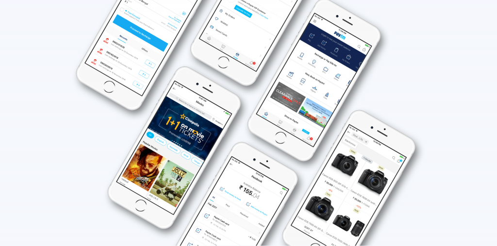
Take the Paytm app, for example; the easy-to-read design and layout is an integral aspect of what makes this payment app so popular. Another excellent example is the clean, simple layout of Square; apps such as these feature large areas of white space to simplify the steps users need to follow in order to enter payment details and process their funds, reducing the confusion and risk of mistakes that can often accompany a screen with too many moving parts.

“The banks of the future should provide a full digital onboarding. It needs to be fast, intuitive and frictionless.” Make onboarding match the reality of our digital age.
Business versus Personal banking:
Inconsistencies between personal banking and business banking often make sense for both large financial institutions and new fintech companies; for security reasons, there will often be different access levels and authorization protocols. However, the end users don’t necessarily care about the particulars of these differences. They simply want control over their finances, and consistent functionality across the platform to be able to manage that control.
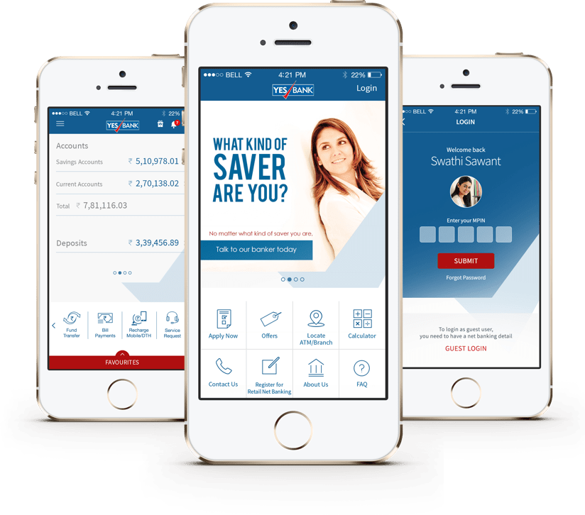
An excellent example of effective integrated mobile banking is YES Mobile 2.0. Their app features a seamless experience across devices and various platforms – smartphones, tablets and smartwatches, and desktops ─ with innovative features enabled to offer on-the-go ease for day-to-day transactions such as:
- One-touch bill payment.
- Speech-to-text for hands-free registration
- On-the-go bill payments from Wearables
- Transfer of funds to your social media contacts

Especially when using the same bank or financial institution, users will argue that banking and finance functions shouldn’t change much in the day-to-day transactional needs. App developers should be sensitive to this and design an app with a consistent, delightful user experience in mind.
Payments:
One of the greatest aspects of mobile banking is the ability to make payments from wherever you are, whenever you need to. Many customers have often lengthy and sometimes frustrating experiences at the bank teller, with long and complex forms and processes have been the norm. Now users have the flexibility to manage both receiving and sending payments, saving them time and, not surprisingly, money. However, when that system breaks down, customers may find themselves shopping around for another option that provides better, faster, simpler service.
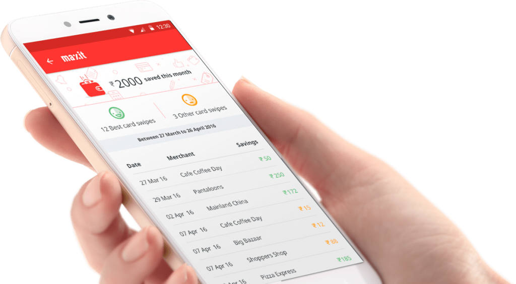
A prime example, MAXIT @ My Universe, was launched to save money for its customers every time they used their credit/debit cards for payments. The company began to notice that the majority of transactions went through cards, without fully harnessing the rewards and offers typically available through these cards. The MAXIT app, in turn, helps users track spending, discover offers and choose the best card for payments.

The whole point of your banking app is to make your customers’ lives easier and to give them more control over their finances. When simple transactions and payments can’t be made, you’ve essentially rendered your app pointless.
Prioritize Security So Your Customers Don’t Have To
As with anything to do with finances, money, and customer data, security is at the forefront of the conversation, from a backend development perspective. But it shouldn’t be in your customer’s mind. Which means, they shouldn’t even consider that it’s not a priority. When designed well, world-class security surrounding their information should simply be assumed and the customer can go about their day with confidence, ease, and trust in your app.
Make things as simple as possible, as secure as possible. In the interest of security, many financial applications encounter problems with the convenience of access for customers. Consider: would you want to visit a restaurant that was only open for one hour a week? This is an area that is still going through changes in innovation, but if you can combine your institution’s need for security with your customer’s desire for convenience, your customer’s trust in your company will grow.
Less but Better: Mobile Apps and KISS method
Create an easy to use system, and stick to it. Complex systems can be made simple, don’t get caught in the trap that more is better.
Navigation:
Navigating your app should be even simpler than navigating the financial institution’s website in order for customers to access their information. For specific items or issues that cannot be resolved by looking through, they should easily be able to find the Contact page with clear instructions on how to reach someone from their financial institution.
Lack of usability is a common concern for users through their mobile banking application, which translates to an undesirable experience resulting in either lost business or angry customers calling or visiting the bank.
Even something as simple as ensuring button colours are consistent across pages can eliminate moments of confusion and frustration. Can customers easily find buttons for processing monthly bill payments? Are the fields for searching through past transactions clearly and obviously labelled? If changes have been made to the site or app, can users still access their information based on repetition, or will they be required to call technical support?
Customers will thank you for following the wisdom of the KISS method (Keep It Simple, Stupid), and they’ll reward you for this in customer loyalty and more business through referrals and word of mouth praise.
Let Your Customer Support Be Your Cornerstone
So you have an app, that’s great. Welcome to 2018, everyone has an app. The challenge now will be to create a banking application that sits above the rest and that supports your customers’ needs properly. Have you created a process or a system that streamlines, simplifies, and saves time? Have you added subtle details and functionality that delights and surprises customers in ways that add value?
One key takeaway is to make your customer service accessible to your customers. Should they encounter a problem or roadblock, be sure that help is easily found, or that an actual person is readily available to help them and get them on their way. If you make your company’s support team a scavenger hunt to find on your site or app, you leave customers with the impression that you don’t care, or that you don’t want to help. Be friendly, be accessible, be knowledgeable.
All in all, good design in mobile banking brings together security, convenience, and accessibility in one place. Be sure to do your research. Ask your customers what they need and want, and really listen to their frustration. Above all, keep things simple, less but better. And then watch those 5-star ratings roll in.
UX/UI design plays a key role when it comes to creating engaging and delightful products for consumers and we at Robosoft strive to create such digital solutions across industries. We are thrilled to be named as one of the Top User Experience Design Agencies of 2020 by Upvotes.co a leading listing platform for full-service agencies, web design companies, digital marketing firms & top technology companies. You can see more of our work here.


