We all have experienced that annoying feeling when we get too many notifications, seeking actions for tasks that are not particularly important at that moment. Timely notifications are integral to the overall proposition of a platform, but they are fast becoming intrusive in nature. Today’s apps and websites send notifications regarding things that often don’t really require our immediate attention, and they send them repeatedly. These frequent and thoughtless notifications don’t mean anything to the user after a point. We just shut ourselves and cancel them out completely.
The next logical question would be — how do we, as designers, design notification systems, which serve the primary goal of increasing user engagement without disturbing users with unimportant pieces of information?
Firstly, it is important to understand that there are many variables that can affect how people may feel and respond to notifications. A person’s attitude towards a notification on any given day can depend on many factors such as:
- What is the notification?
- How is the tone of voice?
- What is the person doing when he/she receives the notification?
- What time of the day are they getting the notification?
- How many times are they getting notified?
- What is the location of the person when he/she receives the notification?
Before we proceed further, I want to share with you some personal experiences of different notification systems.
Exhibit A
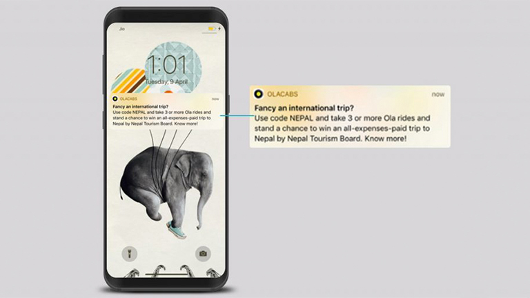
A notification sent by Ola cabs
Let’s breakdown this notification that I got from Ola Cabs:
- It is asking me if I fancy an international trip at an hour when I am most probably having my lunch.
- I usually travel in the mornings or evenings via Ola. Getting this message at a time when I am most likely to book a cab, would have made me interested in it.
- And at that moment, let’s say I was more interested in going to Bangkok than Nepal. So clearly, I ignored the notification.
Exhibit B
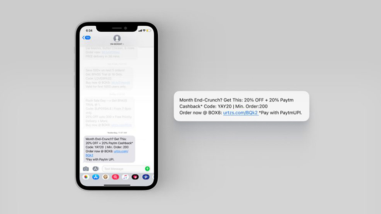
Box8 message
- A notification to save money on lunch, around month end is relevant. I usually order my lunch between 11:30 am – 12:00 pm. And this notification from Box8 meals was timed well. In terms of content, the message or value was conveyed easily.
- Another factor to decide the importance of this message for me would be my location. This message wouldn’t be of any importance to me if I was at a location where Box8 meals are not available.
As designers, it becomes imperative to consider factors like timing and location of the user that affect their decision, in a positive manner and design notification systems that are pleasing and non-intrusive in nature.
Exhibit C
Picture this — it’s Monday morning, I am late for work. Just as I reached the railway station, I realize that my pass has expired. I need to renew it online or stand in a long queue to buy one. I quickly fill in all the details to buy the pass online. To make the payment, I need to login to my digital wallet. I enter my number and wait to get an OTP.
And the platform sends me this notification:
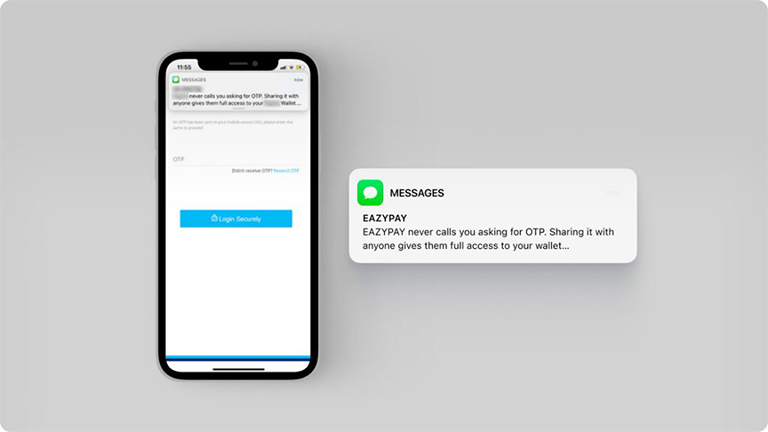
OTP notification for railway pass booking
As you can see, the notification has been constructed in such a way that the OTP number is not visible here. To see the number, I had to leave the platform and open my messages to get the OTP. This may not be a big deal, but it did increase the journey time.
Once I logged in, I proceeded with the payment through my debit card. Another OTP was sent to my phone. But this time I got the following message:
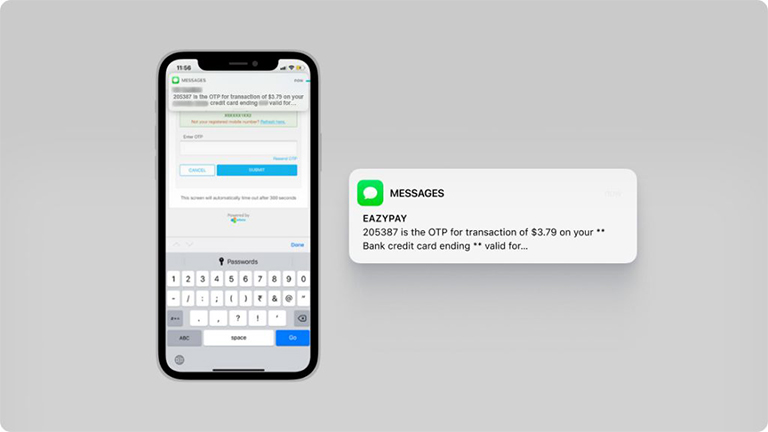
Bank OTP notification for railway pass booking
The above notification was created in a way that the first thing I read was the OTP number (which was the only piece of information that mattered to me). And finally, the transaction was successful.
Like me, I am sure many of you have had some bad experiences (and sometimes good too) with notifications on different digital platforms. As designers, we are constantly striving to improve users’ experience on our digital platforms, and notifications are an integral part of this structure.
I am going to share with you a framework for designing effective and meaningful notification systems.
Framework for Notification System
In order to build a notification system that is engaging and does not irk users to the point that they uninstall the application, there are few parameters or “steps” that we can follow:
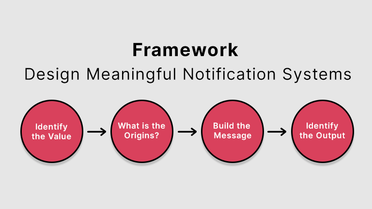
Identify the intent and value of the notification
The foremost thing to be done is to understand the intent and value of a particular notification to the user. There is no point in wasting a user’s time with meaningless content. A person wouldn’t mind being interrupted as long as what they are getting in return is valuable and interesting. It is human nature to ignore things that are of no value to them. In this context, it is crucial to understand users’ needs and goals.
Nowadays, data analytics plays an important role in helping designers understand users habits and behavior on digital platforms. For example: Discovery+, Amazon Prime, Netflix and Hotstar do a great job of personalizing their push notifications. They use push notifications to let users know when their favorite shows or movies are available. They also analyze the type of content users are watching or the shows they follow and recommend similar content.
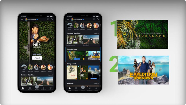
Recommendations on Discovery+ based on titles you have watched
Origin of the notification
Based on the structure of the digital platform, there are multiple channels through which notifications are directed to the user. The source of these channels is the point of origin for notifications.
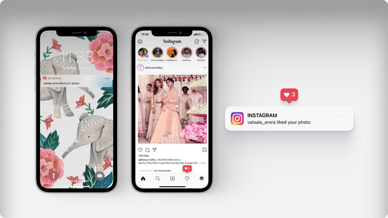
Instagram notification for likes on picture
For example on Instagram, notifications regarding the number of likes your picture gets are part of the activity update channel. These updates are then shown in the notification center as a collective figure.
Building the Message
This section is about the message that is to be delivered to the user through the digital platform. The message content will help the user understand the purpose of the notification and what needs to be done on the platform to achieve his/her goal. Here are a few points that can help build personalized notifications:
A. Information (What)
Users appreciate information that is directly related to their personal interests. They tend to ignore the high frequency of notifications delivering valuable information. While building the information section, we first start with “What”; What information are we passing to the user that would help achieve their goal?
Once you have figured out the “What”, it is time to focus on the tone of voice of the information to be conveyed. It plays an important role in the overall user experience. Language used in the communication is an opportunity through which you can connect the user with the brand. It will help build trust and make the user more attached to your platform. To determine your tone of voice, consider these questions:
- How is this message going to affect the user?
- What emotions do you want the user to feel while using your platform?
- What situation is the user in at the moment?
- How can you maintain the user’s state of mind or put them in a better one?
Based on the situation, the tone of voice of the message could be serious, authoritative, or even instructive in nature. Take for example, a banking or finance services applications. Sense of security among users is of primary importance to the brand. Hence, they have to take extra care when giving instructions and write content in a manner which exudes a sense of security.
Users also welcome a break from the mundane and enjoy the experience when brands go for a playful and lighter tone of voice. I ordered one of my meals from Box8 and they added a playful touch to the notification regarding my delivery by using the word “Sooperman”.
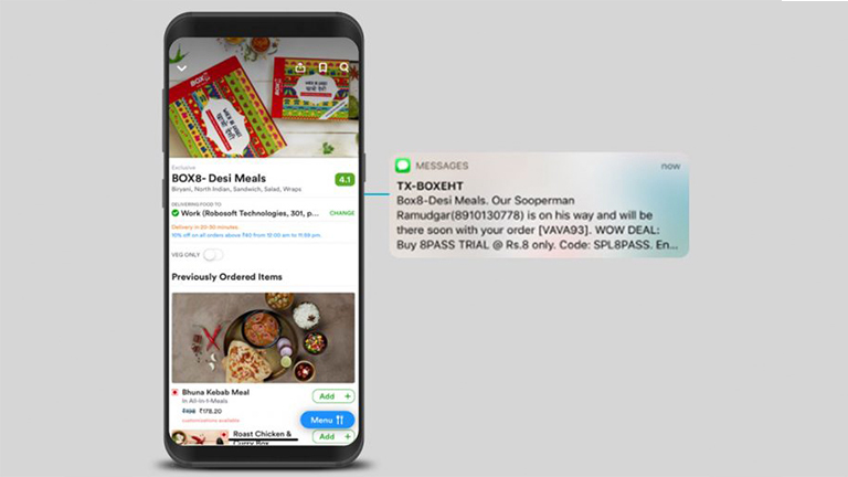
Box8 delivery update
B. Timing and Location (When)
In order to deliver a successful notification strategy, it’s necessary to provide customers with the right message at the right time. But timing means much more than simply segmenting your users by time zones, or customizing messages according to the seasonal calendar. It means delivering information at the precise moment a customer is likely to take action. Nobody likes to be disturbed in the middle of the night because of a notification to avail discount on a purchase on an eCommerce site.
While figuring out the timing, we must also consider the frequency of notifications. Is it something crucial that the user needs to see twice everyday or would one message a day suffice?
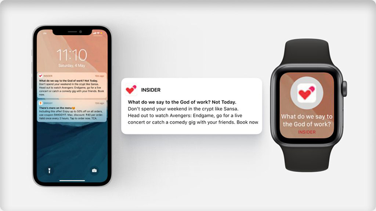
Insider Notification
Let’s consider this message from Insider – it references topical subjects like Avengers and Game of Thrones in the message. The tone of voice no doubt may be great, but the timing of this message could have been planned better. I got this notification on a Saturday morning, when I am not at work and am most likely sleeping. Most of my weekend plans are made on Friday, at work. Had I received this message on Friday, I would definitely have booked something via the app. Notifications at the wrong time are completely useless. Untimely pings get ignored and the sound they create dilutes user interest and may even cause frustration.
Another important variable to consider is the location of the user. Users tend to use an app more if it sends them push notifications triggered by their selected hometown. Let’s say I have recently relocated to Mumbai from my hometown. What if food ordering apps used my location to notify me about the best deals on food near my location or the must-visit restaurants in the new city.
C. Type of notification (How)
Once you have figured out the “what” and “when”, the next step is to figure out the type of notification which is the “how”. In general, notifications can be categorized in the following categories:
User Generated Notifications: This type of notifications are targeted towards specific people. Their content is created by an action of a user on the app. Mobile messaging or WhatsApp messaging are examples for this category.
Context Generated Notifications: These notifications are generated by the digital platform based on user permission. One example of this could be the location based notifications from Zomato or Swiggy, where the apps send you offers and recommendations based on current location.
System Generated Notifications: These notifications are generated by the digital platform based on application needs. These type of notifications can help in re-engagement or some users may term it as spam based on the value they provide.
Push Notifications: All the above notification types can be push notifications also. They ideally appear on the locked screen or at the top without interrupting the user’s activity. These messages have a limited word count as well. Push notifications are of two types. One that requires you to take immediate action and the second one is passive notification. Most of the examples shown above are passive notifications. The image below shows a notification of a Medium article that seeks an immediate reaction:
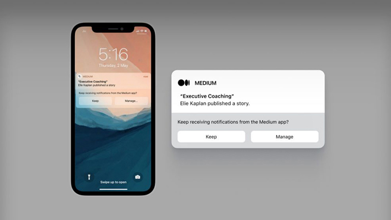
Push notification with action
Earlier we only had mobile apps and desktop notifications to design for the user. But the introduction of smart wearables like smartwatches and apple watches have widened the spectrum. These watches are capable of concisely showing the push notifications in a much smaller and personal screen.
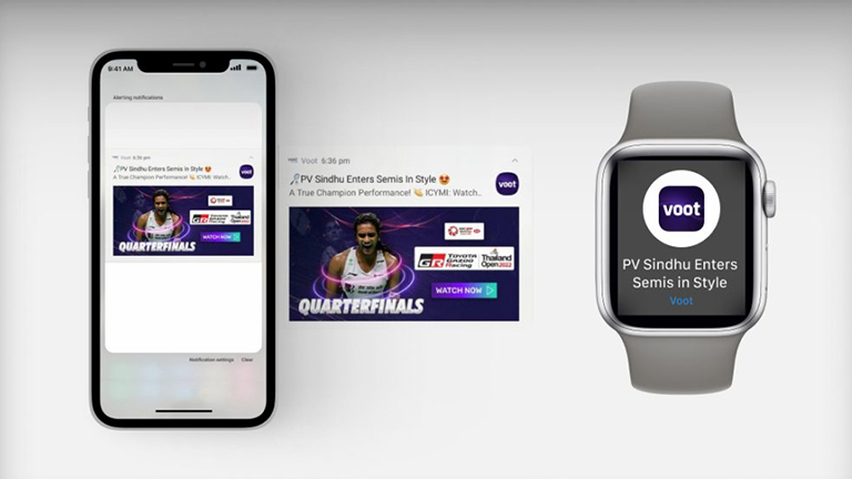
Voot notification on a smart watch
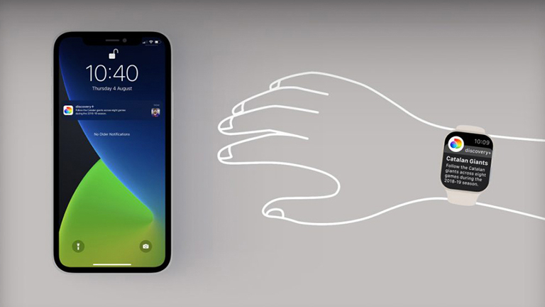
Discovery+ notification on an Apple watch
Output
“Output” is the part where the notification will be displayed on the digital platform. The output section can showcase notifications from multiple sources or just one. Some digital platforms have a separate notification center, where all the notifications are shown to the user, eg. Pinterest and Facebook or LinkedIn. They bundle information about who liked your posts, what people you are following are doing, etc. into a single notification center.
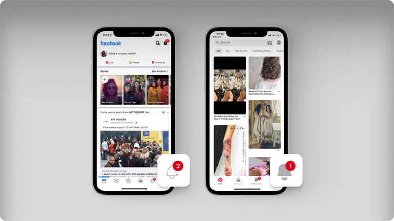
Single Notification Center Platforms: Facebook & Pinterest
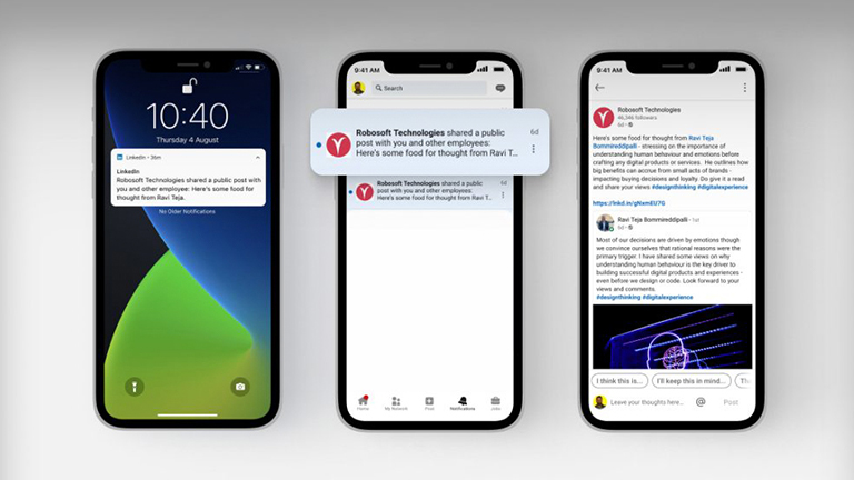
Single Notification Center Platform: LinkedIn
On other digital platforms, every notification is connected to a navigation option which is the origin of the notification as well. For example, WhatsApp has navigation channels like Status, Calls, Chats that are both, the origin and output points for respective notifications.
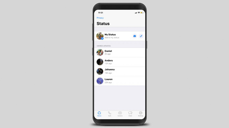
WhatsApp Navigation Channel
Final Thoughts
We, as users, have learnt to identify and avoid notifications, just as we have learned to identify and avoid ads. As designers we need to understand that, if not carefully designed, notifications can become less effective in engaging users with your platform. We need to design notification systems in a manner that messages sent by brands bring value to the users journey.
The framework explained above can be used to design an effective and meaningful notification system for any digital platform. Think of it as a template, that could be applied to any user journey on your platform to enhance its overall notification experience.

