To fly, we must. For some, the regularity has numbed us, for others less frequent; it remains a daunting chore — You stand, you wait, you get frisked, you wait, you fly, you eat, you sit and stand again, and then you make a last restless dash for the doors, as if every second counted in this inevitable race to nowhere. The baggage carousels and Uber queues are the great levelers. Nobody gets ahead of this game.
This essay is about design suggestions that would help create a deeper, more intimate “airport experience”. These insights are personal, derived from hours of waiting at airports and watching. And over time the process has become almost meditative, resulting in a few distilled concepts around design and technology. I hope this would urge airlines to embrace emotionally designed journeys, wherein technology becomes a pillar of dependability rather than just another tick-mark to a digital transformation mandate.
It’s only through consistency and reliability, born out of unflinching focus that a business can truly succeed. And not through the contemporaneous handstands of forced digital disruption.

The 7 Stages of flying
There are subtle rhythms behind every process. They are like musical compositions, miss a beat and the tune goes for a toss. To better understand these rhythms we need to break a process down into precise stages, with each stage possessing a clear demarcation of purpose.
Currently, a typical airline journey is broken down into four stages — Booking, Departure, Flying and Arrival. While this may hold good from a macro perspective, there are micro-rhythms that are missed. How do users plan their journeys? There is definitely more to planning than just a pretty booking interface. What are the strains from pre-trip anxiety? And arrival at a port of call is not necessarily the end of a journey.
In order to accommodate these micro-rhythms of the new age traveler, I expanded these four stages into seven steps. The new flow adds three essential stages — Planning, Pre-trip, and Post-Arrival. These seven steps form the base-framework of the new UX flow.
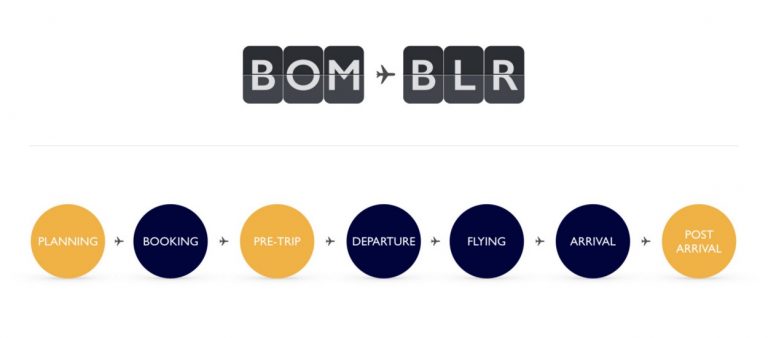
Image 01 – Seven steps that form the base-framework of the new UX flow
The Users
Decades ago, flying was a unique experience, happened once in a while, and to distant places. There was a certain romance that existed. Airports weren’t crowded, counter experiences personalised, flight attendants were courteous, security personnels smiled, and your baggage weight was not part of a revenue model. You had butterflies in your stomach every time you entered an airport. I still have butterflies occasionally, especially at take-off. With the advent of low-cost carriers, flying went supernova, and almost everyone flies now.
Time is of the essence and when that happens romance jumps out of the window.
To keep things simple, I have bucketed the users of new age airline travelers into four profiles based on their needs.
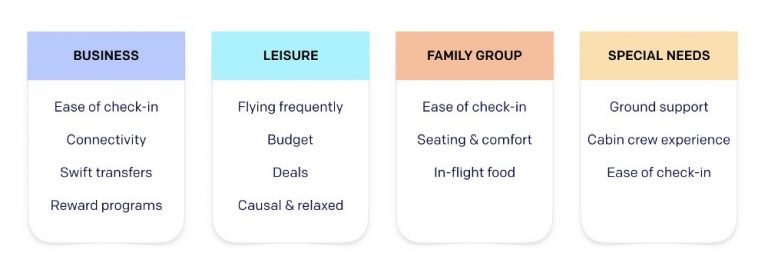 Image 02 – Four user profiles based on their needs
Four user profiles based on their needs
Business Traveler — Always late or in a hurry, quick check-ins are the priority. Connectivity and swift transfers always on their minds. The rewards and lounges access is something they gun for.
Switching between phones and laptop, emails and messages, coming and going, lost in transit and they sometimes get isolated.
The Leisure Traveler — Off to places where the sunny side is up. Usually, on a tight budget, they make choices on recommendations and keep a sharp eye out for deals on tickets. Flying frequently, they are casual and relaxed. Shopping at the arcades, they look at things they otherwise wouldn’t need. May buy a book but not the Sony LCD. May have a beer as opposed to a coffee. All is good, a life of fun awaits.
Family Groups — Large groups shuffling through the airport, constant head counts of children and luggage alike. Seats need to be together. Baby tantrums and seat belt extensions for the grandfather. Check-in, in-flight food and comfort are a priority.
Special Needs — Care for specially-abled and elderly calls for a rooted sense of empathy. Flying can become an extremely anxious experience of our older folks. The sheer sizes of airports today, language barriers, new digital systems that breed impersonal attitudes all cause a fair amount of disorientation.
Wheelchair or personal assistance is not just limited to a physical want. It needs to be administered in the most gentle manner, it is only then that the experience has a profound emotional effect. Care-giving is the focus here.
The experience map of family travelers
I have chosen to elaborate the experience of the family groups, as their needs are more varied and demanding. Compressing the entire journey into main nodal points, the red dots are the areas of maximum pain.
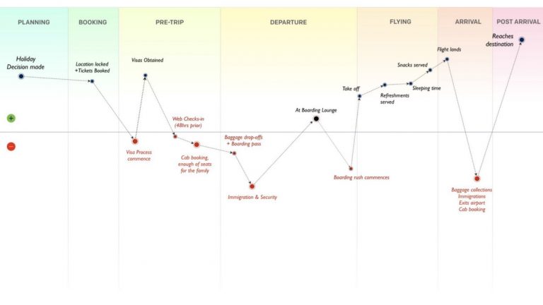
Image 03 – Experience map of a family traveller
In the above map, while planning and bookings having their own hurdles, the focus here is on what happens in and around the airport like immigration and security checks. There is the chaos of the boarding lounge, then baggage collection and finally transportation at the destination, while check-ins, baggage drop-offs, lounges could all do with some improvements.
Pain points summarized for the Family Traveler
Besides Facebook and banks, airlines seem to have access to a lot of user data. By efficiently using frequent flyer data, can we answer some of the below questions?
It’s been a long and hectic year. We need to take a break. Where can we go this year?
Challenge — Planning a family trip is an emotional and repetitive decision. Can airlines preempt this need and help suggest relevant destinations?
With more significant aspects of the travel taken care of. “Hope I haven’t missed out on anything.”
Challenge — At the last minute, small things tend to be forgotten. Travelling with family requires meticulous planning & confirmation of all logistics.
“Hopefully, we are done quickly with immigration and get our bags soon.”
Challenge — Travel doesn’t end at the port of destination. Being a reliable partner means focusing on the complete end-to-end travel experience, from the baggage carousel to the hotel room.
Below is the experience map for a Business Traveler.
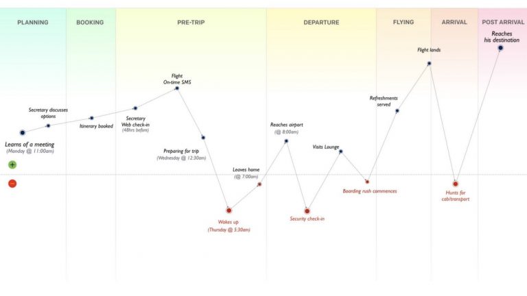
Image 04 – The experience map for a Business Traveller
Business Travelers are usually too preoccupied with their personal agendas and don’t get into the nuances of travel planning and execution. They want to just go with the flow, herd their way through.
The emotional pillars
Identify the negative emotions, and you will understand the nature of a specific pain-state.
The primary need of product features is to address these pain-states. Very often we do not resonate with the real pain and land up treating superficial pain points, creating features that are benign.
Hence I make it a practice of drawing up the key emotional pillars — celebrating the positive emotions that negate the negative ones. In this case, designing that end-to-end travel experience requires three key emotional pillars.
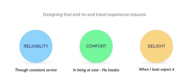
Image 05 – Emotional Pillars
Reliability
Air-travel seems to be caught in a continuous tug-of-war with time. And it’s not just about flights taking off on-time, it starts with the booking experiences, counter transactions, baggage safety and a host of other services. Reliability is not about doing new stuff every time, but doing a few essentials correctly and consistently, so that travelers can depend on these services blindly.
Comfort
When things get reliable, they start to get comfortable. True comfort transcends the physical needs. It is not just about creature comforts, it is more about mentally being at ease. Hassle free rescheduling, notifying a change in boarding gates, subtle in-flight experiences, baggage drops-offs and so on.
Delight
You are happy when an experience exceeds your expectation, you are delighted when you least expect it.
Through the essence of reliability and comfort, delight can be experienced time over. Only when an airline has embodied reliability, will it have the ability and time to focus on the other more humane micro-rhythms — the gentleness of speech, seamless transfers, quick rescheduling, the rhythms of baggage handling, ownership of screw-ups, quick compensations and forgiveness.
User errors and mistakes should not be looked upon as a monetisation event but as an opportunity to delight the traveller.
The new experience
Here is a new take to create a seamless airline experience. Below are insights that help address the above pain points, creating a connected experience of delight.
How can airlines understand emotions and use big data to help users plan a trip?
We all have a fair guess as to how much of our information is really out there. Every time we fly, there is information we voluntarily and involuntarily divulge — the time of year we tend to travel, the places we have visited and how long we stayed, the exact dates of entry and exit. The seats we preferred and the food we like, our payment modes and credit cards. The extra baggage we haggled on, whether we have been “good or bad”, it’s all out there.
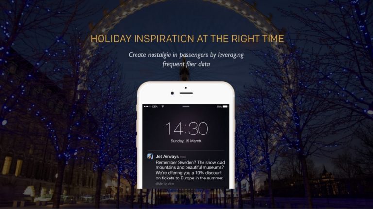
Image 06 – Airlines tap into those past moments to create relevant discounts and offers
The aftermath of a holiday is nostalgia — “The passion of reliving a good moment.” Can airlines tap into these past moments, based on the user’s flight histories, to understand where and when was the last significant event/holiday, and at the right time suggest new/similar places?
Can an email/notification sound like this:
“Remember Sweden, the snow-clad mountains and the beautiful museums? This summer we offer a customized 20% discount not just on your tickets but on your hotels too. And to make it easier, you can pick a destination anywhere in Europe!”
All you need to do is to pack a bag. Click here to let our Travel Planners sort the rest out.
Tapping into our nostalgia, they can create a desire to travel and then facilitate this new want further by relevant discounts rather than a generic 20% off. Also, bring in assisted travel planning through the seamless booking of tickets, hotels etc. A host of services can then be added on. (Image 06)
Create a “pull” notification instead of a “push” notification.
Focusing on the UX of the booking interface is a start to an error-free journey
The primary needs of the booking interface are to — discover, communicate, and encourage a booking.
Family or multiple bookings can get complicated, simple things like getting the names, dates, destination or timings right need a certain amount of effort and focus. For example, there are many cases where the users had selected the dates right but mistakenly booked the destinations in reverse order. To avoid these human errors visual checks should be designed to communicate and validate each decision made by the users at every step.
It is important to avoid jargon by maintaining a direct, uncomplicated tone of voice. Large and legible type should be encouraged. Section grouping brings focus, for example, have a clear demarcation between selecting destinations, dates and number of people flying help in quickly comprehending the priority of information needed. (Image 07)
Avoid the hidden costs and click bait prices. Final booking dates, time and cost should be summarized with clarity before a payment gets initiated.
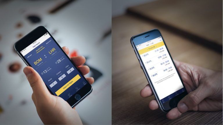
Image 07 – Flight Bookings — An elegant interface makes booking flights a breeze
Check-ins, boarding passes and rescheduling from the comfort of your phone
Create one step mobile check-ins, which are designed to be inclusive of seat upgrades, meal preferences and choice of entertainment. For repeat user, these preferences should automatically be auto-recognized, linking them directly to the user’s airline membership and loyalty programs, earning points as you go.
Cancellation and rescheduling trips are often last-minute decisions that give rise to a fair amount of anxiety. Once a booking is done, they should appear upfront on the ticket interface as prominent buttons. (Image 07)
The cancellation should offer immediate clarity on implications such as the refund amount/policy. The rescheduling journeys need to intuitively recognize rescheduling from a normal booking and produce smart results instead of querying the user for previously stated information like destination, passenger info etc.
Relevant weather updates
Most often the weather within a country varies – it might be dry on the west coast and pouring on the east. Rather than just displaying temperatures, a thoughtful reminder to carry an umbrella would go a long way.
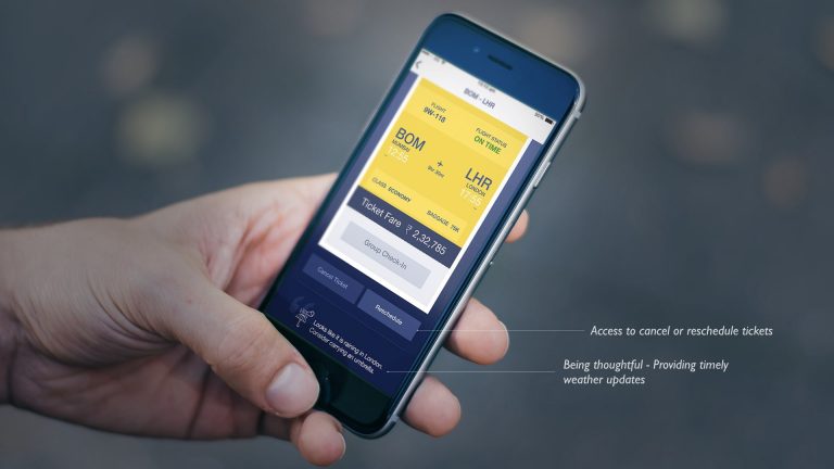
Image 07 — With seats, meal preferences and weather updates, check-in is only a tap away
Mobile boarding passes
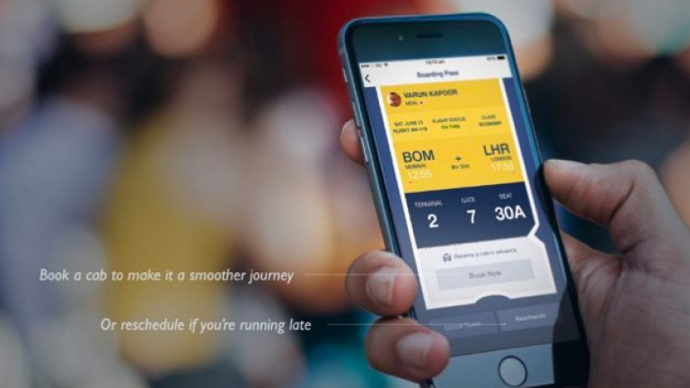
While some airlines have adopted digital boarding passes, many have not. It’s time we replaced the printed tickets with a digital one. Besides being eco-friendly, this feature creates a seamless journey especially for the business traveller who is always in a rush. (Image 08)
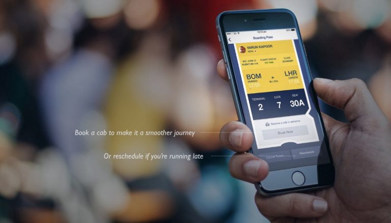
Image 08 — Mobile boarding pass, clubbed with relevant features like cab bookings and rescheduling
A notification strategy built on the pillars of time and relevancy
The core of an effective notification-strategy is based on time and relevancy. Notifying the users about an event that had or will have a direct impact on their lives.
Over-enthusiasm in firing out generalised notifications can antagonize users. The notification triggers have to based on personal actions of a specific user’s micro-actions that are developed over time through intelligent learnings of the macro behavioural pattern.
A notification strategy for a traveller should able to pre-empt a future situation, avoid anxiety, be sympathetic through an honest tone of voice and most importantly do not generalize the moment through irrelevant offers and suggestions.

Boarding reminders and gate change notifications
Today most airports are going silent, minimizing boarding and flight announcements. While this seems like a boon, for the sleepyheads it could spell disaster. I know of quite a few tired folks who have slept off in the terminal, missing their flights.
Often times, boarding gates are changed at the last moment. Then sprinting across a large airport with your hand baggage needs a certain sense of humor. A timely mobile notification of a gate change will have travelers board on time, especially the elderly. (Image 09)
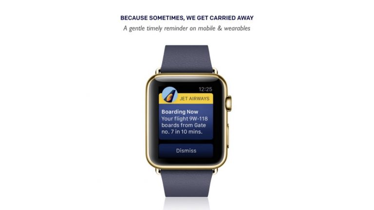
Image 09 – Boarding or gate change notifications
Baggage tracking notifications lead to peace of mind
Even though this may be your hundred and tenth flight, your baggage is always on your mind. Has it been loaded on the same flight? Will get lost in transit?
A thoughtful system can be designed that monitors baggage loading. It can send out a gentle notification keeping travelers informed about their baggage status, helping them have a relaxed flight. (Image 10)
![]()
Image 10 – Bags loaded. All is safe!
Carousel notifications
Once travelers land, a notification should be triggered informing passengers of the carousel location of their bags. In spite of all good intentions if baggage does get misplaced, a quick call to action to flag the lost baggage should be instantly available. This will provide some comfort by sparing the unnecessary anxiety of a runaround. (Image 11)
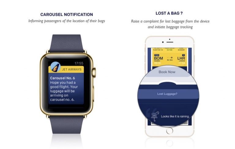
Image 11 – Carousel notification and lost bags
Getting your ride home
All’s well that ends well! The last leg of the journey is about getting your ride home. An integrated transport booking & tracking system built into the app will let users plan and pre-book their travel at their end destination. (Image 12)
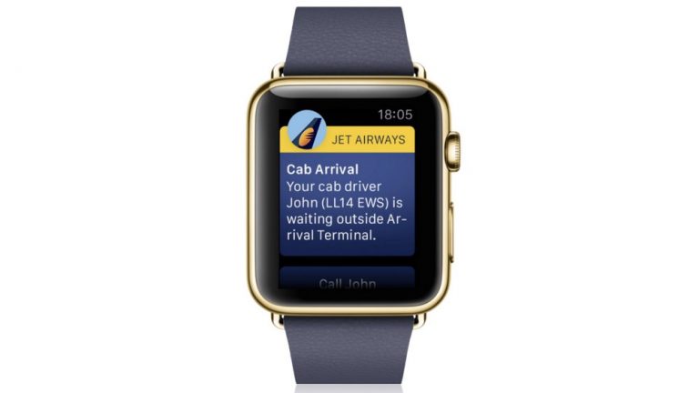
Image 12 – Out of the airport and into a cab. An end to end travel experience
A notification on your Air Miles.
Every time I fly I wonder if my air miles would get auto-credited to my account. Sometimes I ask the lady at the counter and with a smile, she tells me “This time, it has.” Too lazy to keep a tab of the many past times, I let it slip of my mind.
A timely confirmation of air-miles updates works as a great way to proactively acknowledge a customer’s patronage, rather than just a generic notification — “Thank you for flying with us.” (Image 13)
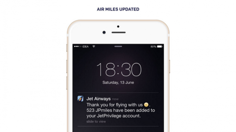
Image13 – Proactively addressing a customer’s patronage
In my view, loyalty programs should be based on the fundamentals of micro-patronizing and smart redemption. Repeated usage of any part of a service offering should be rewarded seamlessly, and should not be limited to only big-ticket items or purchases. In this case, Airmiles — flying should not be the only opportunity for rewards, the program should extend to measurable acts done within the airport, early check-ins, pre-booking of meals, the overall good behavior of a guest could be a reason to reward and appreciated. Just like Uber rates its guest, letting them know that being polite matters.
Redemption programs should be smart and meaningful. Rather than the users having to keep a tab on their point score or waiting until they are about to expire, redemption deals should be intelligently invoked when the opportunity arises.
For example, when you have earned enough number of points an auto upgrade to business class or a seat of your choice can be an automatic prompt. In an intelligent eco-system, users do not need to figure out how and when to redeem points.
Remember, a reward program is only as good as its redemption. The ultimate goal here is to genuinely appreciate loyalty and encourage healthy usage.
Summary
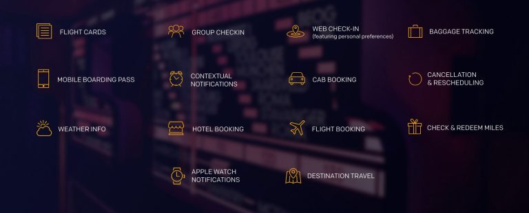
To summarize, in the above image, I have broadly listed down the features that would help make a traveler’s journey comfortable. Some of them are basic hygiene features, things I would personally like to have. Though some of the features may seem simple, there is always much more to simplicity than what meets the eye. Finally, through quality and consistency, an airline reflects its true personality.
Disclaimer: All logos shown here belong to the respective brands and used in mock ups for illustrative purpose only.
